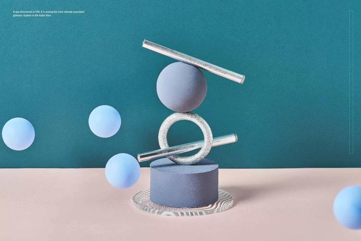
KALLIE STARR
- Behance精選
- 眼妝品牌識別系統設計|包裝設計|攝影企劃
https://kalliestarr.com/
一家台灣在地超過四十年的化妝品製造廠,長久以來以生產代工為主,具備豐厚的專業經驗和產品研發能力,希望和市場上具備領先技術的日韓品牌作區隔,在創意發想階段,別於普遍甜美可愛的風格走向,思考到宇宙銀河系可以表現眼妝彩盤的意象,銀河的閃耀和絢麗能充分展現化妝品的特性。而宇宙的無邊盡、充滿冒險和無限可能,展現品牌長久以來不設限、創新研發的產品實力,因此品牌定位為「Make you a Star」星空系彩妝。
品牌識別設計,結合星軌、星球、星空的概念,以簡化的幾何線條構成「Kallie Starr」標準字型,整體視覺俐落不失個性,其中由A跨越至E的星軌線條更能提升品牌記憶點,也象徵期望每位顧客透過產品的使用,找到屬於自己的光芒。
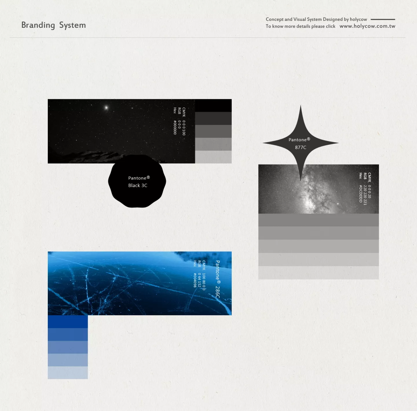
品牌色彩規劃,以隕石黑及星系銀為主色調,輔助色則選擇相互襯托彩度比較高的顏色,象徵星光的黃色、象徵柔光的粉色和象徵星際的藍色。輔助圖形設計,以宇宙中的黑洞搭配隕石、宇宙間的星辰、塵埃作為圖形發展基礎,呼應圖象應用於品牌的眼線系列產品,傳遞其賦予眼神的深邃感,及奇幻探索的風格。其二以星際間閃亮的恆星、星系及輻射的意象,轉化為象徵幾何圖像,烘托迷幻和奇麗感,進而呼應其所應用於眉部類產品的特色,帶給使用者展現自我閃耀。其三將銀河系中眾多星宿和銀暈的特色,搭配宇宙間靜謐的黑與象徵星光的流線圖形,柔和的流線感融合輔助色漸變的粉暖色系,傳遞品牌唇妝類產品的風格特色。
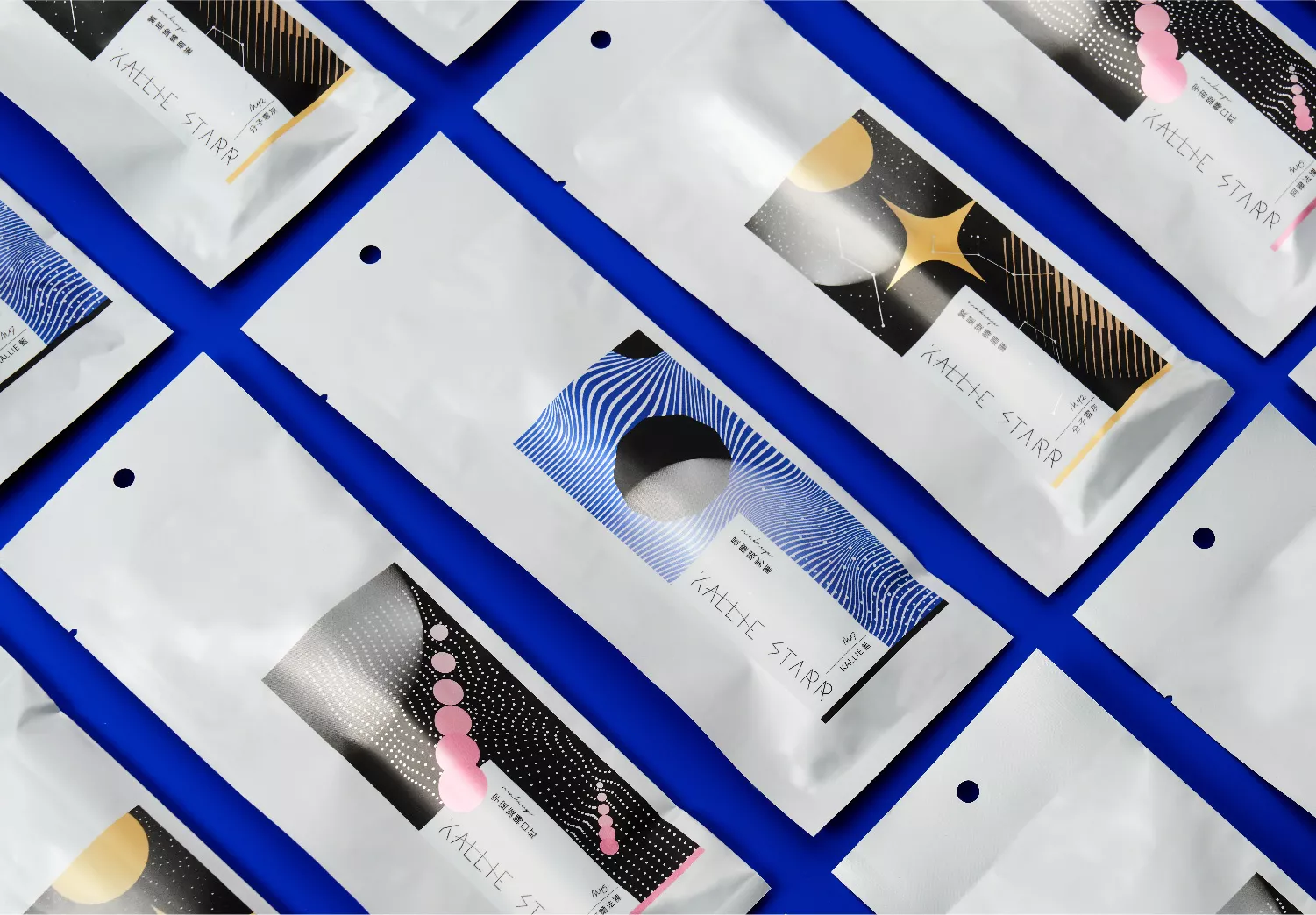
包裝設計,整體色調以大面黑色作為主要調性,結合星系和星球等元素轉化的圖形,在印刷上透過模造面黑卡的紙質結合後加工的表現,營造黑夜中閃耀的視覺感受。產品則採用比較接近太空感的包裝風格,讓整體更貼近品牌追求無限美麗的調性。
This Taiwanese cosmetic manufacturer has more than 40 years of experience in OEM. With its professional expertise and product development capabilities, it hopes to differentiate itself from the leading Japanese and Korean brands in the market. At the innovation stage, instead of using the traditional sweet and charming design style, the concept leans more toward combing the facets of the Milky Way into the eye makeup palette, so that the shine and splendor of the galaxy can be fully displayed. The universe is endless, full of adventure and with unlimited possibilities, making it an ideal representation of the brand’s long-standing innovative research and development capabilities. Thus, the brand position is to “Make you a Star”.
The brand design combines a series of planetary and interstellar designs, using simplistic geometric lines to assemble the letters of the brand “Kallie Starr”, clever and with its own personality. The letters “A” flying towards “E” create a greater impression of the brand into the minds of the consumers and ultimately representing each person’s desire to find their own glow.
The color scheme of the brand uses meteor black and galaxy silver as the main colors, with contrasting auxiliary colors: yellow symbolizing starlight, pink symbolizing soft light and blue symbolizing galaxies.
The auxiliary graphic design uses black holes, meteorites, stars and stardust to echo the characteristics of the eyeliner product line, further conveying the brand’s ability to create greater depth in every look, while creating a sense of fantasy and exploration.
Secondly, the images of interstellar shining stars, galaxies and the invisible light spectrum are transformed into symbolic geometric images, creating a sense of enigma and mystery, echoing the characteristics of the eyebrow product line, guiding consumers to find their own glow.
Thirdly, the contour lines draw out the many characteristics of stars and haloes in the Milky Way in combination with the quiet black of the universe with the faint hint of the auxiliary pink color scheme to echo the characteristics of the lip makeup product line.
For the packaging design, the overall color scheme uses black as the main color scheme, combing the design elements of galaxies and planets. All of it being printed on wood free black paper with post-processing to create a sensation of a starry night.
Overall, the product packaging uses the concept of outer space as the main design, in harmony with the brand’s pursuit of infinite beauty.