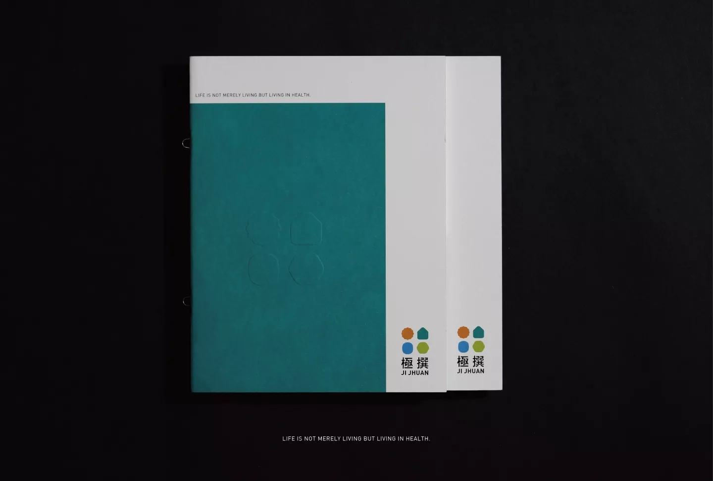
極撰
JI JHUAN
- 綠建材品牌識別系統設計丨品牌應用設計丨品牌改造
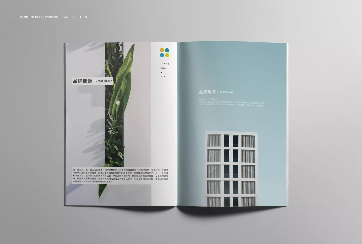
當環保節能成為全球當前重視的課題,盛裝生活中一切的容器「建築」及建築內⼀切建材元素的節能性,也成為都市人對理想⽣活空間的追求。極撰起緣於⼀個家的故事,因為裝璜新家的過程中深入研究綠建材、居家節能設備,⼀邊發覺綠建材對於現代⼈生活及我們⽣活環境的重要性,才毅然決然投入這個產業。
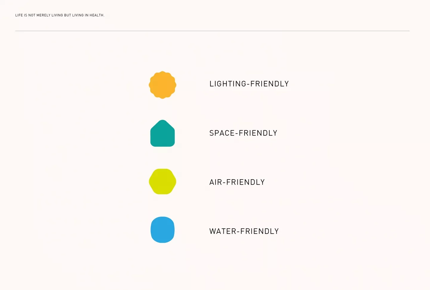
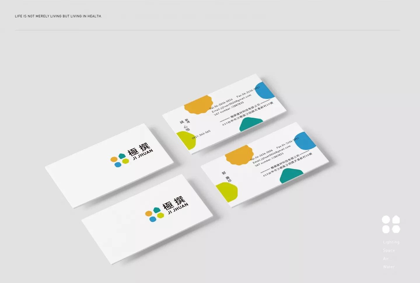
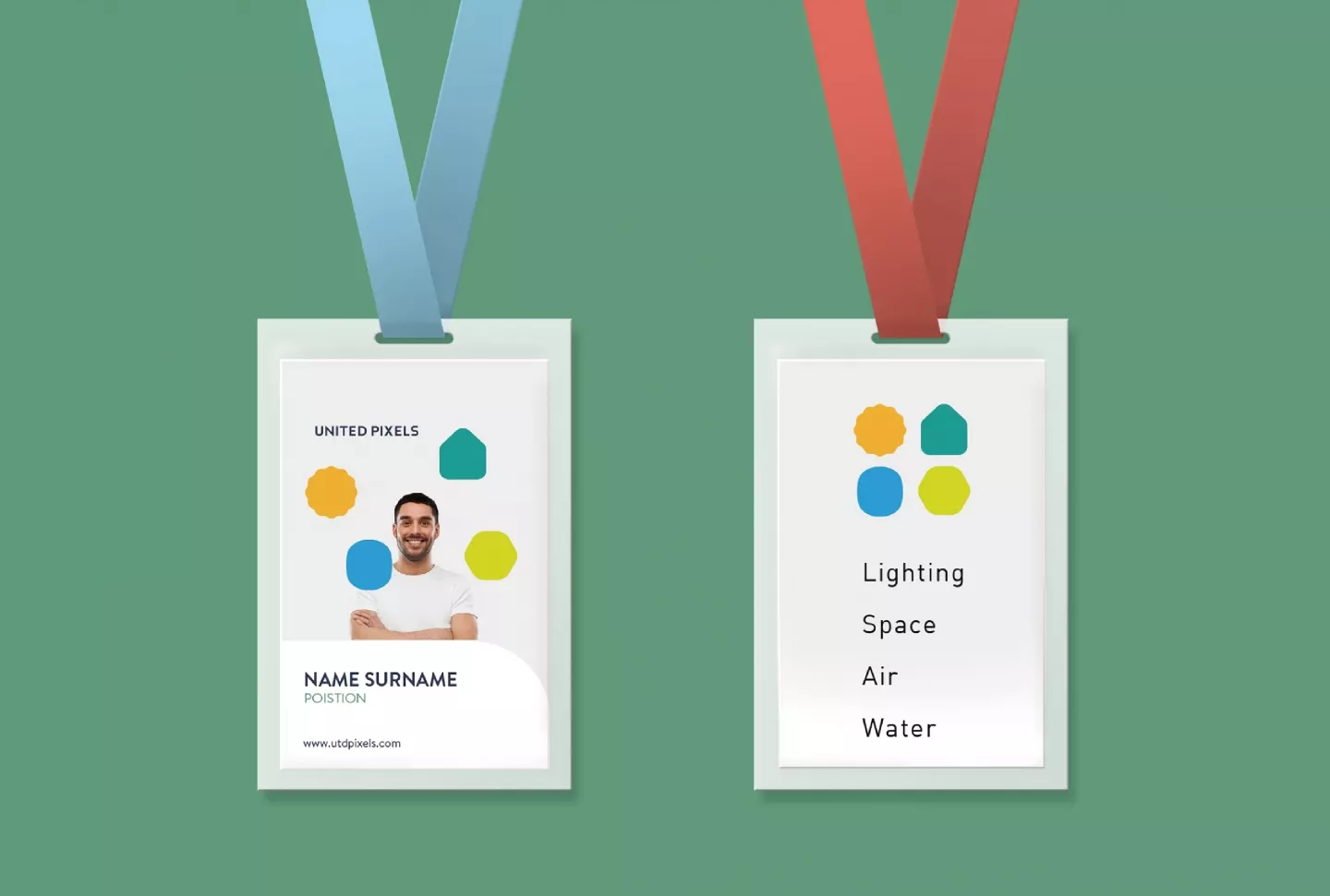
在品牌VI的規劃中,先思考綠建材涉及的產品⾯,從極撰的主軸產品包含「照明」、「空 間」、「空調」、「水質」等,拉出了四個象徵性的圖像設計,並分別賦予代表性的鮮明⾊彩,進⽽延伸設計出既可以是品牌識別,⼜又能化為輔助圖形靈活編排在整體識別應⽤用系統上, 烘托出⼀種簡練清爽卻帶有溫度的氛圍。
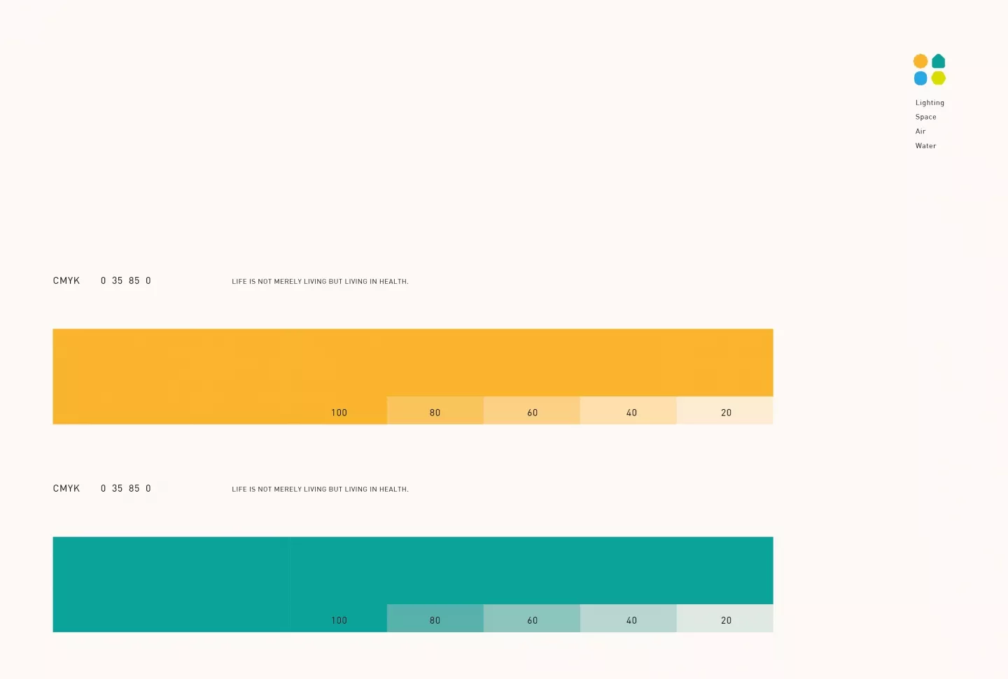
⾊彩規劃上採⽤清爽、偏自然同時飽和的色調為主,結合品牌主色「藍綠色」象徵⼀切⾃然的根本。
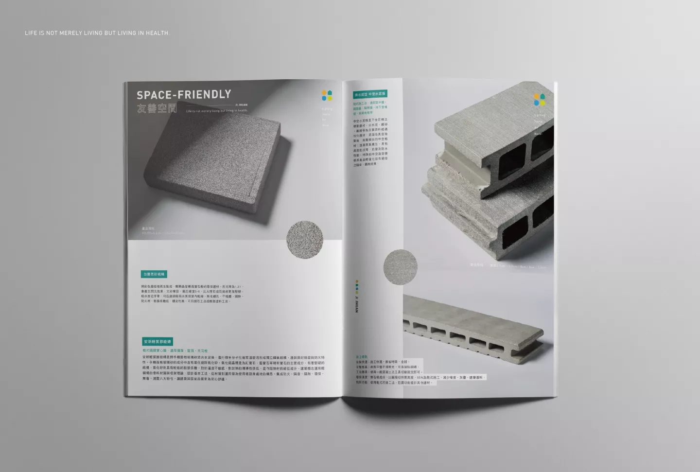
品牌參展的年度型錄設計也採⽤清爽、乾淨、簡練的編排風格,留⽩和⼤⾯圖片, 融合⼩⾯積的設計巧思、著重字體編排的協調性,希望讓視覺呈現回歸到以產品為主題,⽽產品的攝影調性也趨向簡單,讓翻閱者更能清楚感受到建材的本質,並透過整體選⽤的紙材: 環保尼斯紙,模造紙紋的觸感,加上剛好的吸墨性和顯⾊性,結合騎⾺釘裝訂⽅式、局部後加⼯打凸為視覺層次加分,讓整本型錄在顯現質感的同時,不流於刻板、冰冷,⽽是更貼近綠建材要帶給⼈空間⽣活:低負擔、友善循環、舒活自在、珍視環境的精神。
With the environmental and energy conservation trend taking over all aspects of urban life, including living space and all elements and materials involved, more and more city-dwellers have begun to pursue this kind of lifestyle. The story behind this company began with a simple house. During the installment of the new home, the owner began to research eco-friendly material and energy-saving equipment and realized the importance of eco-friendly material in the modern lives of people and thus began investing into this industry.
In the planning for the brand’s VI, the first thing was to consider the materials in green architecture, from which were derived four main elements: “lighting”, “space”, “air conditioning”, and “water quality”. These four design elements combined with vivid colors can be extended into the brand recognition design as well as auxiliary graphics, creatively arranged and mixed to bring out a modest, invigorating, yet heartfelt atmosphere.
The color scheme is based on natural, refreshing and saturated colors to match the brand’s main color of “blue and green”, fully symbolizing the essence of nature.
The brand’s annual catalogue design for the exhibition also adopts a refreshing, clean and concise layout style, with large whitespace and full-picture displays in combination with detail designs and ingenious font arrangement, still placing the overall emphasis on the product. Moreover, the photography of the product leans toward a minimalistic style, so the viewer can clearly comprehend the building materials. The selection of the paper material for the catalogue is a rich eco-friendly paper, with unique texture, excellent ink absorption and high-resolution color rendering. In combination with the saddle-stich binding and post-processing work to create a layered visual, the overall design has a stylish, graceful flow to it, yet at the same time without being rigid and distant. Together, these elements represent the eco-friendly lifestyle and living space, which is characterized by lightheartedness, comfort, hospitality, and a deep appreciation of nature.