島語覓密
UNLOCK ICELAND
- 私旅旅行品牌識別系統設計 | 位於冰島 | 品牌應用設計
島語覓密
是一名旅居冰島的台灣人所經營的私旅,分享關於冰島的美好事,生活哲學、文化、透過深度旅行,替冰島旅人實現冰島夢。
我們將品牌取名叫:『島語覓密』。透過UNLOCK ICELAND 文字的堆疊、話語的傳遞,不僅能夠幫助你想像冰島的純淨、詩意、寧靜與荒涼,也讓這裡最深層的人事時地物通通毫無保留地讓你知道。藉由知性、感性的旅行,帶你深入在地的冰島風景,在這座島嶼一起尋覓屬於你的私房軌跡,尋找那份心目中的無可取代。
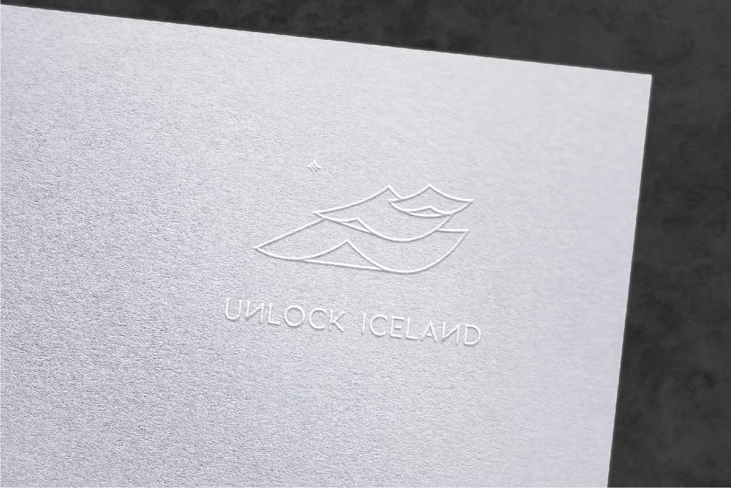
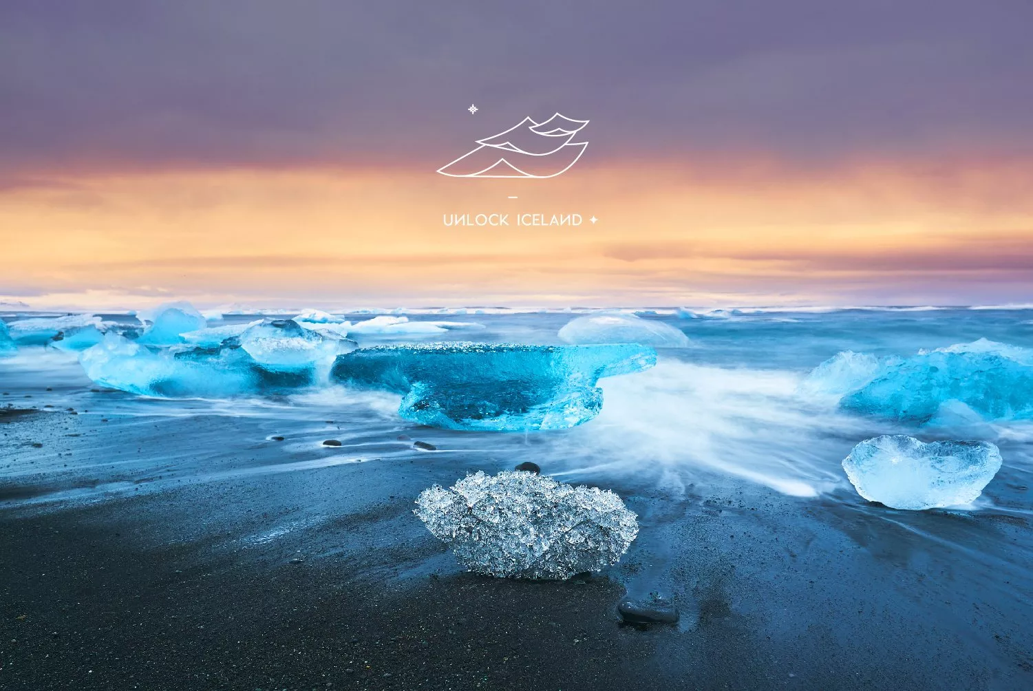
視覺設計以層疊的書頁作為主視覺,彎曲翻飛的意象代表文字的堆疊累積與大自然間流動的氣息,如同冰島綿延的山峰與崎嶇地貌。左上角的星光象徵著北極針,引導旅人深刻體驗冰島的美好事。英語標準字的設計,特別將N上下顛倒,帶出翻轉冰島的意味。如 UNLOCK ICELAND 帶你進行的,是一場顛覆想像、令人怦然心動的旅程。輔助圖形|個別象徵-漸變的圖形象徵,總是帶給不同驚喜的冰島。圓球體代表冰島像是一個奇幻的星球,層疊的三角曲型代表冰島特色地形,星辰弧線象徵耀眼的星空、明亮的光、旅人們心裡的期待。
冰島人對於冰淇淋有著一種莫名的熱愛與堅持,尤其在晝短夜長的寒冷冬夜,在心靈上更具某種程度的慰藉作用。因此在色彩規劃方面,選用天藍色與粉色相互搭配,營造出吃冰淇淋的療癒感,希望透過顏色讓人感受到冰島的幸福哲學。
品牌標語:You’re Bound to Find More.
「你的發現肯定會超乎預期。」透過 UNLOCK ICELAND 的導覽,你可以從中得到意想不到的收穫。Find More 兩字用得有點曖昧,刻意不去強調會尋覓到什麼,營造出更多的想像空間與期待感。也許會是一份驚喜、也許會是一陣靈感、也有可能會是一段深刻美好。
更了解 UNLOCK ICELAND
https://unlock-iceland.com/about-me/
UNLOCK ICELAND
Run by a Taiwanese owner living in Iceland, UNLOCK ICELAND is a private tour company aiming to share the wonders of Iceland, its philosophy of life, culture, taking travelers deep into the treasures of Iceland so they can fulfill their innermost ambitions.
We named the brand: “UNLOCK ICELAND”. Through arrangement of the letters of UNLOCK ICELAND and its subtle meaning, you cannot help but imagine the purity, poetry, tranquility and quietness of Iceland, while at the same time feel as if all the deepest secrets of the land are being unlocked to you.
It is an intellectual and emotional journey, taking you deep into the Icelandic landscape, to find a private place of your own, creating for you an irreplaceable memory.
The visual design uses layers of pages as the main concept, with the curves and contours representing nature and its natural flow as well as Iceland’s rolling peaks and rugged terrain. The starlight in the upper left corner symbolizes the Arctic compass, guiding travelers to experience the full beauty of Iceland. The design of the English font flips the letter “N” vertically, symbolizing how Iceland will be a life-turning experience. So likewise, UNLOCK ICELAND will take you on a journey that will captivate your imagination and stir your heart.
Auxiliary Graphics | Individualized Symbols – Gradient graphics represent the different surprises Iceland will bring, with the circles representing Iceland as a fantasy planet, and the triangles representing its terrain. The arcs symbolize the dazzling sky, the bright lights, and the expectation of every travelers.
Icelanders have an inexplicable love and passion for ice cream, especially in the cold winter nights, as if it were to give a certain degree of comfort to the mind. Therefore, in terms of color schemes, the combination of sky blue and pink are used to create that healing sensation when eating ice cream, and hopefully through the colors, people can feel the philosophy of joy behind Iceland.
Brand Slogan: You’re Bound to Find More.
“Whatever you discover will exceed your expectations.” Through the UNLOCK ICELAND tour, you will gain more than you imagine. The words “Find More” in the slogan have a subtle implication. It deliberately does not emphasize what it is you will find, making space for the imagination and feeding your anticipation. Maybe it will be a surprise, maybe it is a burst of inspiration, and perhaps it will be a profound and beautiful moment.