WANG PROJECT
- 品牌識別設計 | 清潔類包裝設計
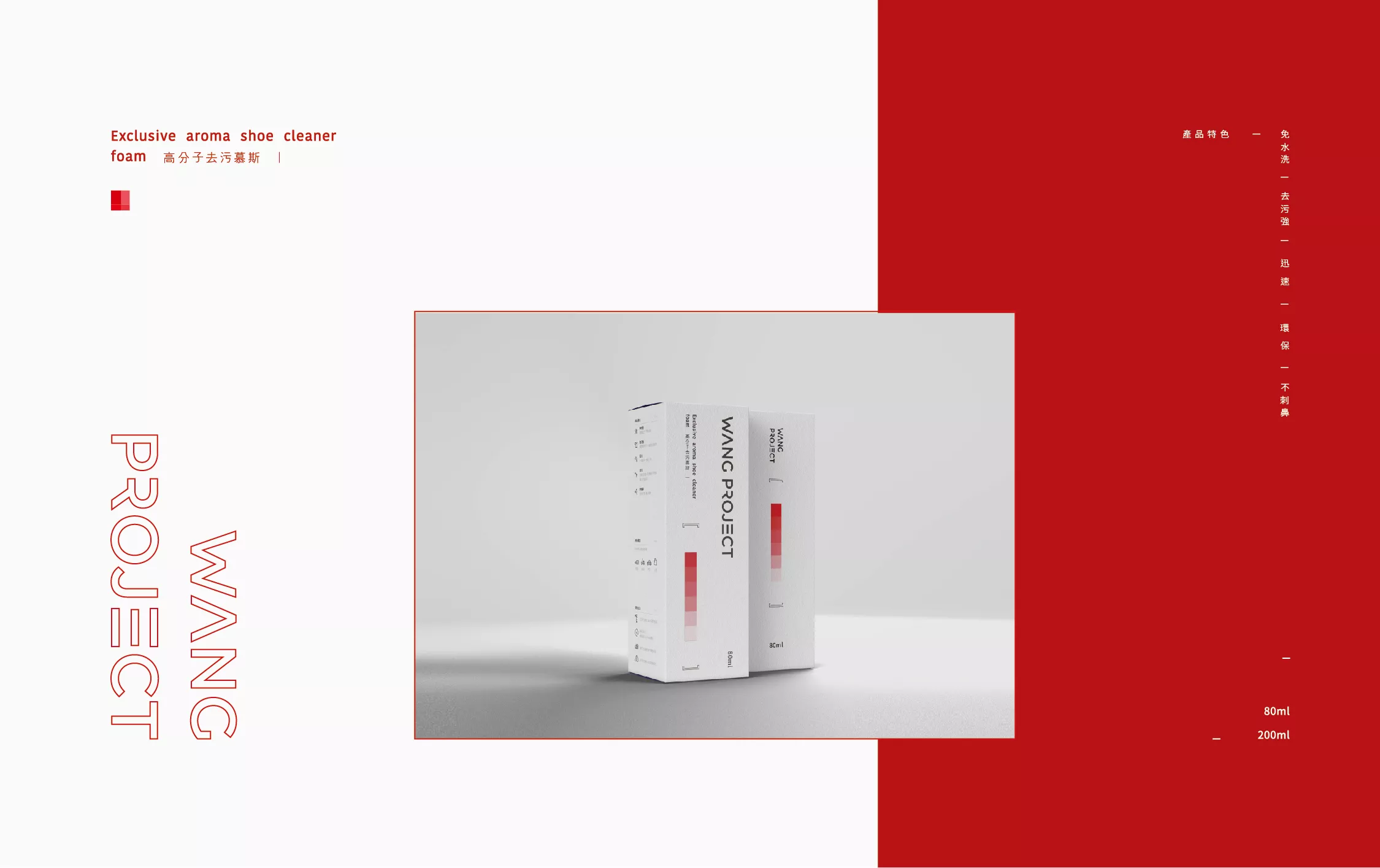
這是一款去污力強的慕斯,Logo設計以黑體呈現穩重與專業感營造品牌形象,減少筆畫的設計傳達品牌除去污漬的核心價值。識別配色以紅色為主,無彩色做輔助色,柔和化大面積紅色產生的視覺衝擊,讓視覺更乾淨,達到視覺平衡。
包裝設計以清潔性為主,將清潔的過程轉換成色票,從重色慢慢變成淺色,象徵品牌的去污力強,搭配引號加強品牌的特殊性,讓整體視覺跳脫傳統包裝。內文產品特色加上簡單icon為使消費者更易閱讀,使用方法將阿拉伯數字改家圓點,讓整體視覺更加簡潔乾淨。
This is a cleaner foam in the form of mousse. The logo design uses solid Hei Ti font to bring out the brand’s sense of professionalism, while reducing strokes in the font to convey the brand’s core value of removing stains.
The color scheme uses red as its focus with achromatic color as auxiliary to balance out the red color, thus creating a cleaner look and visual balance.
The packaging design focuses on the concept of cleanliness, especially conveying the process of cleansing through its color design. The color design has an intentional gradient effect from dark to light colors, highlighting the strength of the detergent. Thus, to achieve the goal of thinking outside the box, the packaging design uses Chinese quotation marks to further strengthen the brand’s uniqueness.
The product instructions are labelled with icons and Arabic numbers to make the instructions visually simple and clean.