旺萊山
Wanglai Mountain
- Behance 精選
- 鳳梨酥中秋禮盒設計丨年節禮盒設計
旺萊山座落嘉義民雄鄉,位處副熱帶與熱帶氣候間,在700多公頃的土地中孕育每一顆鳳梨。因土壤呈現紅色弱酸性,為鳳梨最佳的生長環境,因此栽種出來的鳳梨香甜多汁。為了提供給消費者新鮮美味的食用品質,以「一顆鳳梨,僅能做四顆鳳梨酥」為品牌口號,將鳳梨酥每一個製作成果極致完美展現。
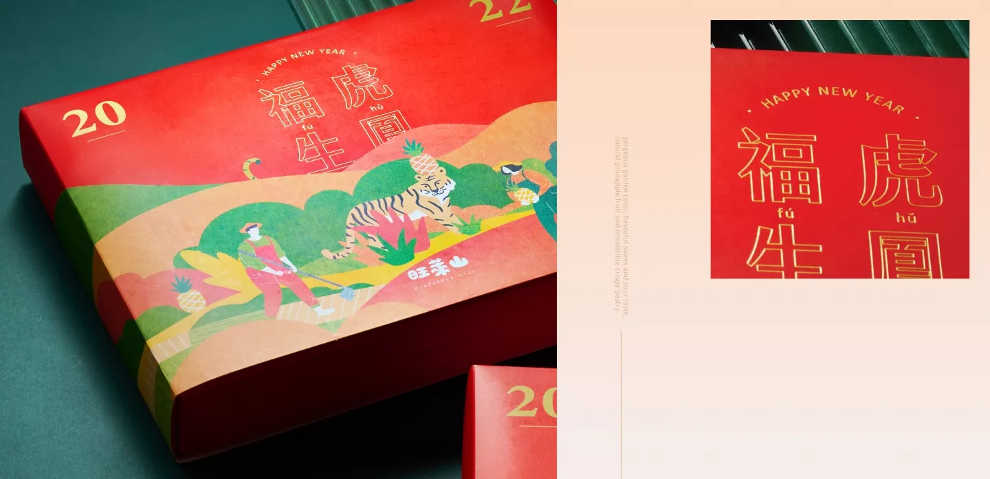
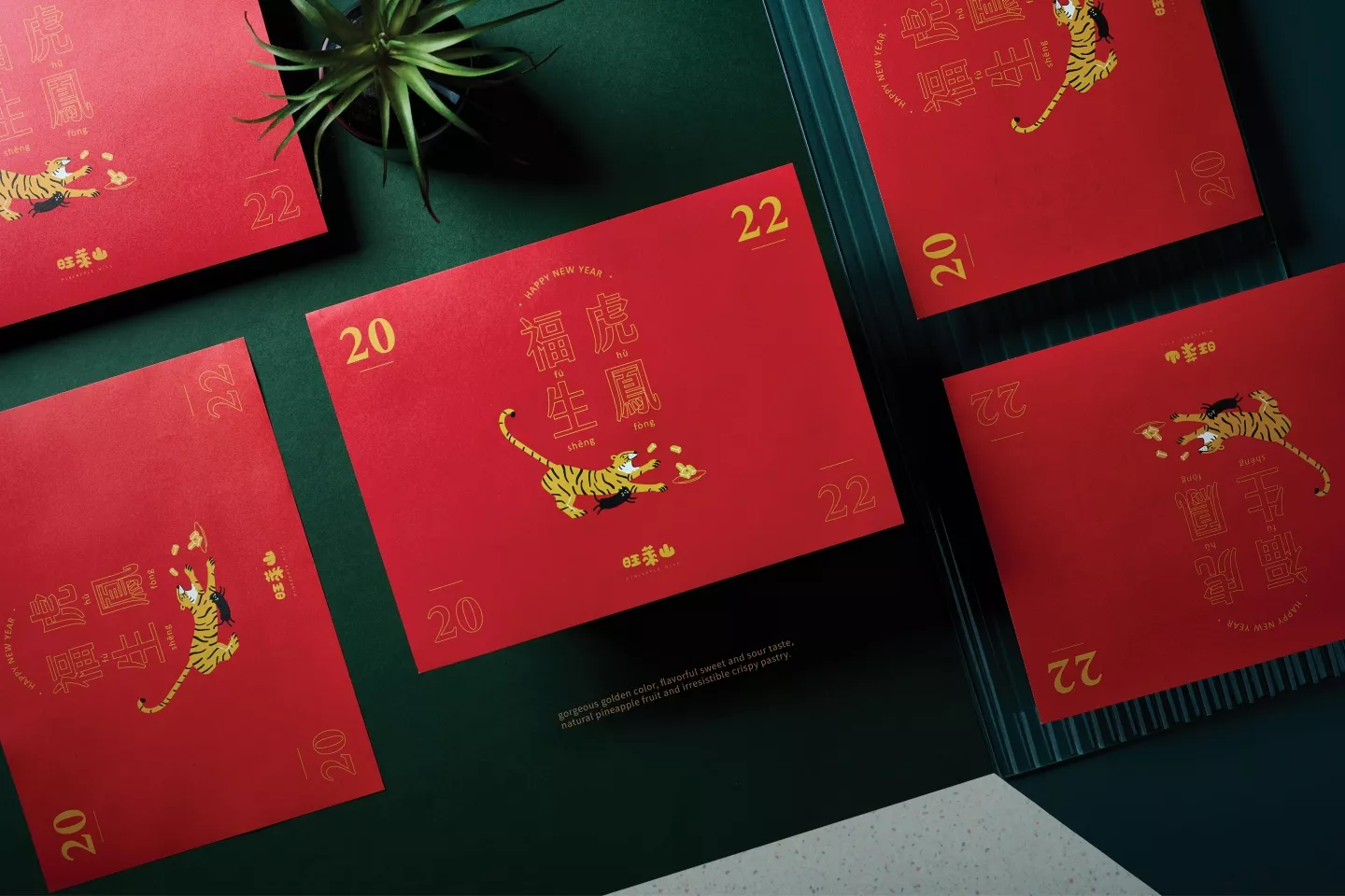
2022年福虎生鳳,旺萊山鳳梨酥新年禮盒包裝設計,以虎年意象及品牌產品鳳梨做結合的新年標語,完整體現出虎年喜氣形象。外盒的封套設計以農村鳳梨田園為主題,展現純樸、踏實及濃厚的鄉土情懷,大家辛勤耕耘、互相幫助,共同為甜美的收成努力打拼。暖色調的紅、橘、黃,不僅是新年的象徵,更是親切、溫暖、人情味的代表,期望收到旺萊山禮盒的每位顧客,都能被這份溫暖所感動。
結構編排設計上也暗藏神秘,套著封套的禮盒,悄悄的在山的後方發現了動物的尾巴,封套拆開後,驚喜發現原來是一隻老虎與旺萊貓吃著鳳梨酥的趣味互動,呼應標題的福虎生鳳,將整體禮盒包裝設計概念巧妙的串連起來。旺萊山座落嘉義民雄鄉,位處副熱帶與熱帶氣候間,在700多公頃的土地中孕育每一顆鳳梨。因土壤呈現紅色弱酸性,為鳳梨最佳的生長環境,因此栽種出來的鳳梨香甜多汁。為了提供給消費者新鮮美味的食用品質,以「一顆鳳梨,僅能做四顆鳳梨酥」為品牌口號,將鳳梨酥每一個製作成果極致完美展現。
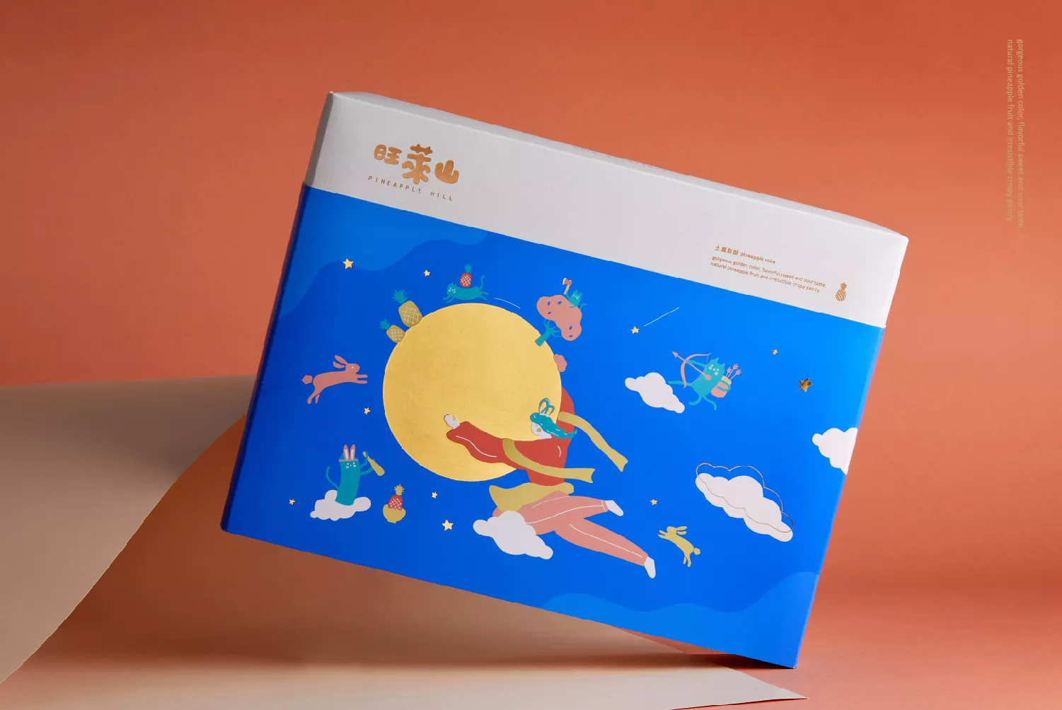
2019年中秋禮盒設計,以「今天,我們在月色下 團圓了!」為設計發展,禮盒中以嫦娥為主角,與品牌吉祥物旺萊貓一同化身中秋節慶故事裡的後裔、玉兔及吳剛。畫面中嫦娥張開雙臂擁抱圓滿的月亮,象徵中秋佳節,一同團圓的節慶習俗,在星空月色與歡樂的氣氛下團聚一起。
色彩規劃,兩款袖套主色分別選擇代表星空的寶藍色,與溫暖團聚的粉橘色,搭配鳳梨代表的黃色及其他鮮明色,選用淡色系搭配,整體給人較活潑、舒適,且象徵活力、愉快氛圍。
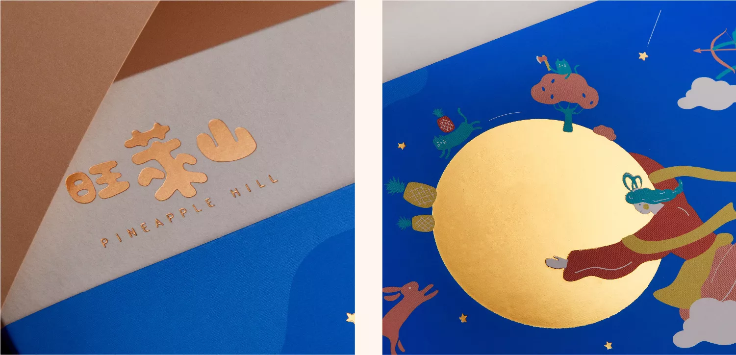
材質設定部分燙金及燙銀如品牌logo、圓滿月亮,可加強禮盒的高級感;內部增加一層描圖紙,隱約透出禮盒內一個個美味可口的鳳梨酥,點綴禮盒之於也可提升質感,內外兼具設計的小細節,無論送禮或自用,都能感受到品牌希望帶給消費者除了用心製作產品以外,更是在乎品牌整體的視覺感受。
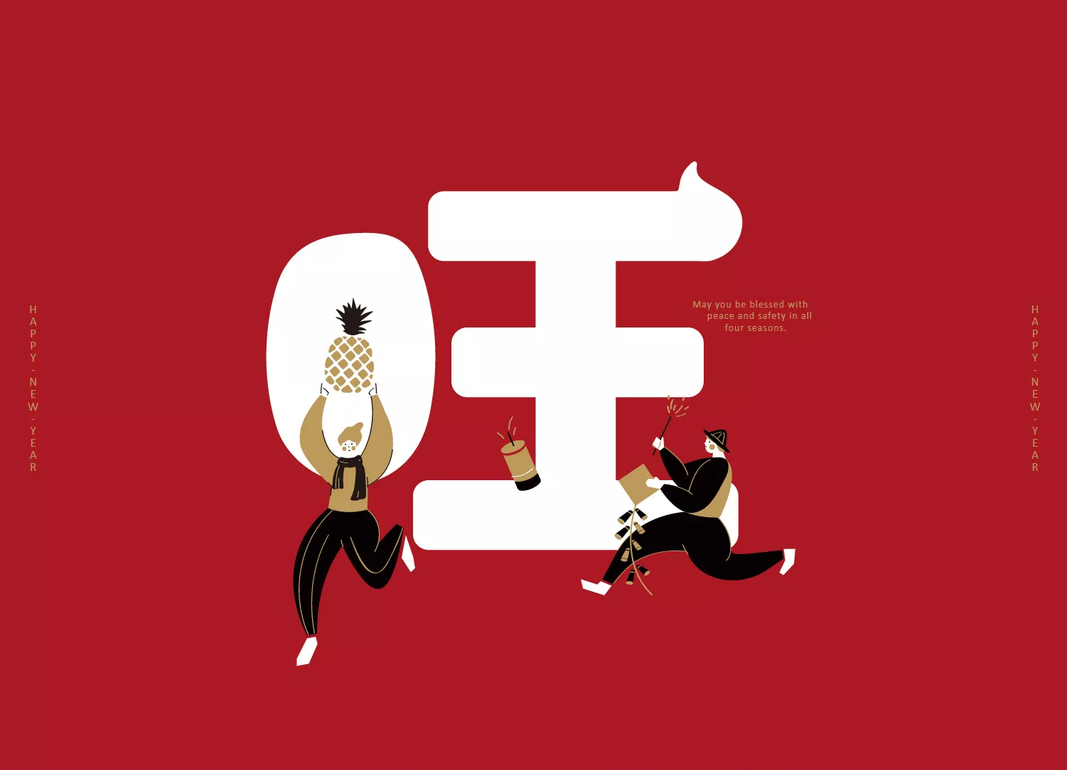
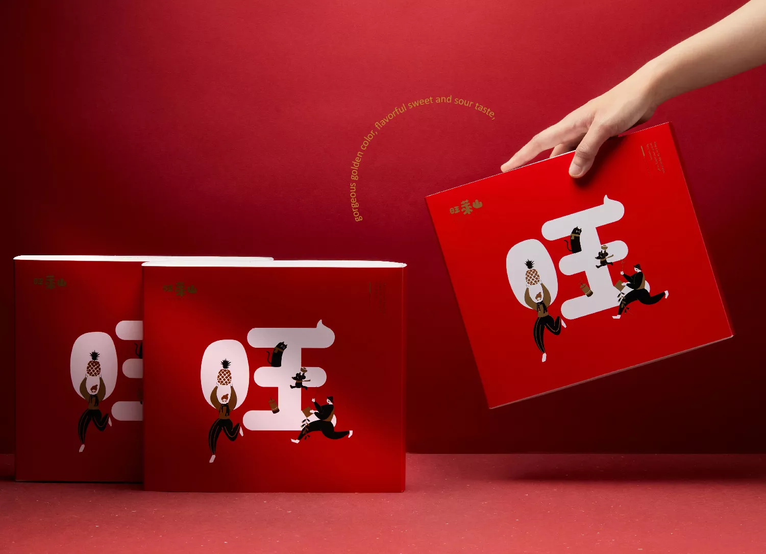
2020年春節禮盒設計,以「春來、旺來」為主軸概念,用「旺」一字設計發展。透過春聯的表現方式,結合過年時的喜慶活動,如家家戶戶喜慶的鞭炮活動、鼠年的吉祥代表及象徵好運旺旺來的鳳梨等元素,融入禮盒設計;以一文字及圖像的設計手法,版面保有一定的乾淨度,且適度的留白增加禮品的高級感,亦能將送禮的祝福傳遞出去。
Fuhu Sheng Feng – Wanglai Mountain Pineapple Pastry New Year Gift Box Packaging Design for the Year 2022.
The packaging design combines the imagery of the Year of the Tiger and the brand’s pineapple products, fully embodying the festive spirit of the Tiger Year.The outer sleeve of the box is themed around rural pineapple fields, showcasing the simplicity, steadfastness, and local sentiment. It portrays the hard work and mutual support of everyone, working together for a sweet harvest.
The warm tones of red, orange, and yellow are not only symbolic of the Lunar New Year but also represent warmth, friendliness, and human touch. We hope that every customer who receives the Wanglai Mountain gift box can be touched by this warmth.The structural layout design also holds a sense of mystery. The gift box is covered by the sleeve, which subtly reveals an animal’s tail behind the mountain. When the sleeve is opened, a delightful surprise awaits as it turns out to be a funny interaction between a tiger and the Wanglai cat enjoying the pineapple pastry. This echoes the title “Fuhu Sheng Feng” (Tiger Brings Good Fortune and Phoenix), cleverly connecting the overall concept of the gift box packaging design.
Wanglai Mountain is located in Minxiong Township, Chiayi, situated between the subtropical and tropical climates. Within its 700 hectares of land, every pineapple is nurtured. The soil, presenting a weak acidic red color, provides the optimal growing environment for pineapples, producing sweet and juicy fruits. In order to providing consumers with fresh and delicious products, the brand’s slogan “One pineapple can only make four pineapple pastries” reflects the commitment to present each pineapple pastry with ultimate perfection.
Pineapple Hill is located in Minxiong Township, Chiayi, sandwiched between subtropical and tropical climates. Every pineapple is bred in a 700 hectares piece of land. Because the red soil present is slightly acidic, it serves as an ideal growing environment for pineapples. The pineapples grown there are sweet and juicy. The brand slogan “No more than four cakes per pineapple” conveys the brand’s commitment to freshness and quality in every cake.
The 2019 Mid-Autumn Festival Gift Box design is centered around the concept “Today we gather under the moonlight.” The design features Chang’e as the protagonist, and together with the brand’s mascot cat, they play the roles of Houyi, Jade Rabbit, and Wu Kang in the Mid-Autumn Festival story. In the design, Chang’e wraps her arms around the full moon, symbolizing the festival’s custom of joyous gathering under the starlight.
In terms of colors, one set of the sleeves uses a royal blue representing the starry skies, while the other uses a pastel orange to represent the warmth in gathering. Both designs also utilize yellow to represent pineapple in tandem with other bright fresh colors. Furthermore, with a combination of pastel colors, the overall visual gives off a vibrant yet comfortable feel, conveying a blissful, energic atmosphere.
The logo and the moon are gold and silver foil-stamped into the packaging to enhance the visual presentation. Inside there is a layer of semi-transparent tracing paper, showing vaguely the delicious pineapple cakes within. These small design details embellish the overall gift box design, so that no matter if it is a gift or just for personal use, one can feel the brand’s attention to visual detail.
The 2020 Spring Festival Gift Box design is based on the concept of “Spring and Prosperity”, centering around the Chinese letter “旺”. Using the concept of Spring Festival couplets, the packaging design integrates New Year festive elements, such as firecrackers, the rat caricature representing the year of the rat and pineapples. Overall, the design uses only one Chinese character in combination with complementary graphics to maintain a clean layout yet preserving just enough white space to display a sense of elegance and ultimately conveying the feeling of blessing in the gift.

