建築與環境
Architecture and Environment
- 榮獲TTS設計獎-特優獎
- 台中市不動產雜誌設計 | 季刊
台中市不動產開發商業同業公會會刊《建築與環境》
《環境與建築》為台中市不動產開發商業同業公會發行之會刊,為該公會探討台中都市發展的刊物,內容以建築、環境與人的交互關係為主題。除了會務報導之外,內容更包含思辨場、專題報導及其他各種不同議題的探尋。
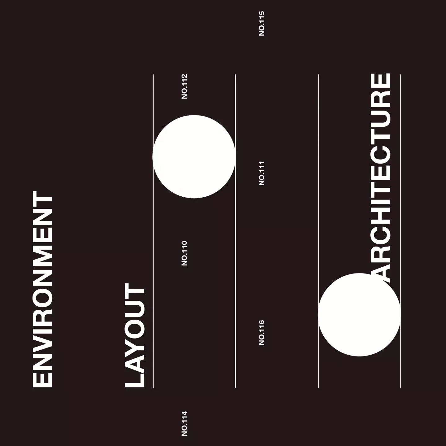
110期
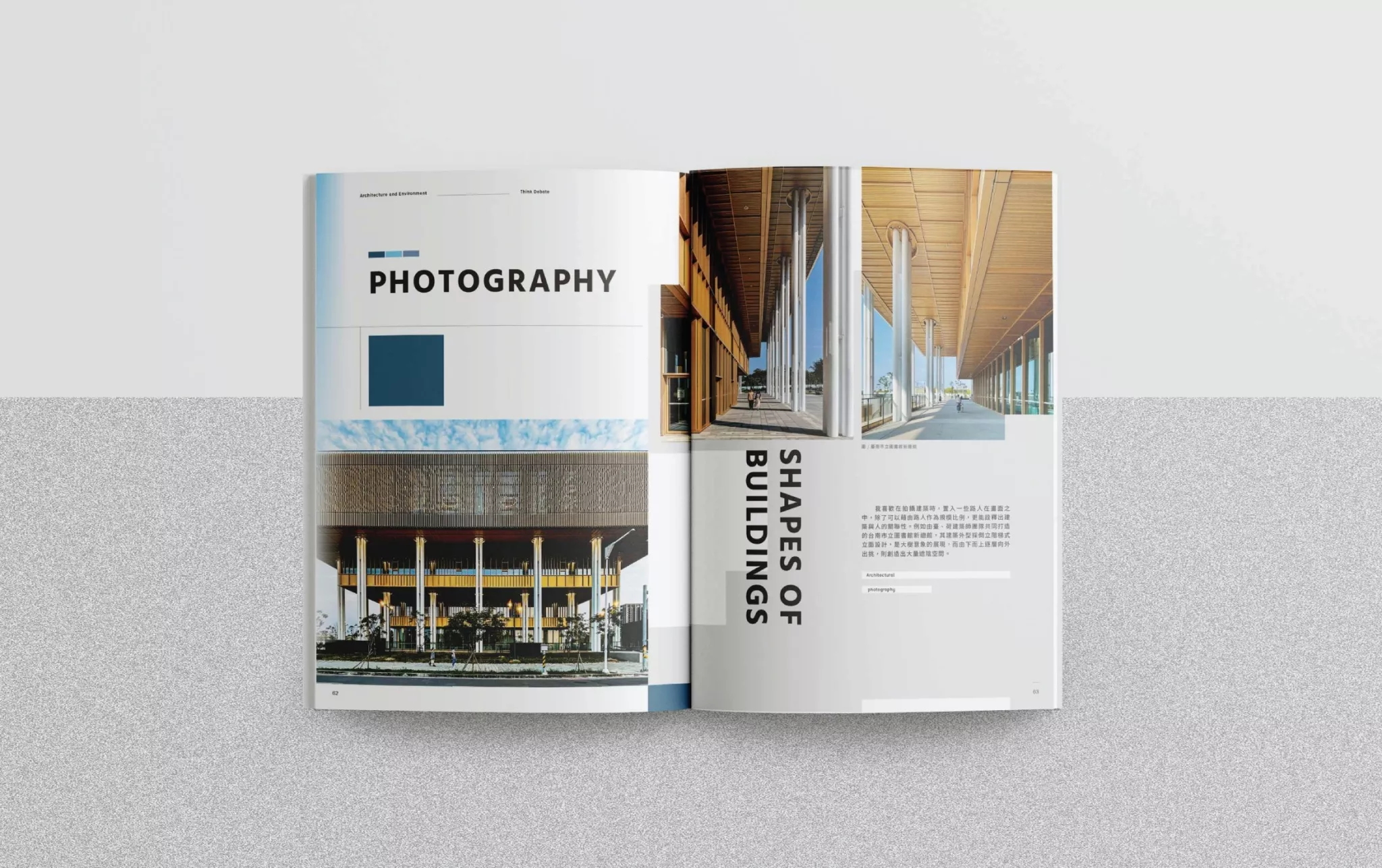
從第110期起,《建築與環境》改變原有設計方向,以現代、簡約的新風貌面向讀者。舊版封面以建築物照片為主要視覺重點,新版封面由白、藍、金三色的幾何色塊與線條構成,冷靜中帶著熱情;低調又不失亮點,同時調降副標題的比例,整體呈現更加簡約清爽。
該刊以專業文章居多,內容豐富且深入,為此,特別在內頁排版加入大量色塊,段落之間適當留白,透過調整文字與圖片的比例,降低密集文字帶來的壓迫感,提升整體閱讀體驗。此外,章節間也適時插入跨頁大圖,讓讀者在閱讀文字之餘保有讓大腦放鬆的空間。
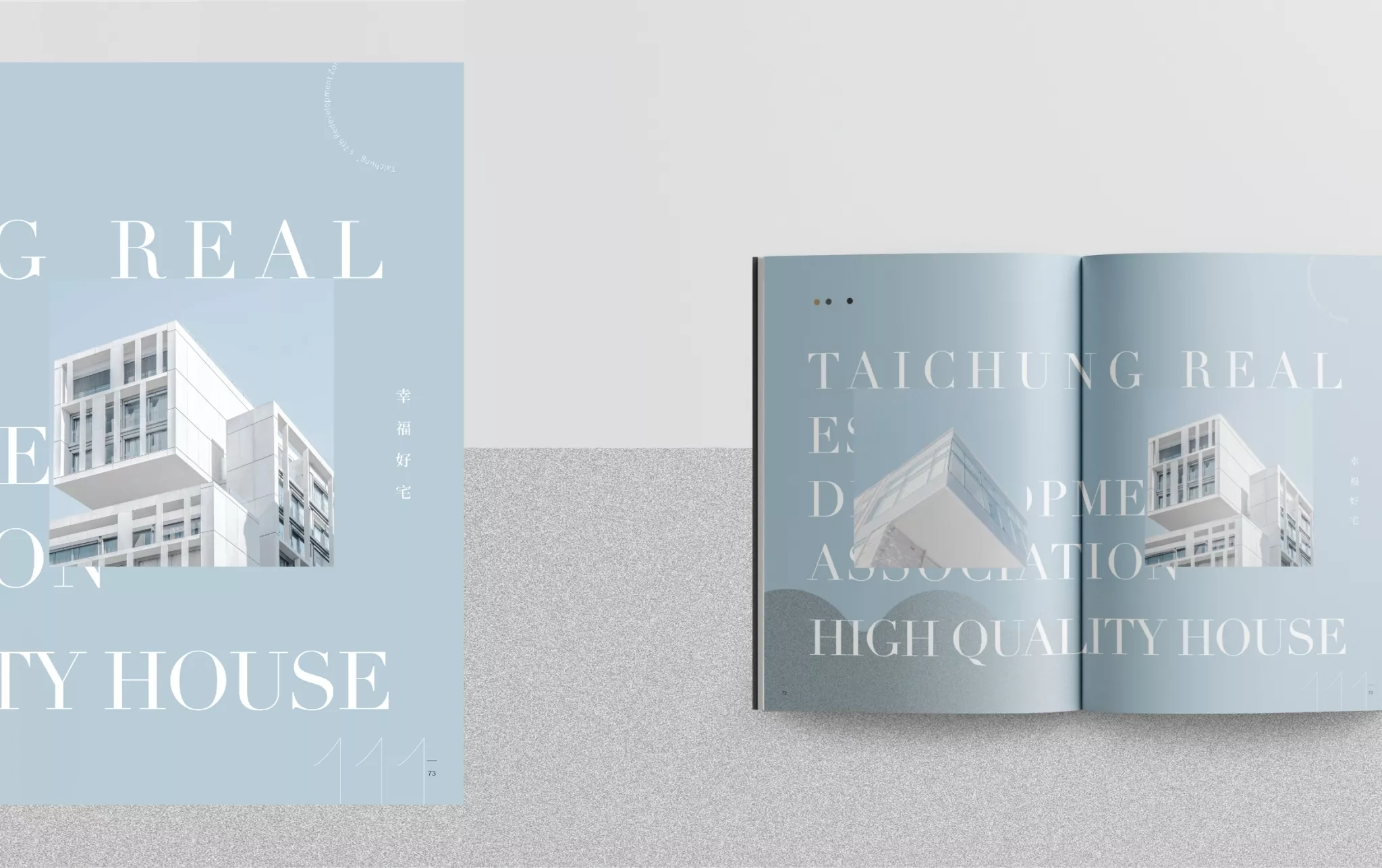
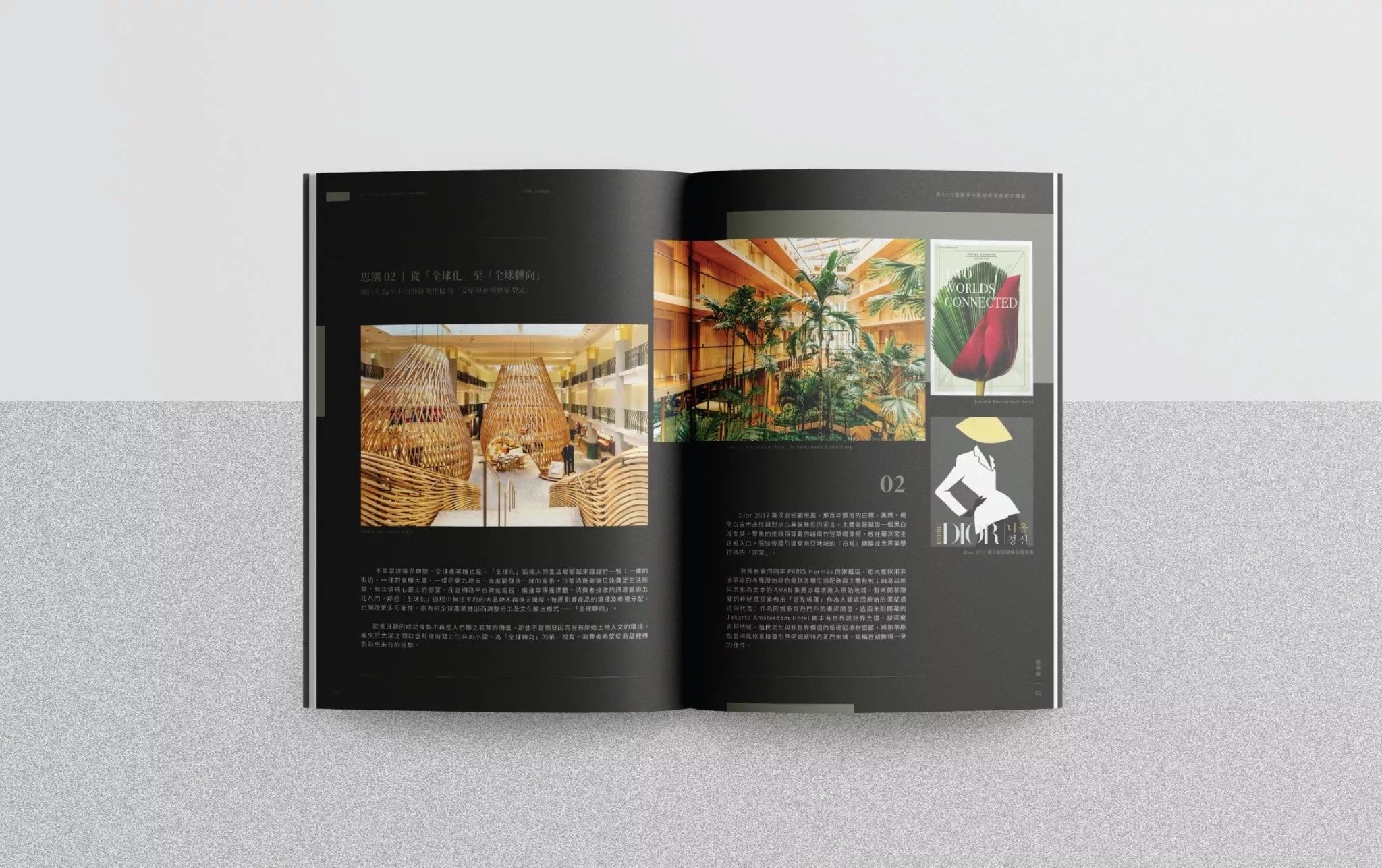
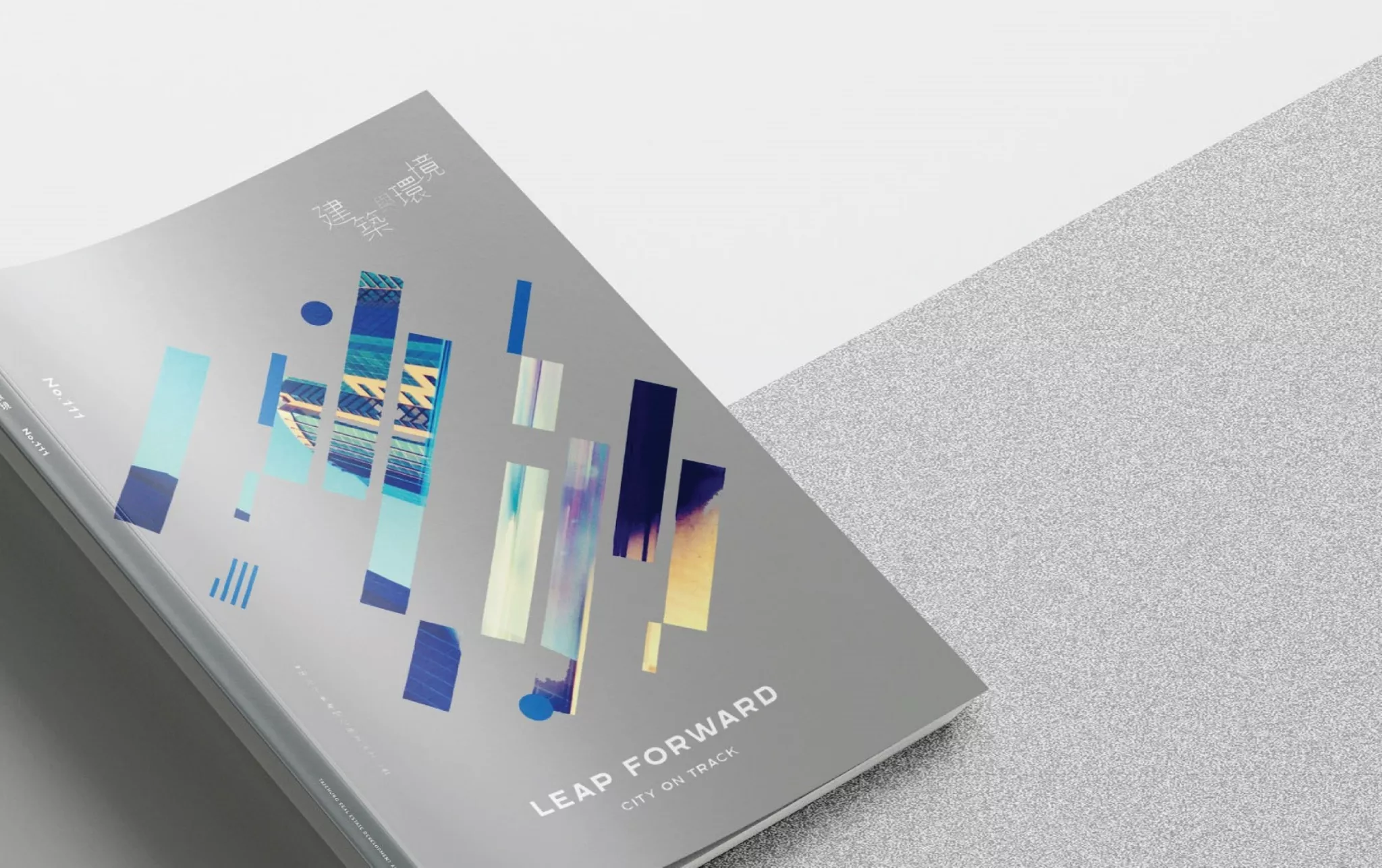
111期
111期封面結合主題「Leap Forward:City on Track」,以城市的幾何剪影帶出交通運輸的速度感,彷彿乘客從車窗窺探城市風景,底色銀色帶來的科技感隱含著對城市進步的期許。本期進一步將封面簡化,僅留下刊名與本期主題等,希望以圖像的呈現,將刊物內容直白地傳達給讀者。內頁則延續110期的排版風格,以色塊切割、堆疊的方式引領張弛有度的閱讀節奏。
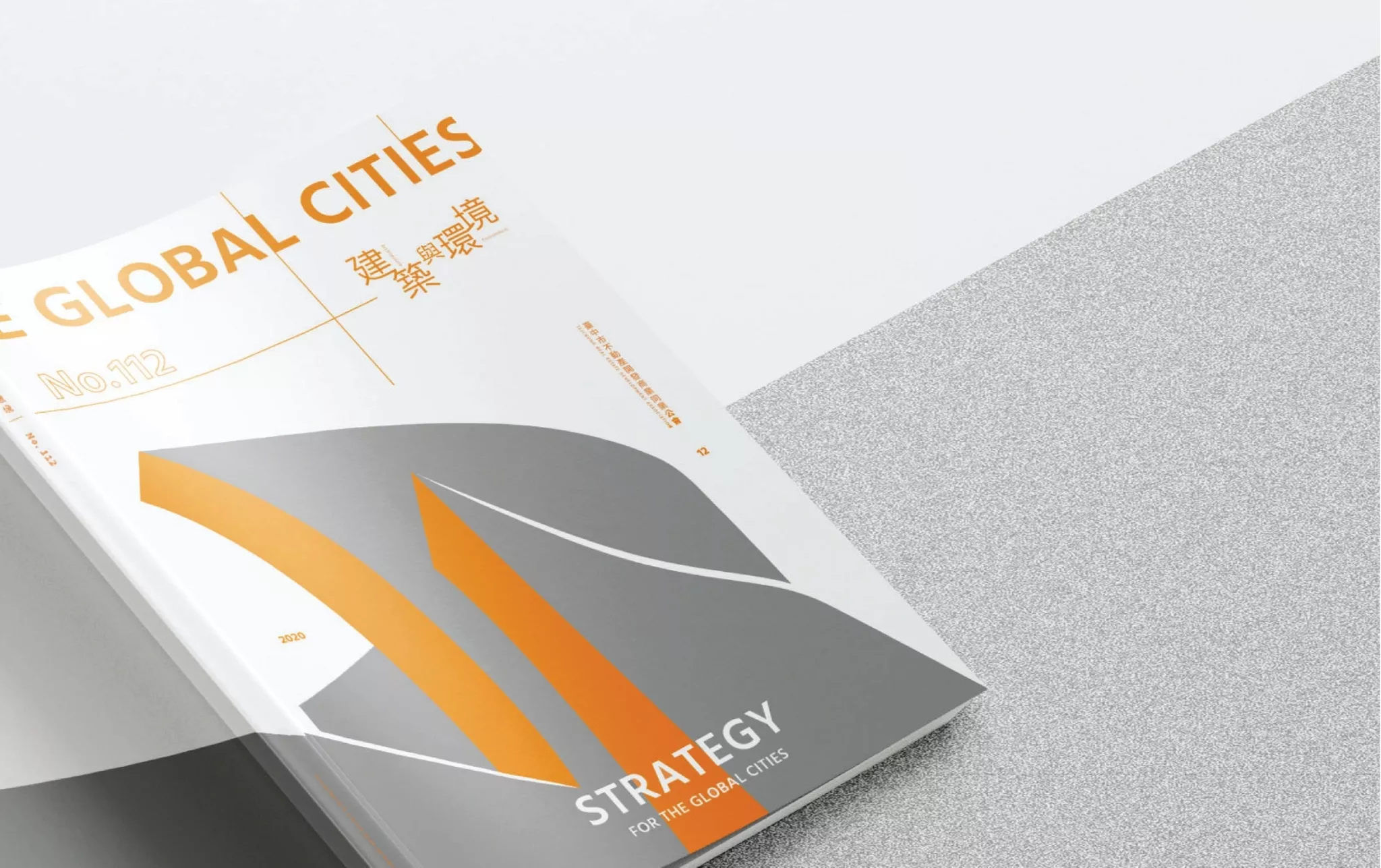
112期
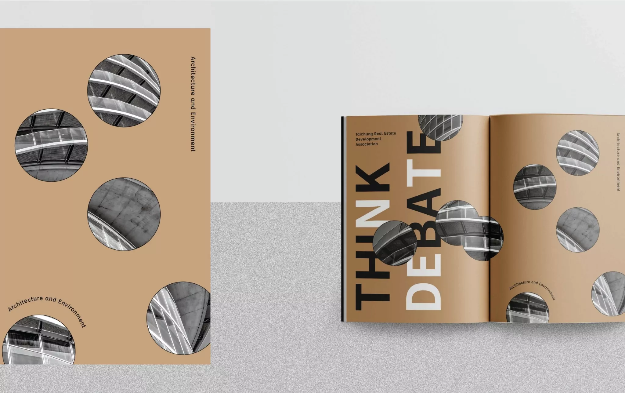
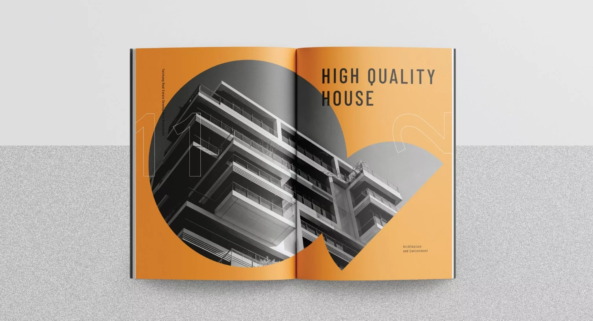
有別於110期及111期的藍色調,112期選用大膽、活潑的螢光橘搭配沉穩冷冽的銀色,隨著角度變化反射出不同的光澤,仿若陽光照射在建築呈現獨特的光影表現,封面的設計延伸至封底,副標題橫跨封面及封底,搖身一變成為視覺重點之一。螢光橘則貫穿全刊,每一頁都可以看到一抹螢光橘,時而擔綱視覺的主角,時而扮演配角,妝點整本刊物。
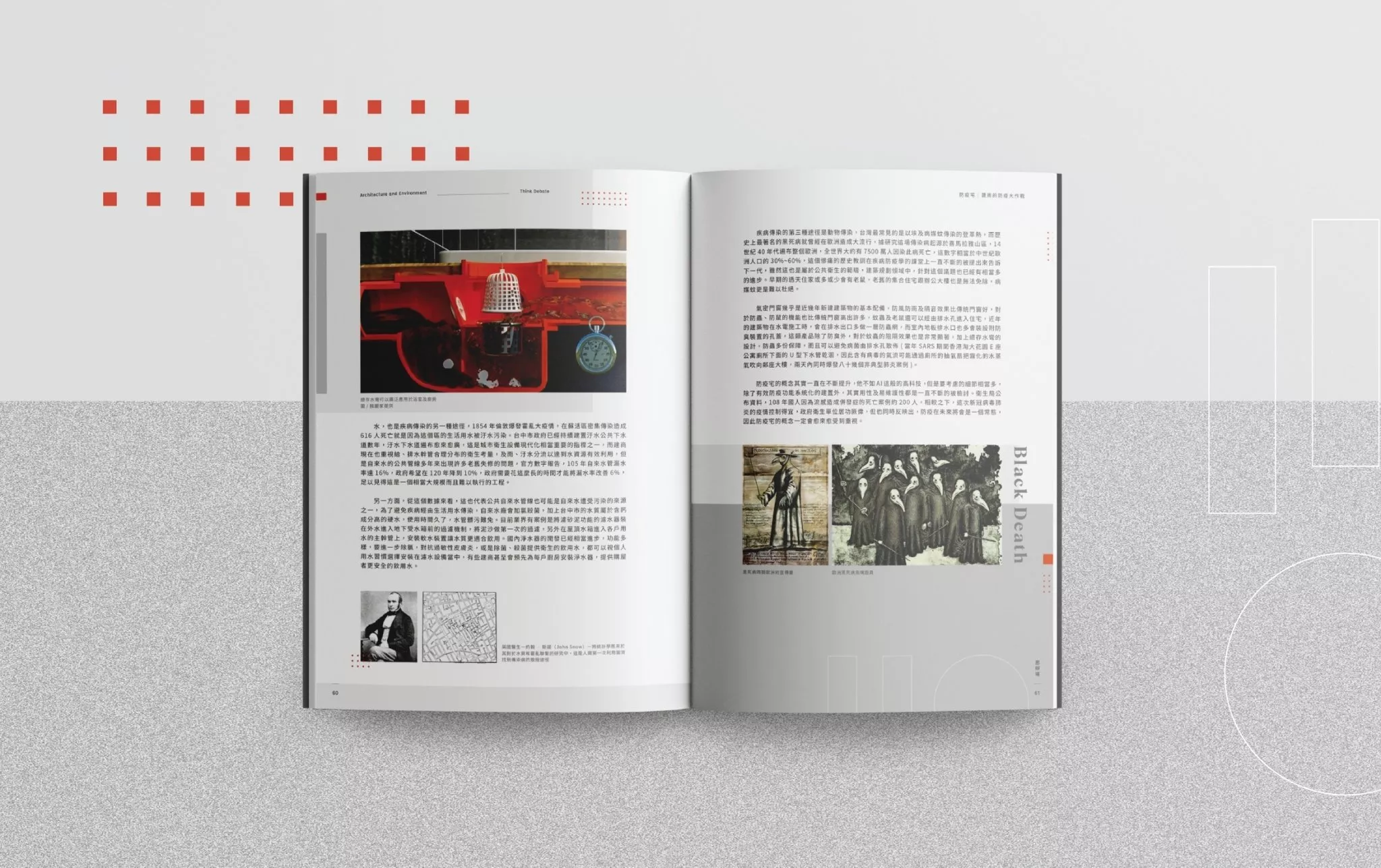
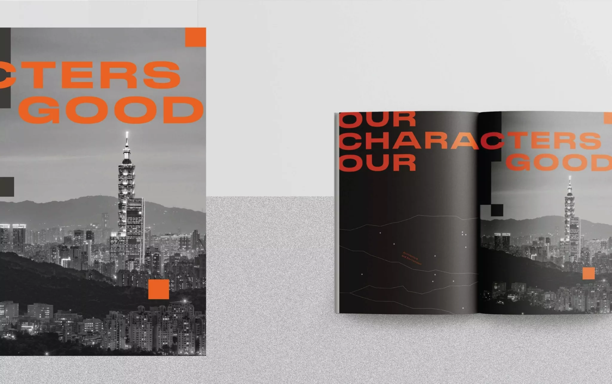
114期
本期刊物以「What’s Next in The Post-Pandemic Recovery」為題,首次使用黑色作爲封面主色調,體現疫情時代為建築產業帶來的停滯期,以及未知的走向,黑暗中隱含著可能發展的契機,仿佛有一個全新的未來在等待被探索。内頁排版以細線條分割圖文以及大量留白,引領閲讀者順暢、有條理地閲讀,同時也給讀者留有更多想像的空間和可能性。
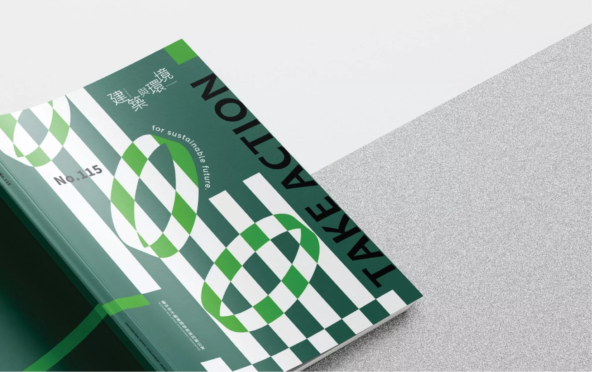
115期
115期主題「Take Action For Sustainable Future」,這期封面以充滿活力、無限生機的綠色為主色調,象徵著希望的白色色塊貫穿進來結生活力四射的螢光綠,仿佛在贊頌城市得以永續發展的美好前程。内頁排版以大量各種不同色彩的大面積色塊佈局,仿佛是都市發展最强而有力的大好藍圖,顯著的標題字眼貫穿全刊,更增添了整本刊物欣欣向榮的氛圍,也幫助讀者更快速找到閲讀方向。
116期
不同以往的特殊色表現,這期由深藍色搭配灰色,單純的線條構成重重堆叠的物件,宛若房地產業正在面臨的層層關卡,灰色的色塊加入帶來了扭轉局勢的可能,也呼應主題「Change Perspective of Sustianable Development」。主題頁使用黑灰色調表現,黑暗中透漏光芒,困境中浮現生機;内頁排版以大量傾斜的線條和色塊切割,呈現一種向上發展的意象,同時也隱含著對未來城市的期待。
The publication “Architecture and Environment” is the journal issued by the Taichung Real Estate Developers’ Association, focusing on exploring urban development in Taichung. The content revolves around the theme of the interaction between architecture, environment, and people. In addition to reports on association affairs, the publication includes speculative discussions, feature articles, and exploration of various other topics.
Issue 110:
Starting from the 110th issue, “Architecture and Environment” underwent a design transformation, presenting a modern and minimalist new look to readers. The previous cover primarily featured photographs of buildings, while the new version is composed of geometric blocks and lines in white, blue, and gold, exuding a calm yet passionate atmosphere. The subtitle proportion was lowered, resulting in a more simplified and refreshing overall presentation.
The journal predominantly consists of professional articles, providing rich and in-depth content. To enhance the reading experience, ample use of color blocks and appropriate white spaces between paragraphs are incorporated in the layout. By adjusting the proportion between text and images, the oppressive feeling of dense text is reduced, resulting in an improved overall reading experience. Furthermore, large images spanning multiple pages are inserted between chapters, allowing readers to relax their minds while reading the text.
Issue 111:
The cover of the 111th issue combines the theme “Leap Forward: City on Track” and portrays the sense of speed in transportation through the geometric silhouette of a city. It gives the impression of passengers glimpsing the urban landscape through a car window. The silver background adds a technological touch, reflecting the expectation of progress in the city. The cover design is further simplified, only featuring the journal’s title and the theme of the issue, aiming to convey the content directly to readers through visual presentation. The interior pages continue the layout style of Issue 110, guiding readers through a well-paced reading experience with the use of segmented color blocks and stacking.
Issue 112:
In contrast to the blue tone of Issues 110 and 111, Issue 112 incorporates bold and lively fluorescent orange combined with calm and cool silver. The colors reflect different glosses depending on the angle, resembling sunlight shining on buildings and creating unique light and shadow effects. The design of the cover extends to the back cover, with the subtitle spanning both covers and becoming one of the visual highlights. Fluorescent orange runs throughout the entire publication, appearing on every page as the protagonist or embellishment, adding a touch of vibrancy to the entire journal.
Issue 114:
The theme of this issue, “What’s Next in The Post-Pandemic Recovery,” marks the first time black is used as the main color for the cover. It represents the stagnation period brought upon the construction industry by the pandemic and the unknown future. The darkness carries the potential for development, like a new future waiting to be explored. The interior pages feature thin lines to separate text and images, along with ample white space, leading readers to a smooth and organized reading experience. It also provides readers with more spaces for imagination and possibilities.
Issue 115:
With the theme “Take Action For Sustainable Future,” the cover of Issue 115 features vibrant and lively green as the primary color, symbolizing hope. White blocks of vitality permeate through the fluorescent green, celebrating the city’s sustainable development. The interior pages employ extensive color block layouts in various colors, resembling a powerful blueprint for urban development. Prominent title words are threaded throughout the entire publication, creating a thriving atmosphere and helping readers quickly find their reading direction.
Issue 116:
In a departure from previous special color presentations, this issue utilizes deep blue combined with gray. Simple lines form overlapping objects, resembling the multiple challenges the real estate industry faces. The addition of gray blocks brings the possibility of reversing the situation, echoing the theme “Change Perspective of Sustainable Development.” The theme page is expressed in black and gray tones, with light shining through the darkness, representing vitality emerging from difficulties. The interior layout features inclined lines and segmented color blocks, portraying an upward development image while also implying expectations for future cities.