Qmilk 初沐
- 手搖飲連鎖品牌識別系統設計|品牌應用設計|攝影企劃 | 品牌重塑 | 品牌命名
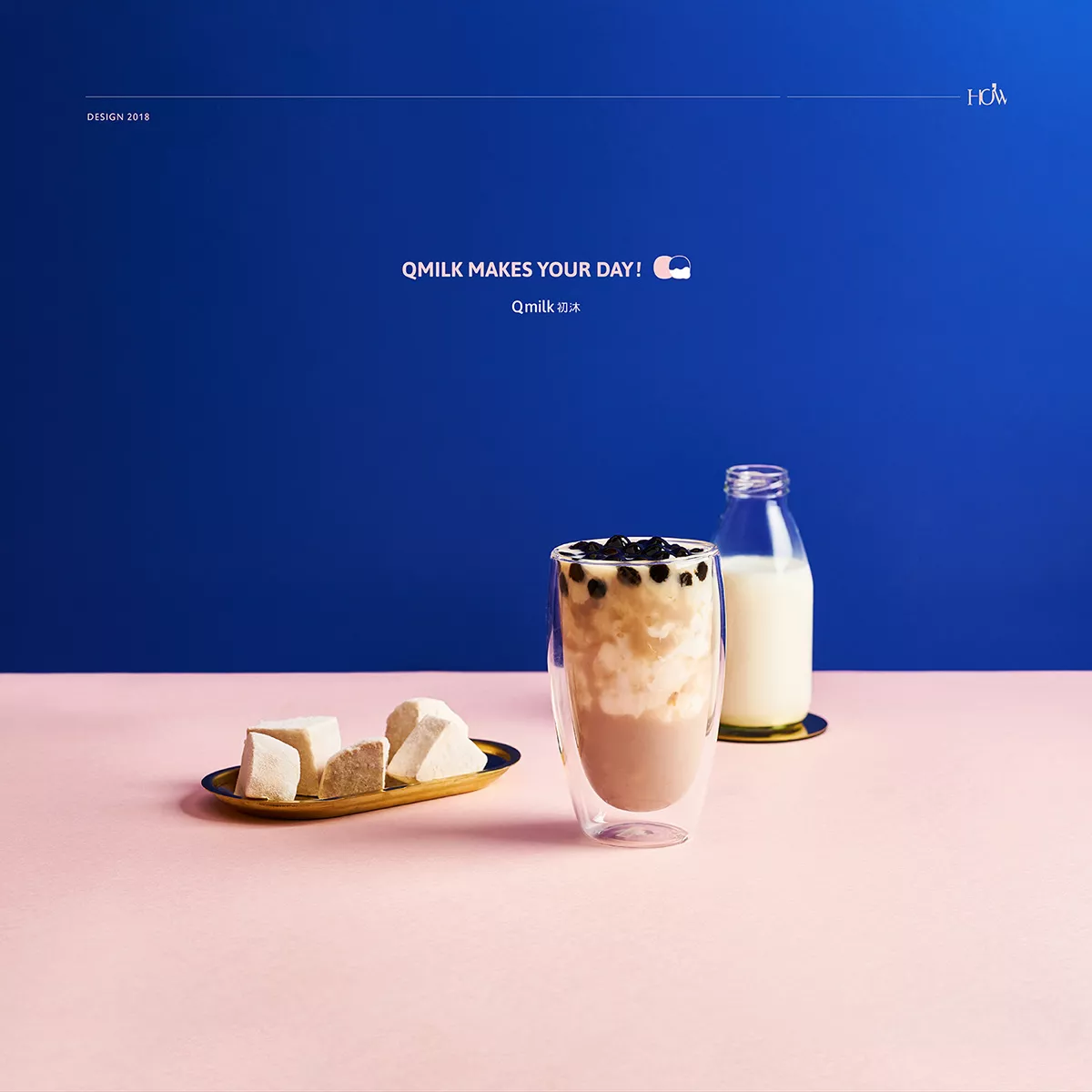
手搖飲料茶可說最能代表台灣⺠生日常的風景之一,一杯杯美好風味,隨手滿⾜了人們⽣活 中許多平凡與不平凡的時刻。位於基隆市美食商圈的Qmilk初沐,秉持新鮮自然、堅持手作 實在、傳遞活⼒風味飲品為理念 ,每⽇⼿工新鮮熬煮的黑糖珍珠,倒入滿滿⼀杯牧場直送的新鮮奶,濃厚奶香結合珍珠Q潤彈牙的口感,成就了令在地⼈和觀光客慕名⽽來的招牌飲品。希望透過整體形象的創新,別於一般外帶性的普通茶飲店,打造出讓⼈很想分享出去, ⼜或隨時都嚮往走進來好好享受感官與味蕾滿⾜的茶茶飲店。
品牌設計策略以產品特色為發想起點,採用珍珠的圓形和乳牛為表現主軸,融合品牌名稱 「Q」的意象,設計出蘊含品牌精神⼜具鮮明印象的logo,⽽中英⽂文標準字體的設計上也細 膩融入圓潤⽽流動般的線條表現。
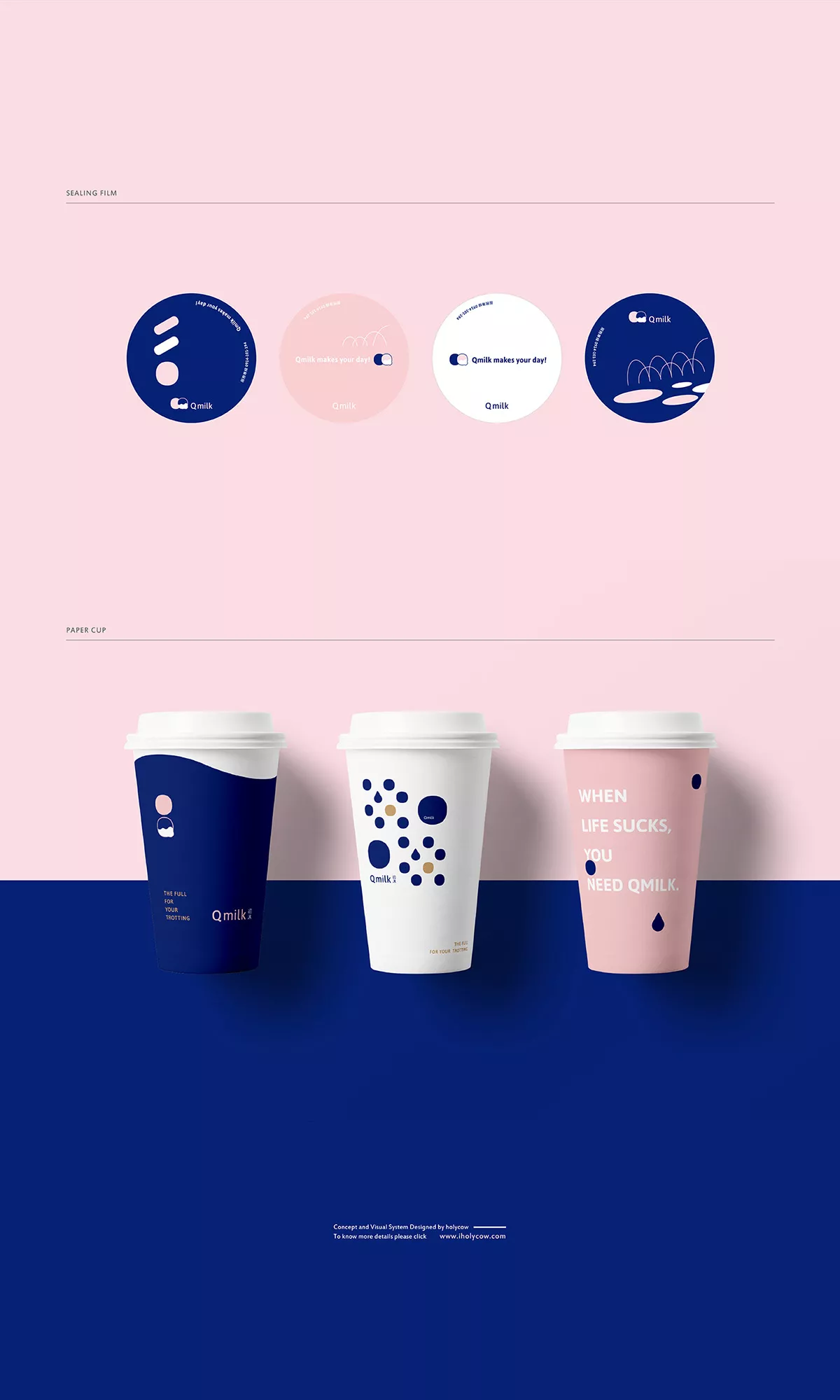
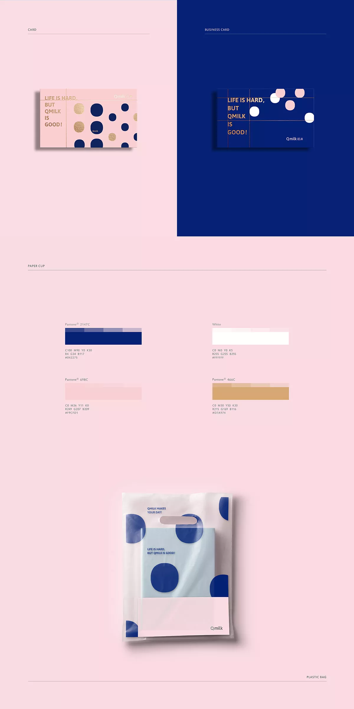
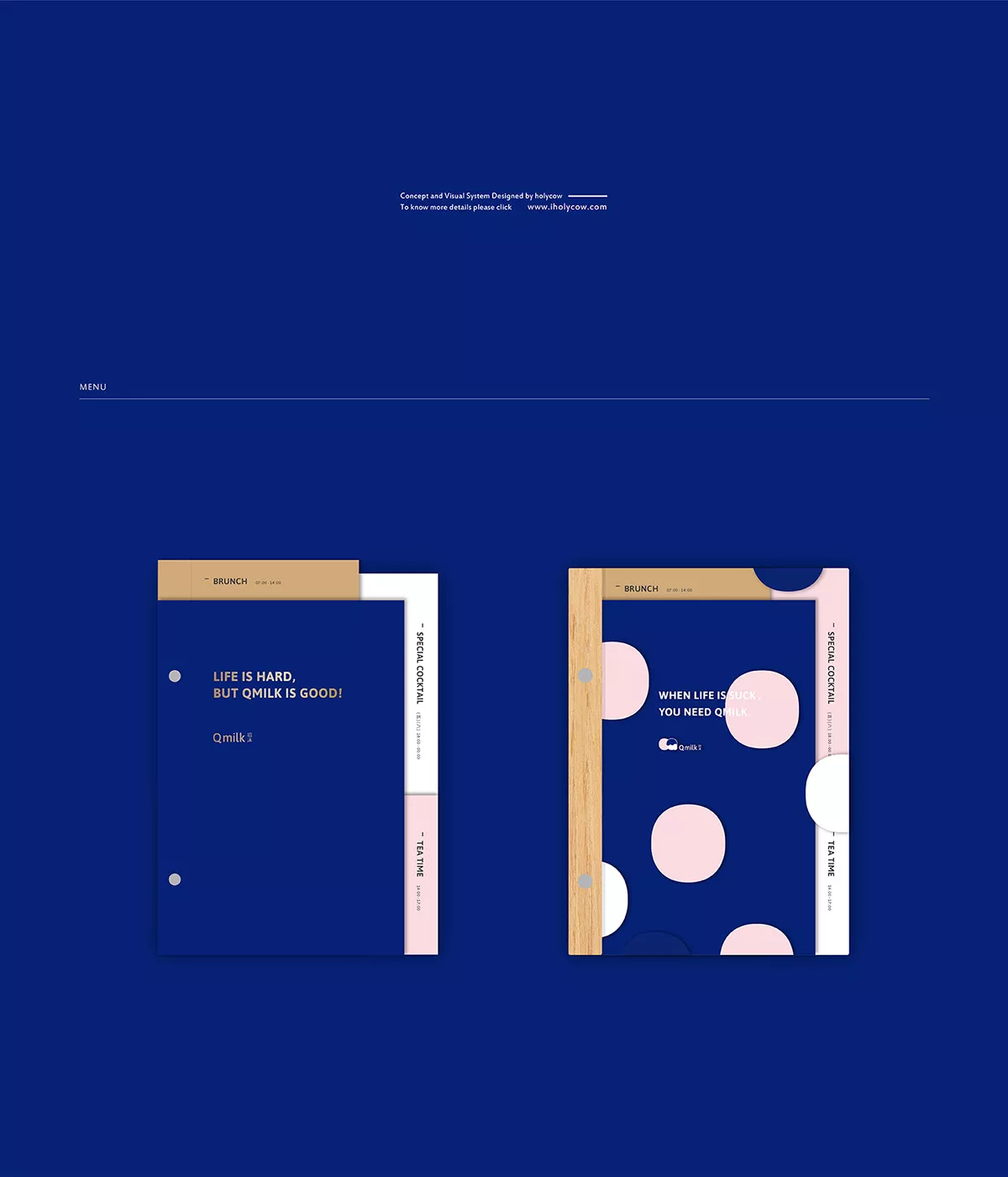
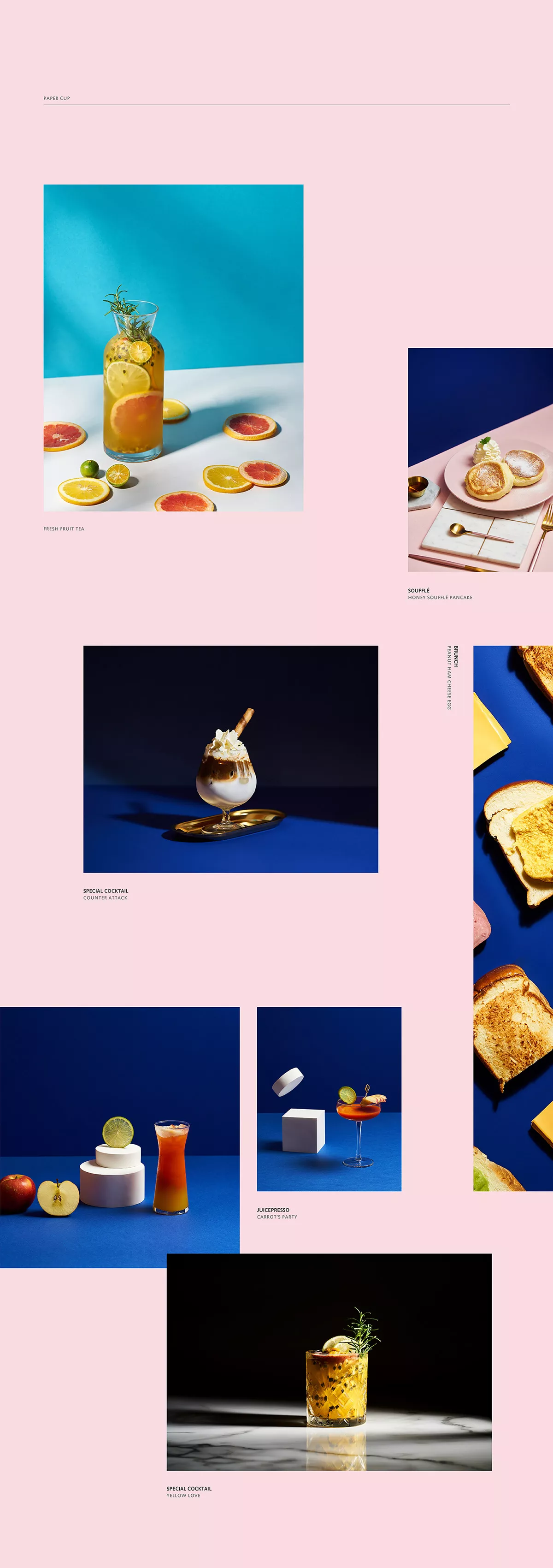
色彩規劃則採⽤象徵純淨和自在鮮活的寶藍色,及象徵乳⽜與溫潤香醇的粉⾊及白⾊為主調, 透過飽滿⽽活潑的圓形色塊,及象徵Q潤彈牙、充滿律動感的幾何線條與圖象,多元⽽而充滿 活⼒的強化了了品牌視覺的記憶點和品牌特色,傳遞出「Q彈口感裡,滿溢牛奶的濃純,及新鮮食材的豐味」的產品內涵。整體識別簡練、俐落⼜帶點時尚氣息, 充分展現了鮮活吸睛⼜自在優雅的視覺個性。攝影企劃則彰顯了品牌風格和產品魅力。畫⾯面雙⾊切割的layout表現,持續使用品牌標準⾊色的視覺撞色感,結合新鮮欲滴的水果切片、自然食材色調及立體的幾何圖形,美好體現出品牌在茶飲研發上著重的新鮮、天然與玩味、創意。
Hand-made beverages can be said to be most representative of the scenery of daily life in Taiwan. Each drink full of flavor and each cut satisfying each moment of people’s lives, whether in the ordinary or extraordinary moments. Qmilk is located in the food court of Keelung City, preserving the values freshness and the natural, firm in hand making every drink to delivery life into every cup. The daily hand-made freshly brewed brown sugar pearls are poured into a fresh cup of dairy milk. The thick milky fragrance joined with the chewy pearls make up the signature drink for the locals and tourists. The hope is that through the innovation of the overall visual to bring the tea shop from commonplace to something that people want to shares, something they look forward to enjoy and taste.
The brand design strategy focuses on the distinctive characteristics of the brand, using the circular shape of the pearl and dairy milk as the main themes, combining them with the brand’s image of the letter “Q”. Together, these elements serve as the foundation of the logo, bringing out its spirit and vividness. Furthermore, the Chinese and English font designs blend skillfully into the contour lines of the logo.
The color scheme uses the royal blue to symbolize purity and freedom in combination with pink and white to symbolize aroma of dairy milk. Moreover, in lieu with circular color blocks as well as diverse and energetic geometric lines and graphics, these visuals reinforce the brand’s features and vision, conveying the product’s undertone of “chewiness, dense pure milk, and richness of fresh ingredients”. The overall design is minimalistic, clear, yet stylish and fresh, full of elegance and personality.
The photoshoot for the product highlights both the brand’s uniqueness and charm of the product itself. The layout uses two colors as contrast, combining images of fresh fruit slices, natural food color tones and three-dimensional geometric figures to ingeniously reflect the brand’s freshness, playfulness and creativity.