金統立
KING TONY
- 手工具品牌識別優化|包裝設計 | 品牌應用設計
金統力
金統立致力於手工具製造,恰逢品牌三十五週年,在原有品牌沉穩、專業、堅毅的形象上提升質感,持續提供優質的服務及產品。 是台灣的驕傲,手工具外銷多個國家。
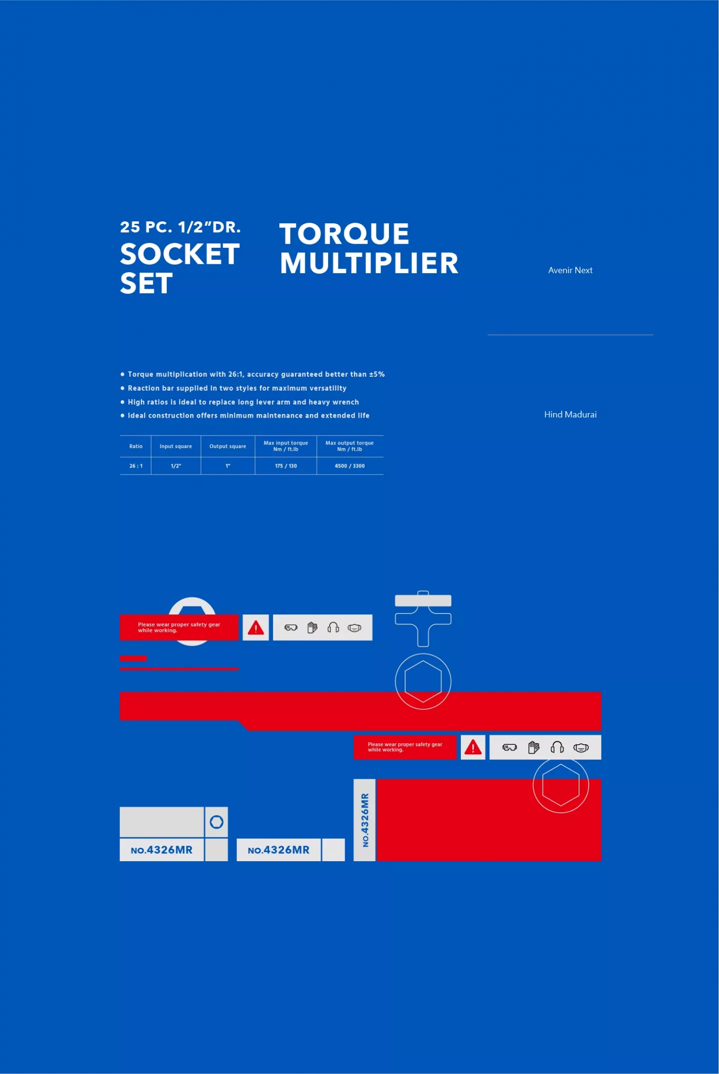
輔助圖形
輔助圖形以產品製程為靈感,藍色作為主要底色,並以品牌標準色之一的紅色象徵製造過程中的「熱熔」工序,圖形線條剛硬,代表著金統立可靠的品質,運用六角、十字、一字等特徵強化「手工具」的意象。在維持統一性的同時,具有彈性的搭配設計,依產品特性而呈現不同的效果。
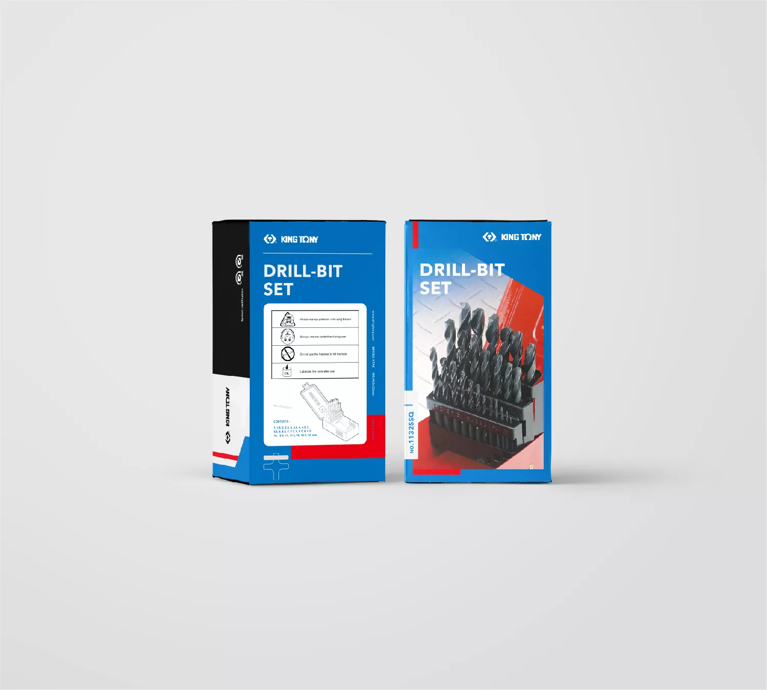
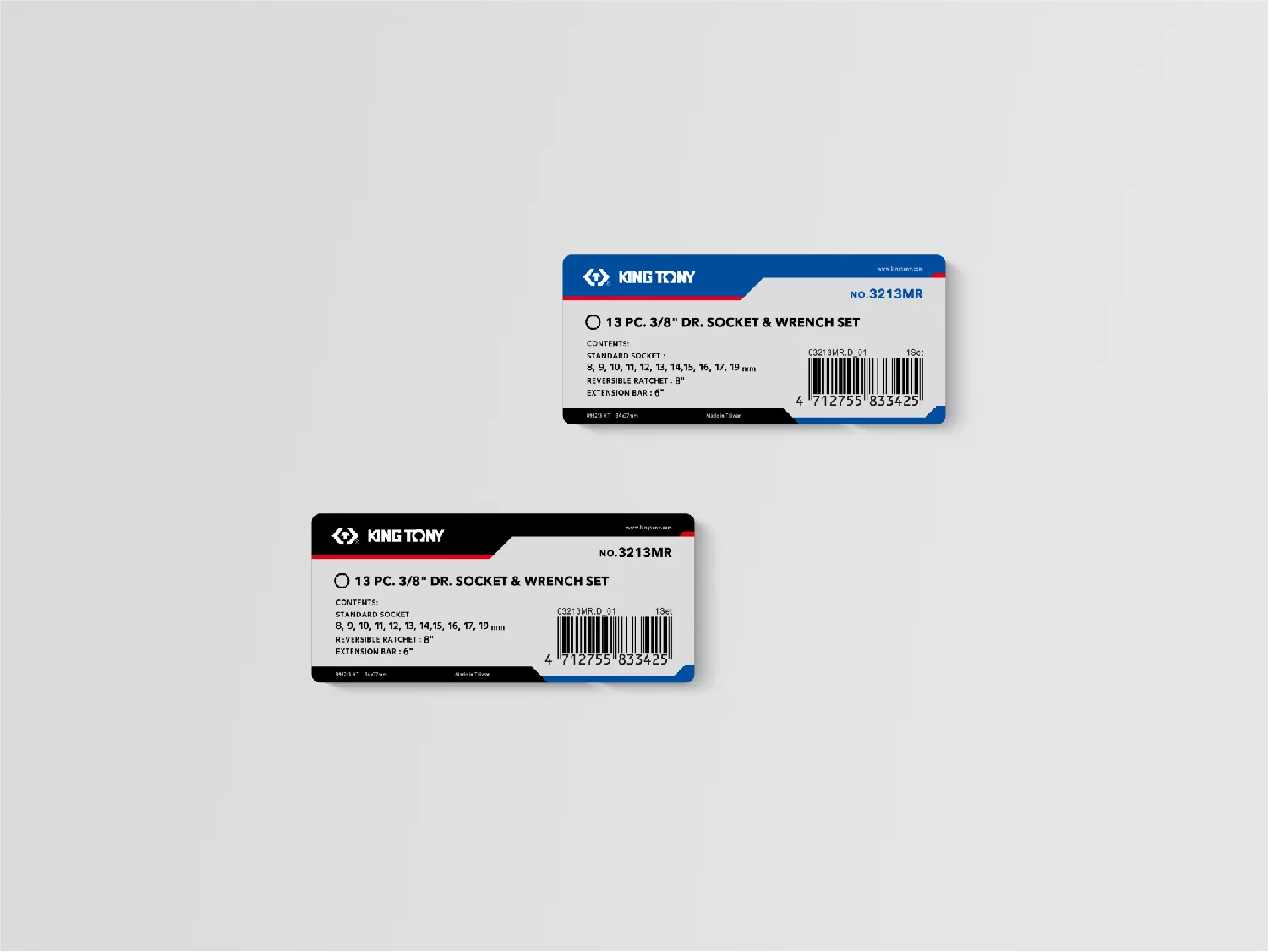
包裝
產品包裝以紅、藍、黑三色帶出高質感及堅固的特性,並運用產品照讓客戶一眼就能辨認需要的商品。圖形線條上導入品牌識別的角度,使豐富的產品線呈現一致的包裝視覺表現。
事務用品
信封、信紙部分,有別於產品包裝的深色系表現,以白色為底色,紅藍色點綴,專業中帶著品牌特色。
四款名片設計異中求同,白、藍、紅、黑四色組合出不同的搭配,表現出品牌專業、健康的企業形象。
制服
制服為polo衫款式,以紅白點色綴大面積藍黑底色,在專業的外表下,蘊藏著滿滿的熱情,傳達著品牌「熱愛工作」的企業理念。
King Tony
King Tony has been committed to years of manufacturing hand tools, and now in its 35th anniversary, it hopes to continue providing high-end quality services and products through the refining of its craftsmanship, adding to the brand’s image of being reliable, professional and resolute.
Auxiliary Graphics
The auxiliary graphics are inspired by the manufacturing process, using blue as the main color for the background, and red, one of the brand’s standard colors, to symbolize the “melting” phase in the manufacturing process. The rigid strokes of the graphics represent the reliability of all King Tony’s products. Furthermore, the use of the hexagon, cross, and line represent “hand tools” commonly used. While maintaining an overall harmony, the flexibility in design allows for variety according to the various products and their characteristics.
Packaging
The product packaging uses three main colors – red, blue and black – to convey the brand’s excellence and stability. Product photos are clearly displayed to allow customers to identify the packaged product at a glance. The design graphics highlight the brand’s characteristics and create a consistent visual coherence among the various product lines.
Stationary
For the letters and envelopes, white is used as the background color in contrast to the dark color scheme of the product packaging. Red and blue are used to enhance the overall appearance, retaining the distinctive features of the brand.
Each of the designs of the four business cards utilize a different combination of white, blue, red, and black to create a sense of diversity while maintaining a sense of unity, overall, displaying a professional and healthy brand image.
Uniform
The uniform uses the polo shirt, using black and blue as the main color, with red and white as highlights. Professional, but full of enthusiasm, conveying the philosophy of being “passionate for your work”.