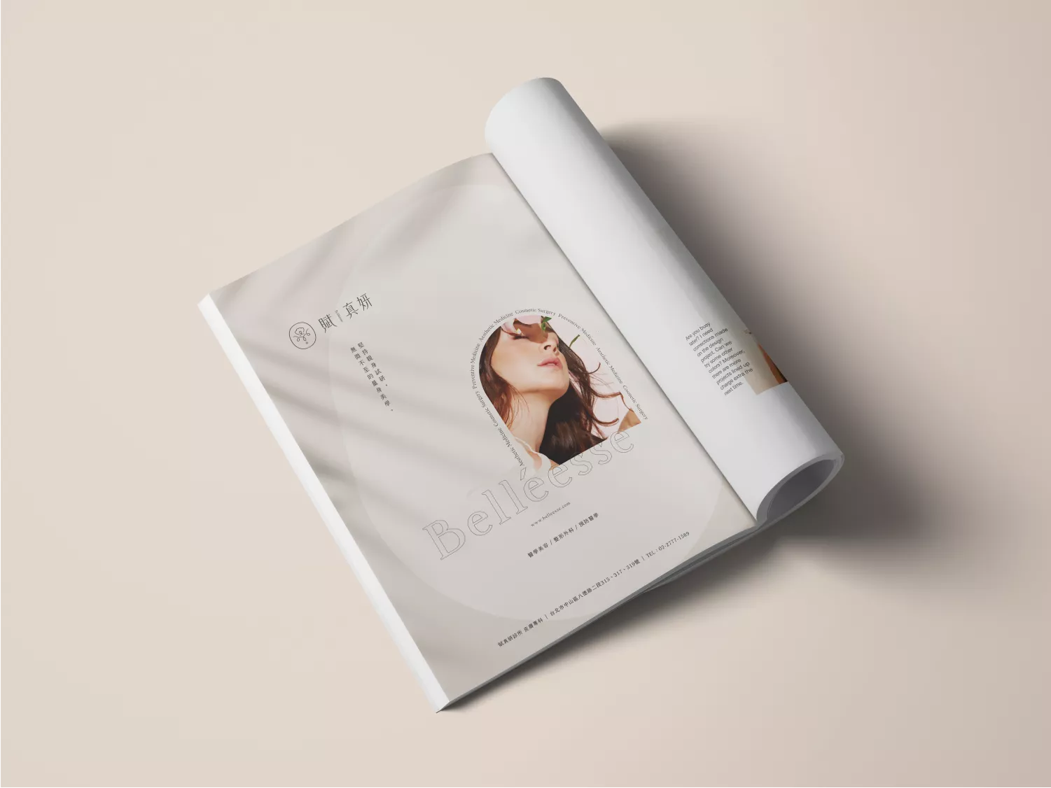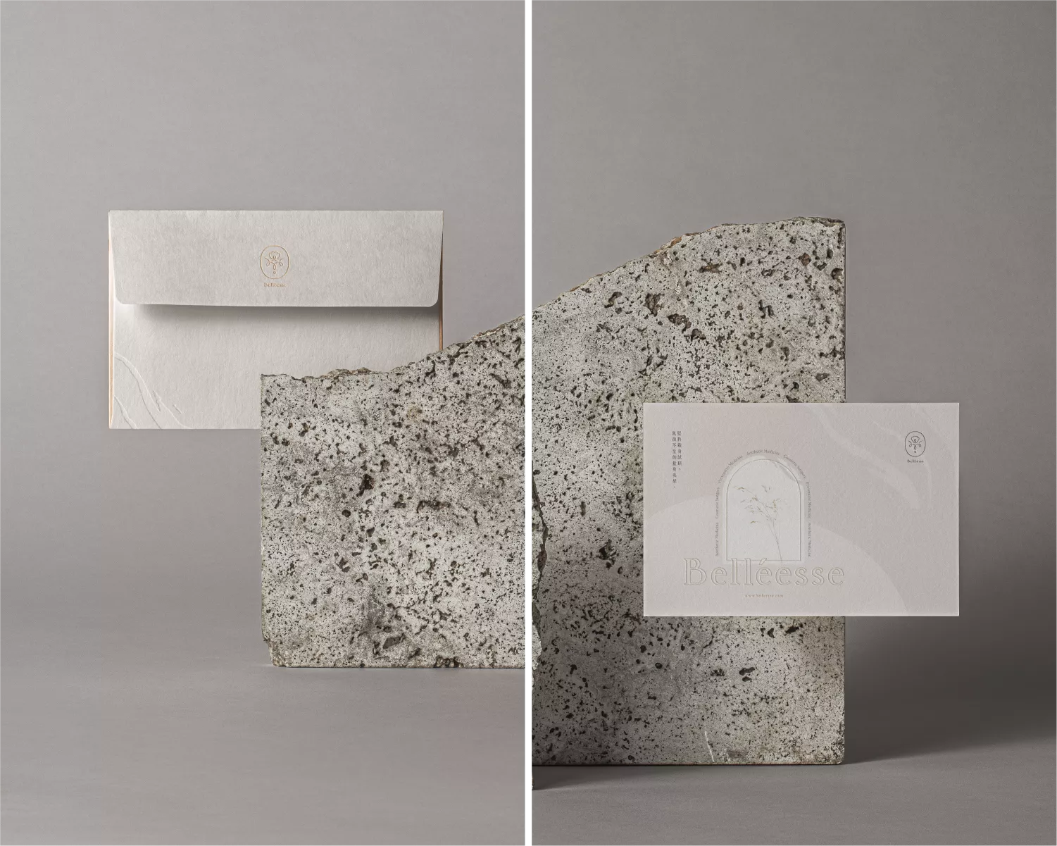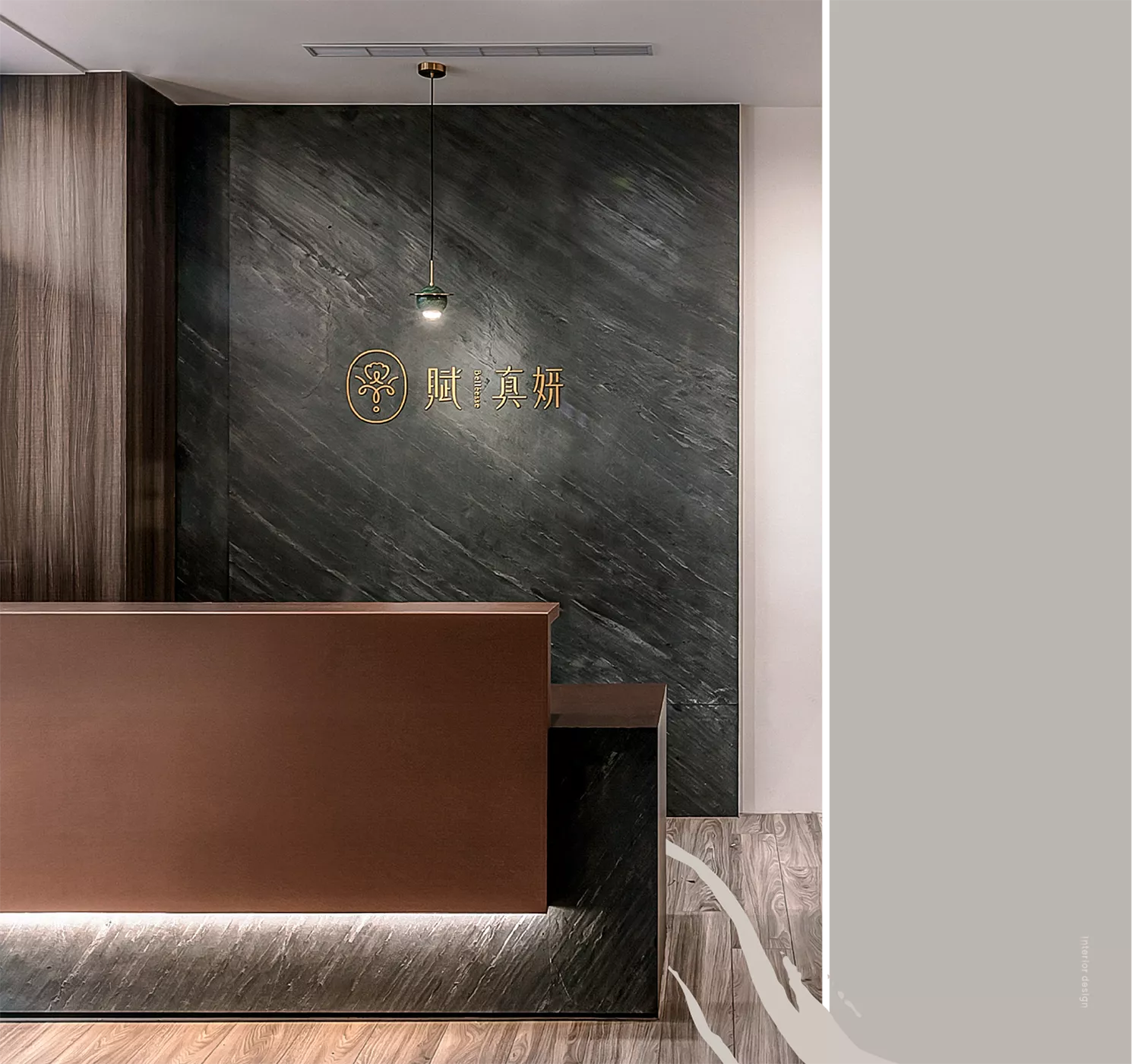
賦真妍
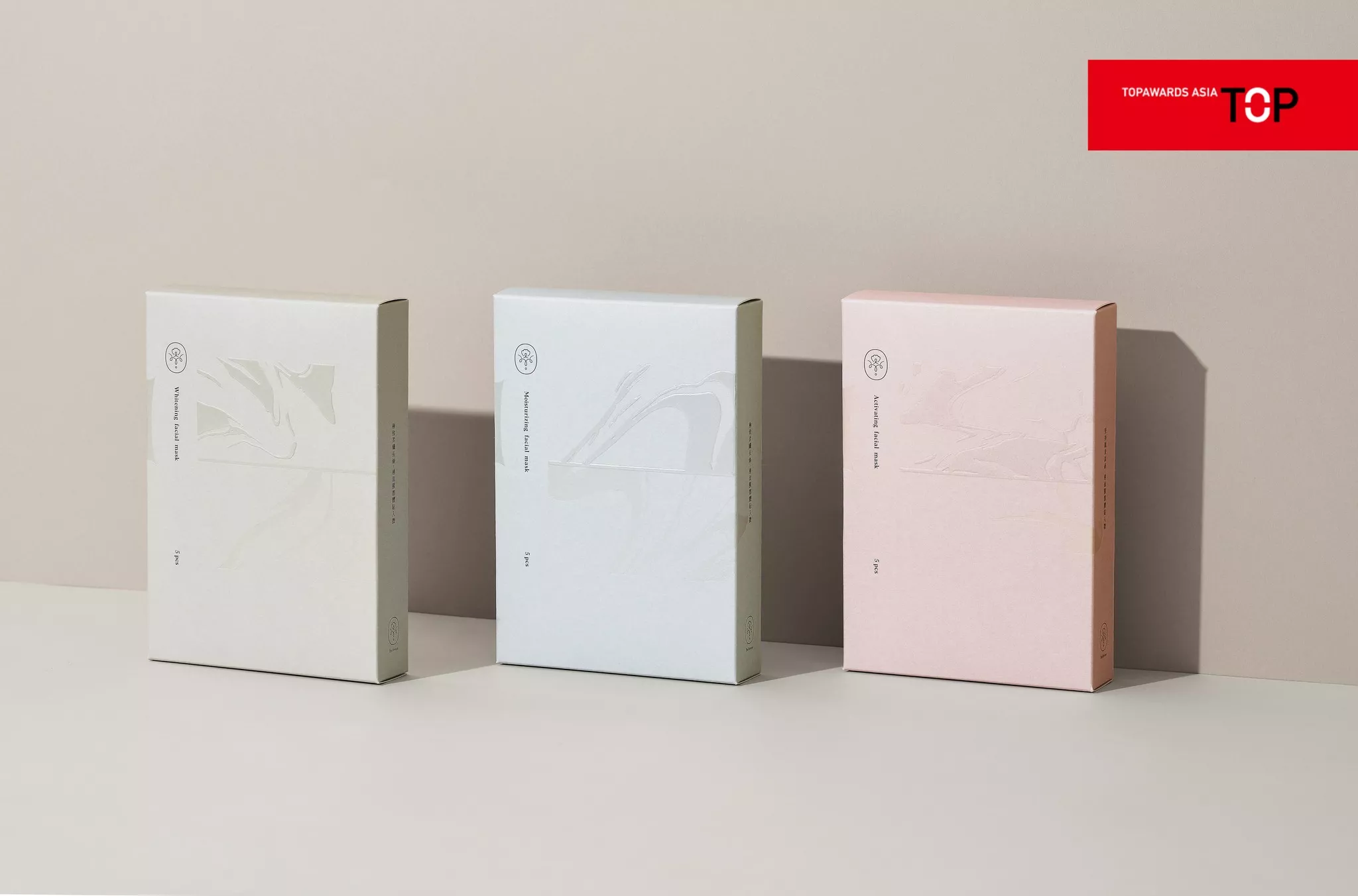
- 榮獲日本TOPAWARS ASIA
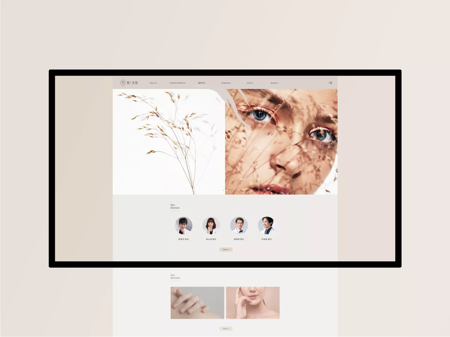
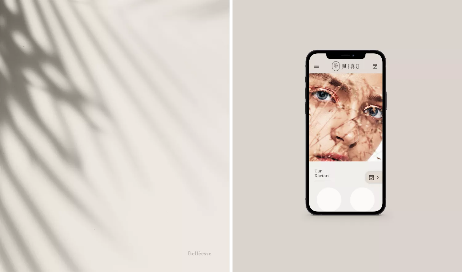
醫美連鎖品牌識別系統設計 |品牌命名|攝影企劃|品牌應用設計|包裝設計
賦真妍」賦,賦予身體細胞活力;真,真切、璞真的醫美體驗;妍,親身試研,展現美好容顏,源自對美最真確的追求。
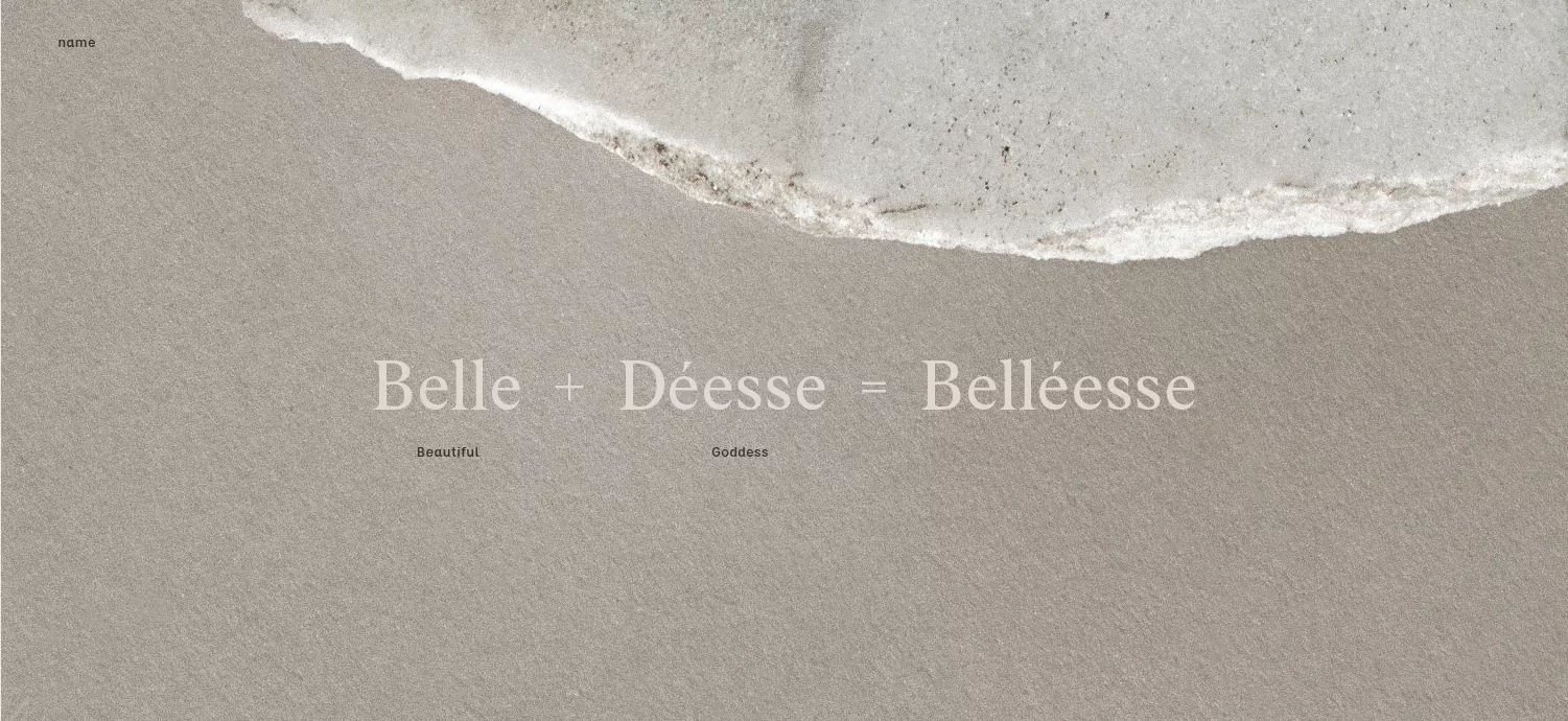
Belléesse取Belle法文的「美麗」之意,Déesse則是「女神」,「Belléesse」結合兩字,賦真妍致力於幫助每一個人成為自己心中嚮往的美麗女神。
有別於業界單純醫師經營的醫美診所,賦真妍團隊由醫美的「資深消費群」所創立,更能體會消費者在追求美的過程中,對於細節的追尋與期望, 除了專業卓越的醫學團隊外,更致力於打造良好的消費體驗,讓消費者來到賦真妍就如同在家裡一樣,感到安心且放鬆,陪伴消費者在變美的路上更加從容自在。
每項服務皆由團員親身體驗過,確保高品質服務,高規格醫學設備整合最專業的醫療團隊,細心傾聽消費者需求,散發從內而外的自信,成就真正體貼入微的美,最懂得消費者需求的醫美品牌。
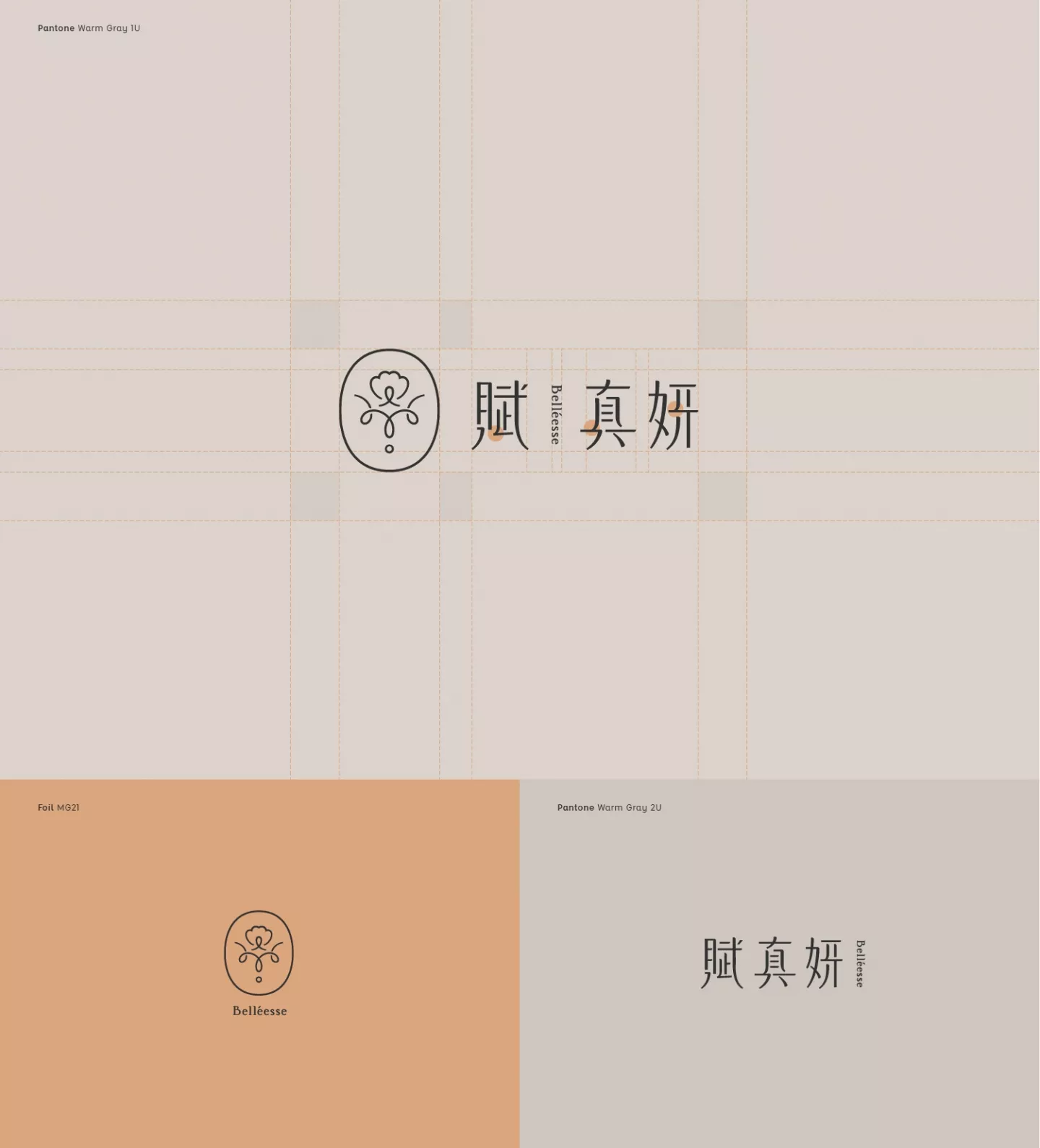
字體設計方面,高挑的設計帶出優雅柔美的氣質,筆畫的收捺以收縮及曲線加強細膩感,而穩重的架構為整體帶來優雅柔美中不失專業的品牌價值。
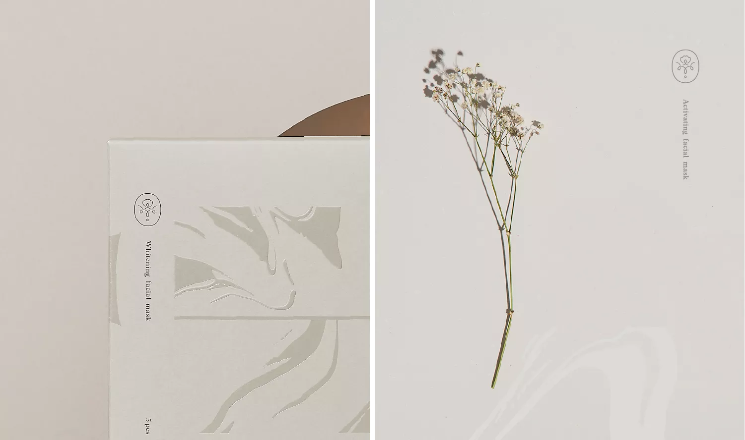
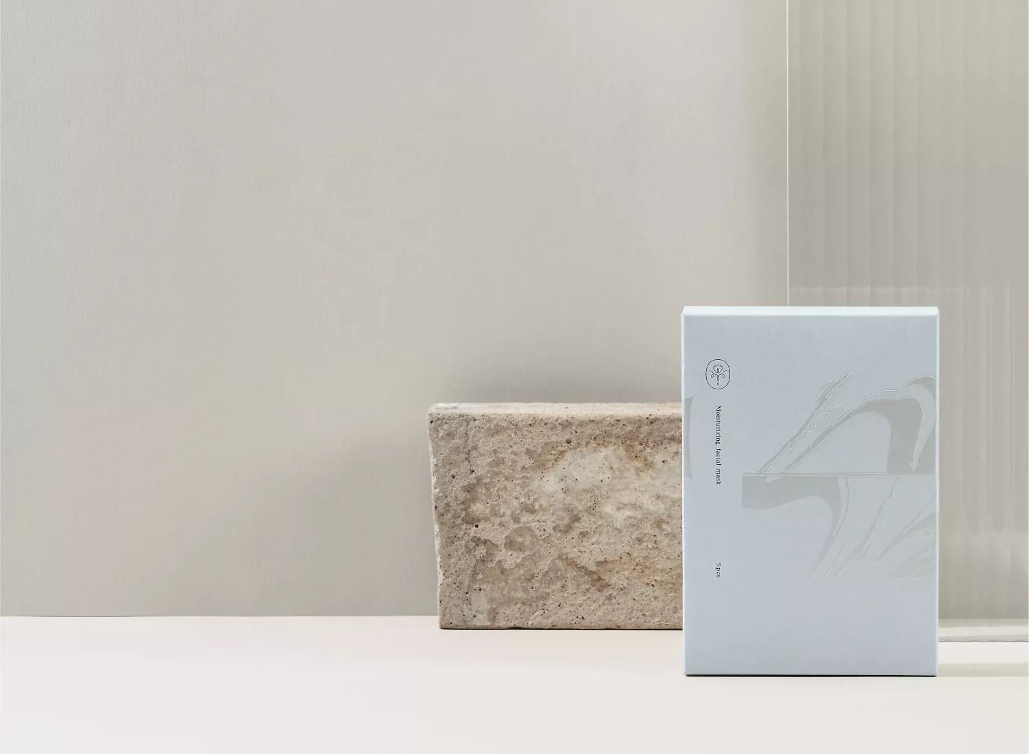
Logo圖示部分,則以標誌、圖章設計感傳達精緻的專業感,,向上盛開花蕊代表賦活新生,兩側則轉化Belléesse的字首,如同花托襯托著花瓣,水滴沿著花托滴下,象徵著賦真妍賦予身體最真切的感受。
#賦真妍皮膚專科診所
分店:
台北市中山區八德路二段315號
台北市忠孝東路四段162號3樓
Each letter in the Chinese name of the brand, “賦真妍”, is endowed with meaning. “賦” means to bestow vitality to the body’s cells; “真” means a true, authentic, and pure aesthetic experience; “妍” means to personally experience that transformation. This is our pursuit of beauty.
The name of the brand “Belléesse” is a combination of the French words “Belle”, which means “beautiful”, and “Déesse”, which means “goddess”. Thus, implied in the brand name, Belléesse’s commitment is to help each and every person to become the beautiful goddess they aspire to be.
In contrast to most aesthetic clinics run by doctors in the industry, the Belléesse team is founded by “seasoned consumers” in the area of medical aesthetics. Thus, they can better understand the customers’ desire and pursuit of detail when it comes to personal beauty.
In addition to the professional medical team, the brand aims to create a genuine customer experience, so that when they come to Belléesse, they feel at home. The hope is that in the journey to beauty, customers will feel at ease and relaxed.
The team members have gone through each of the services thoroughly to ensure the highest quality. Furthermore, the high-grade medical equipment is complemented with the professional medical team. Carefully listening and understanding the customer’s need, the brand is confident that it can truly deliver on the ideal beauty each customer desires.
In terms of the font design, the thin and tall design draw out a feeling of elegance and sweetness, with each stroke and contour line to convey the details within, thus complementing the overall design with a sense of professionalism.
The logo’s design reflects the brands finesse and professionalism. With a stamp-like template, the stamen within faces up, representing new life. On both sides, the letter “B” from the brand name is cleverly designed as receptacles holding the flower petals. The water droplet at the bottom represents how the brand provides the body with the most authentic feeling.

