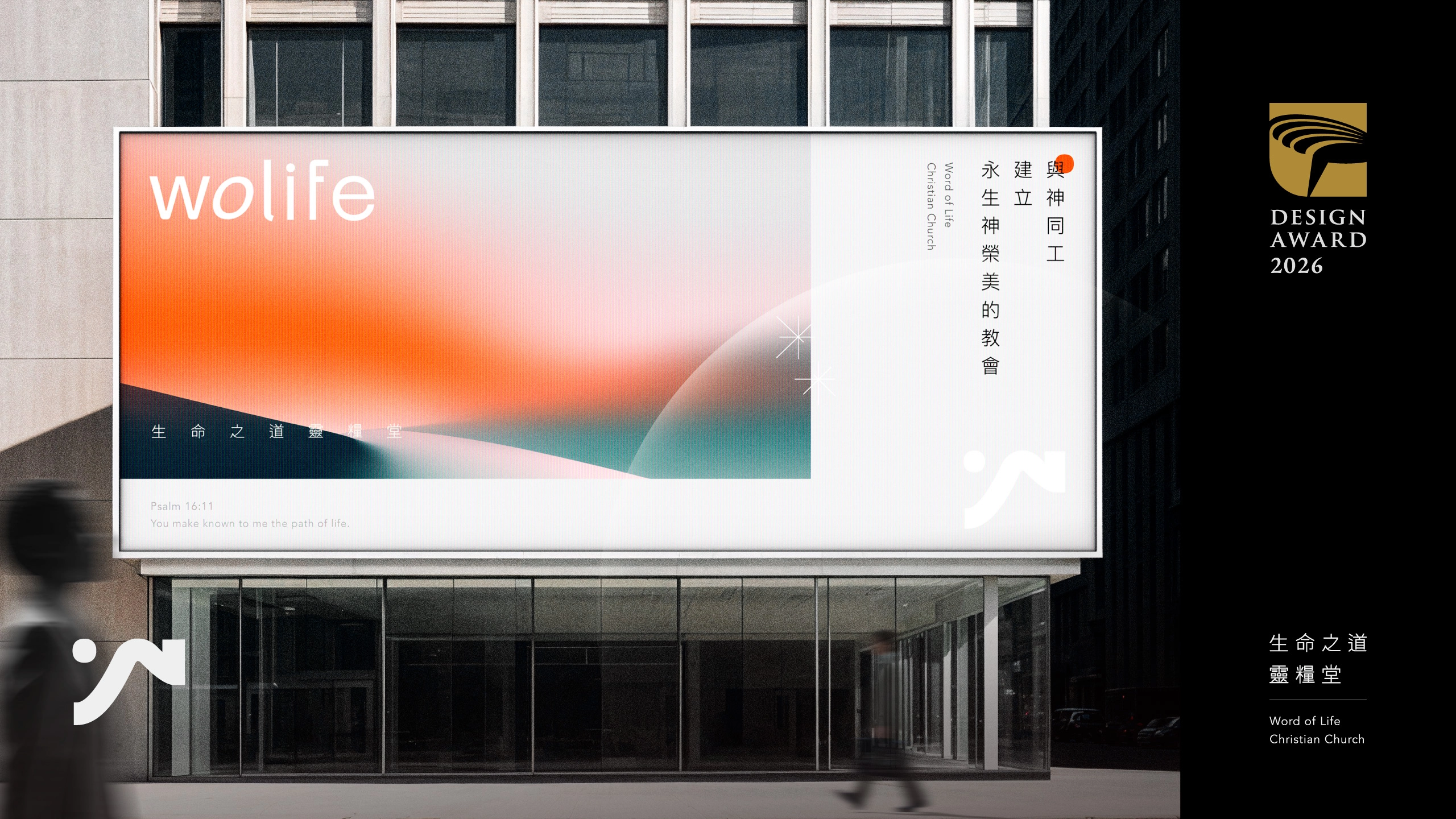
榮獲2026金點設計獎 | 教會識別設計 | 品牌重塑 | 指標設計
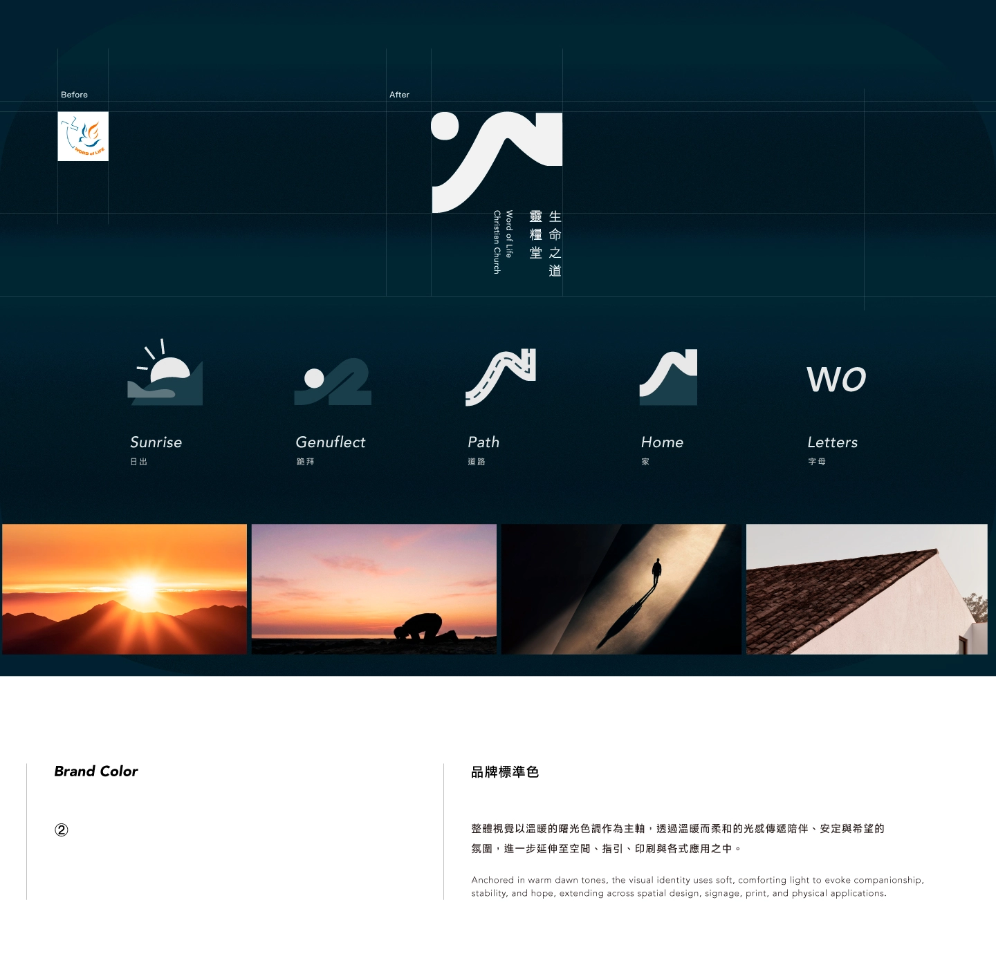
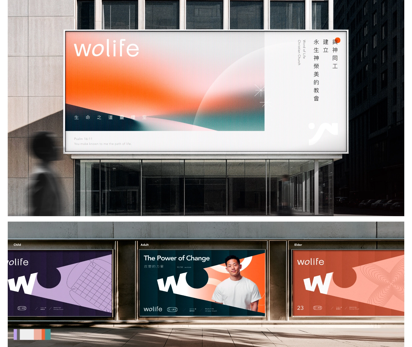
The logo is crafted from WO:
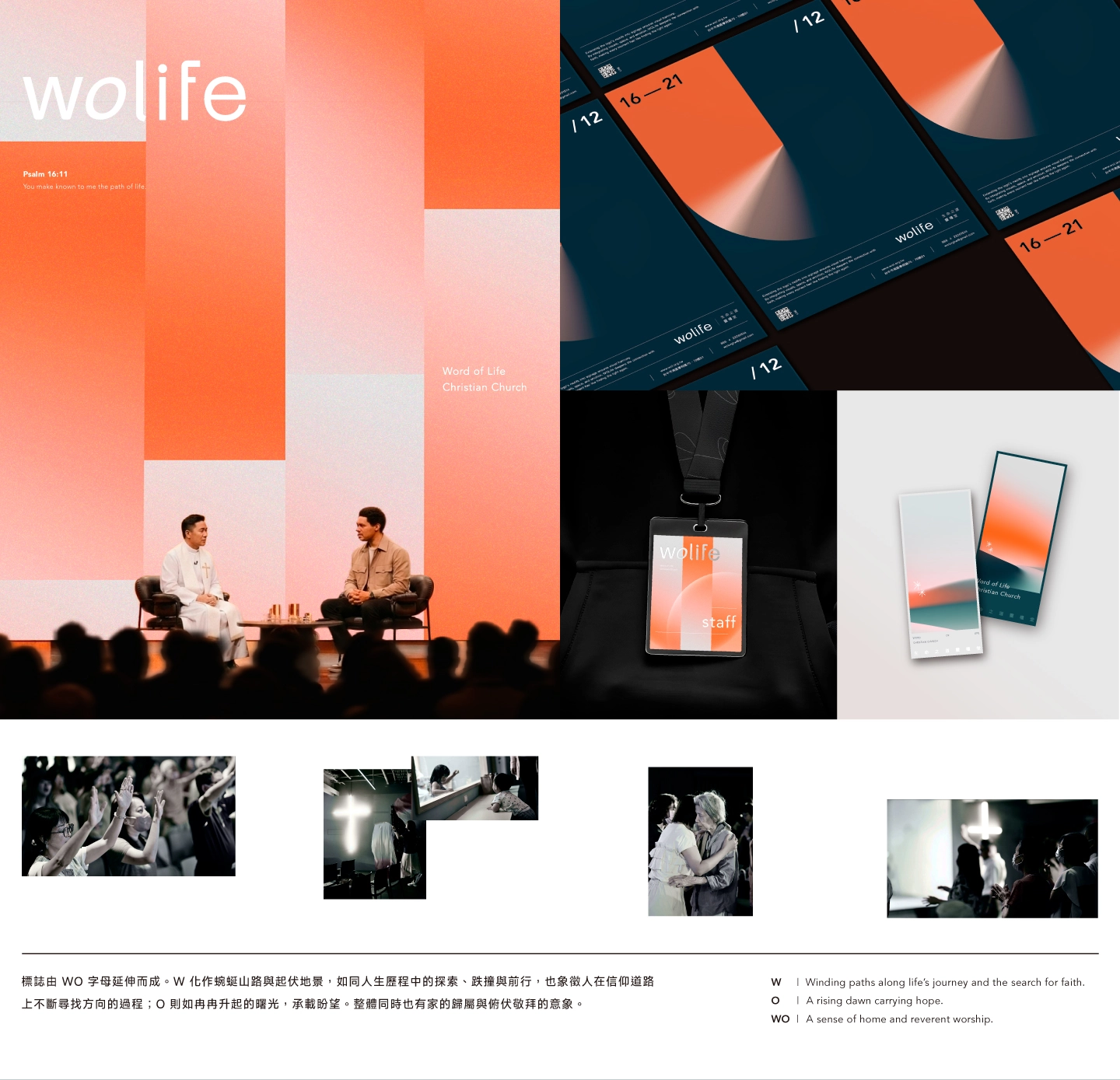
W becomes winding paths and undulating landscapes, mirroring life's exploration and the pursuit of direction in faith.
O rises like the dawn, carrying hope while evoking a sense of home and humble worship.
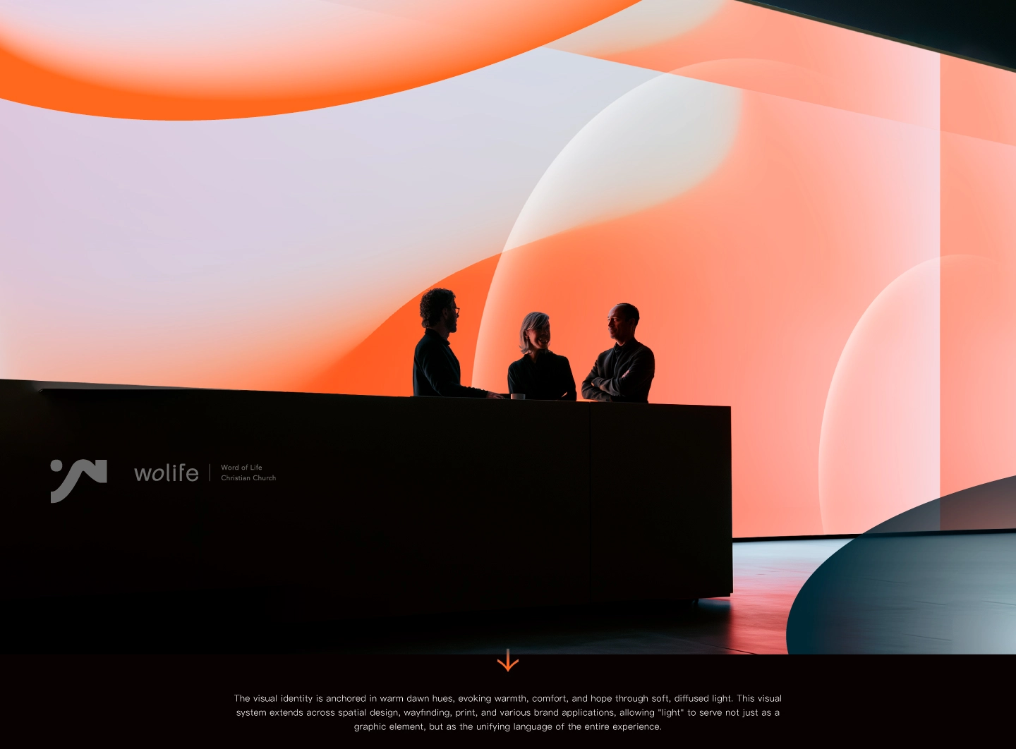
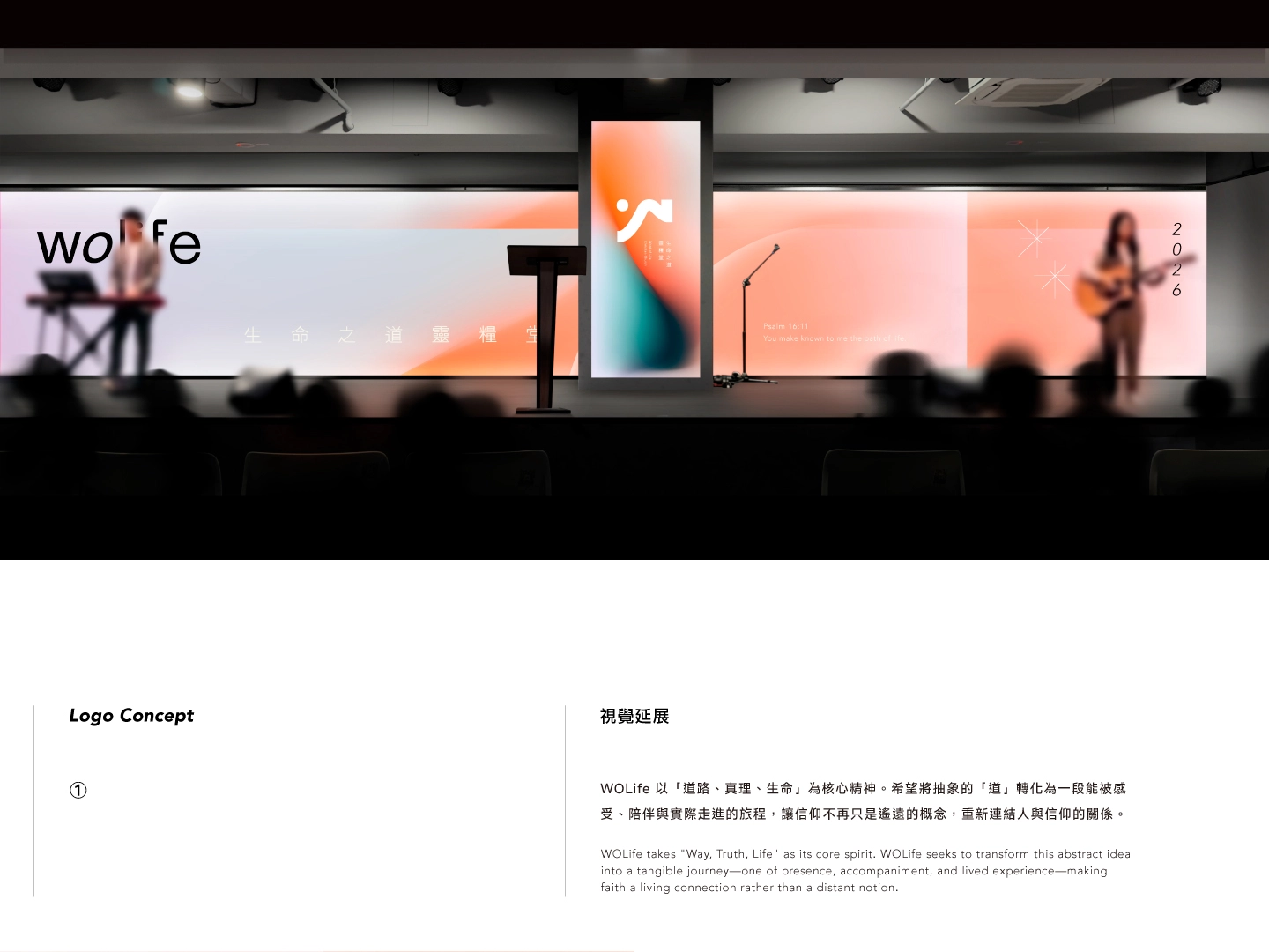
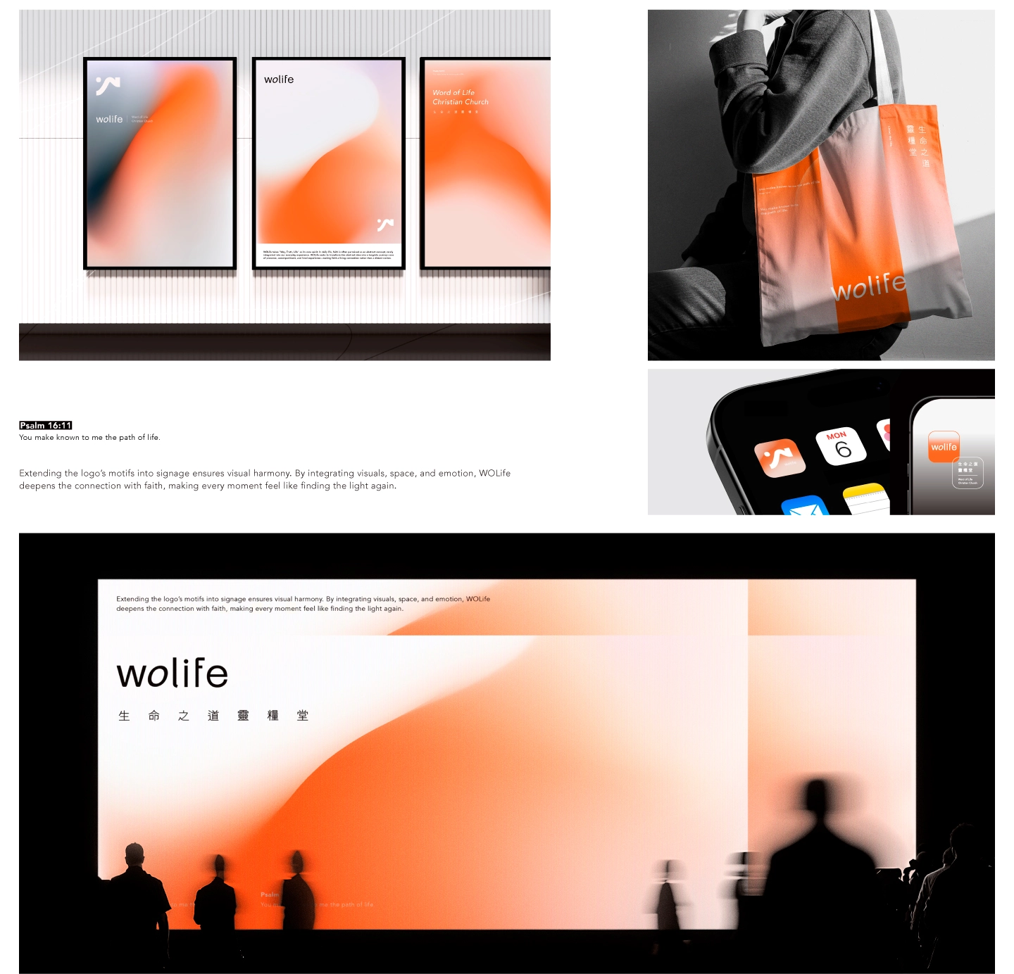
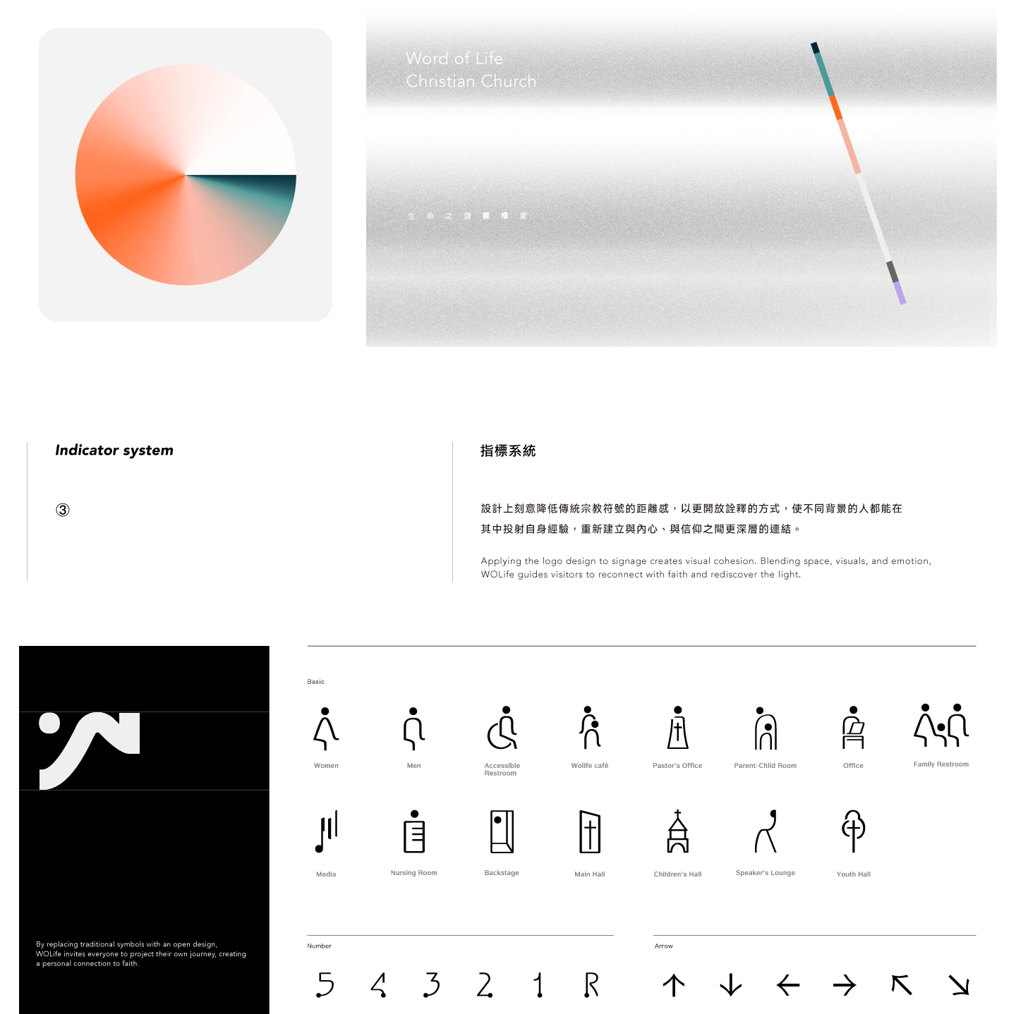
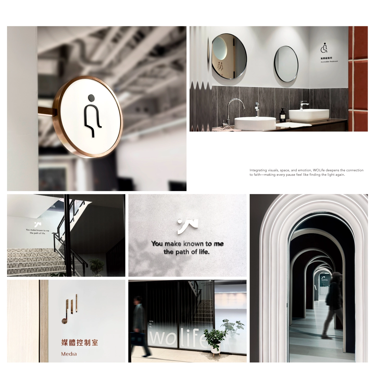
Warm dawn tones set the visual tone, radiating companionship and stability. This sense of light extends beyond graphics into spatial wayfinding, print materials, and brand touchpoints, making "light" the core experiential language. By lowering the barriers of traditional religious symbols, wolife invites individuals of all backgrounds to project their own experiences, fostering a deeper connection with themselves and their faith.
wolife 以「道路、真理、生命」作為核心精神,在生活中,信仰常被理解為抽象的概念,卻較少真正進入人的日常經驗。因此,wolife 希望將抽象的「道」轉化為一段能被感受、陪伴與實際走進的生命旅程,讓信仰不再只是遙遠的概念,重新連結人與信仰的關係。
標誌由 WO 字母延伸而成:W 化作蜿蜒山路與起伏地景,如同人生歷程中的探索、跌撞與前行,也象徵人在信仰道路上不斷尋找方向的過程;O 則如冉冉升起的曙光,承載盼望。整體同時也有家的歸屬與俯伏敬拜的意象。在色彩與視覺設計上,我們以溫暖而柔和的曙光色調為主軸,傳遞陪伴、安定與希望的氛圍。這光感並非僅停留於平面圖面上,而是向外延伸——從實體空間的動線指引、印刷製作物,到各類品牌載體,讓「光」成為貫穿整體體驗的核心語言。刻意降低傳統宗教符號的距離感,以更開放詮釋的方式,使不同背景的人都能在其中投射自身經驗,讓每一次進入與停留,都像是在旅途中再次看見光的方向。重新建立與內心、與信仰之間更深層的連結。
標誌由 WO 字母延伸而成:W 化作蜿蜒山路與起伏地景,如同人生歷程中的探索、跌撞與前行,也象徵人在信仰道路上不斷尋找方向的過程;O 則如冉冉升起的曙光,承載盼望。整體同時也有家的歸屬與俯伏敬拜的意象。在色彩與視覺設計上,我們以溫暖而柔和的曙光色調為主軸,傳遞陪伴、安定與希望的氛圍。這光感並非僅停留於平面圖面上,而是向外延伸——從實體空間的動線指引、印刷製作物,到各類品牌載體,讓「光」成為貫穿整體體驗的核心語言。刻意降低傳統宗教符號的距離感,以更開放詮釋的方式,使不同背景的人都能在其中投射自身經驗,讓每一次進入與停留,都像是在旅途中再次看見光的方向。重新建立與內心、與信仰之間更深層的連結。
Living the life.
The logo is crafted from WO:
W becomes winding paths and undulating landscapes, mirroring life's exploration and the pursuit of direction in faith.
O rises like the dawn, carrying hope while evoking a sense of home and humble worship.
Warm dawn tones set the visual tone, radiating companionship and stability. This sense of light extends beyond graphics into spatial wayfinding, print materials, and brand touchpoints, making "light" the core experiential language. By lowering the barriers of traditional religious symbols, wolife invites individuals of all backgrounds to project their own experiences, fostering a deeper connection with themselves and their faith.