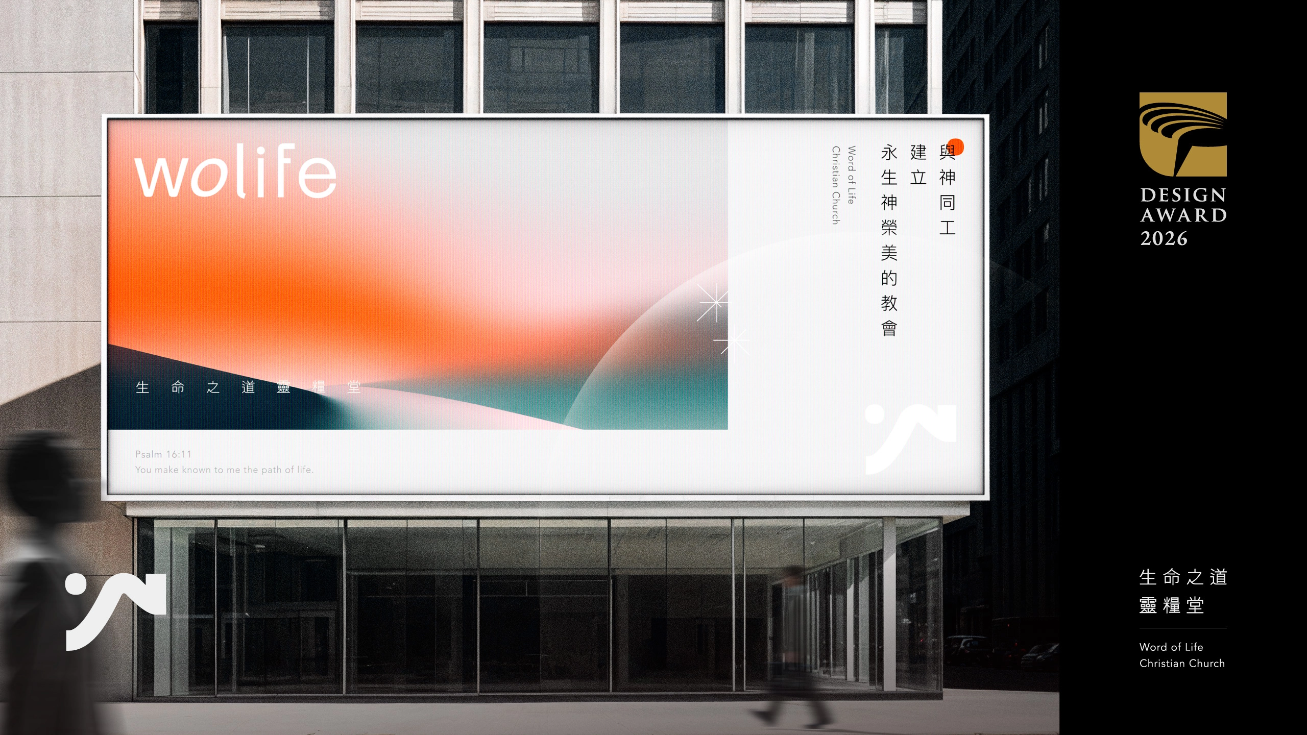
教會識別設計 | 品牌重塑 | 指標設計
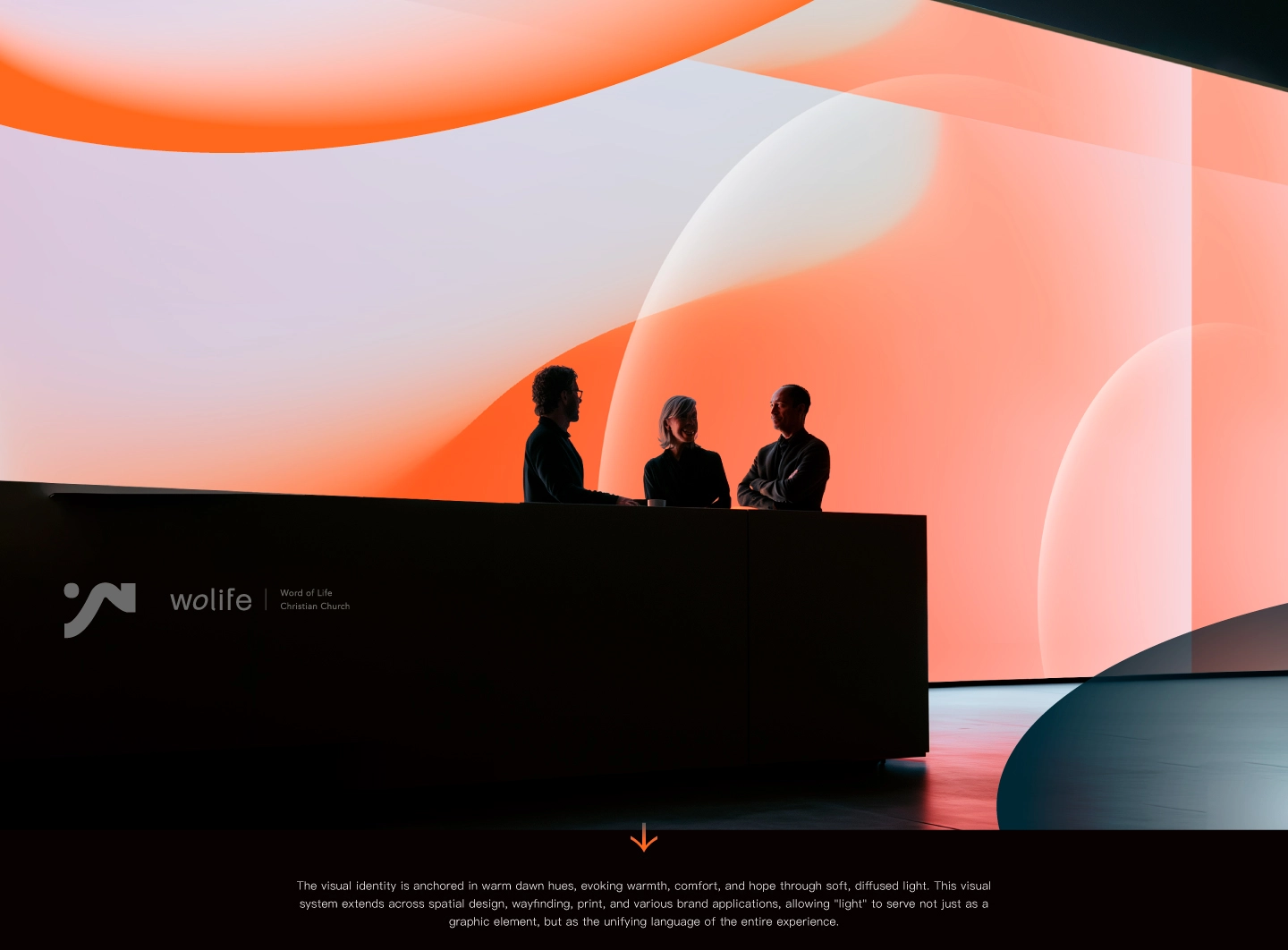
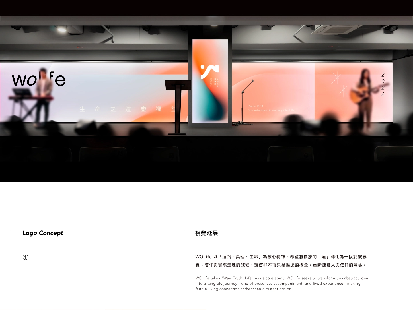
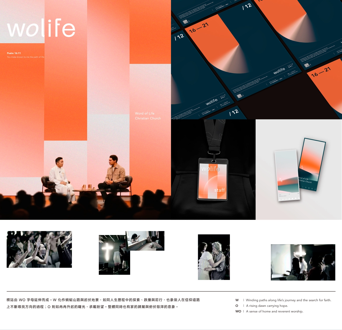
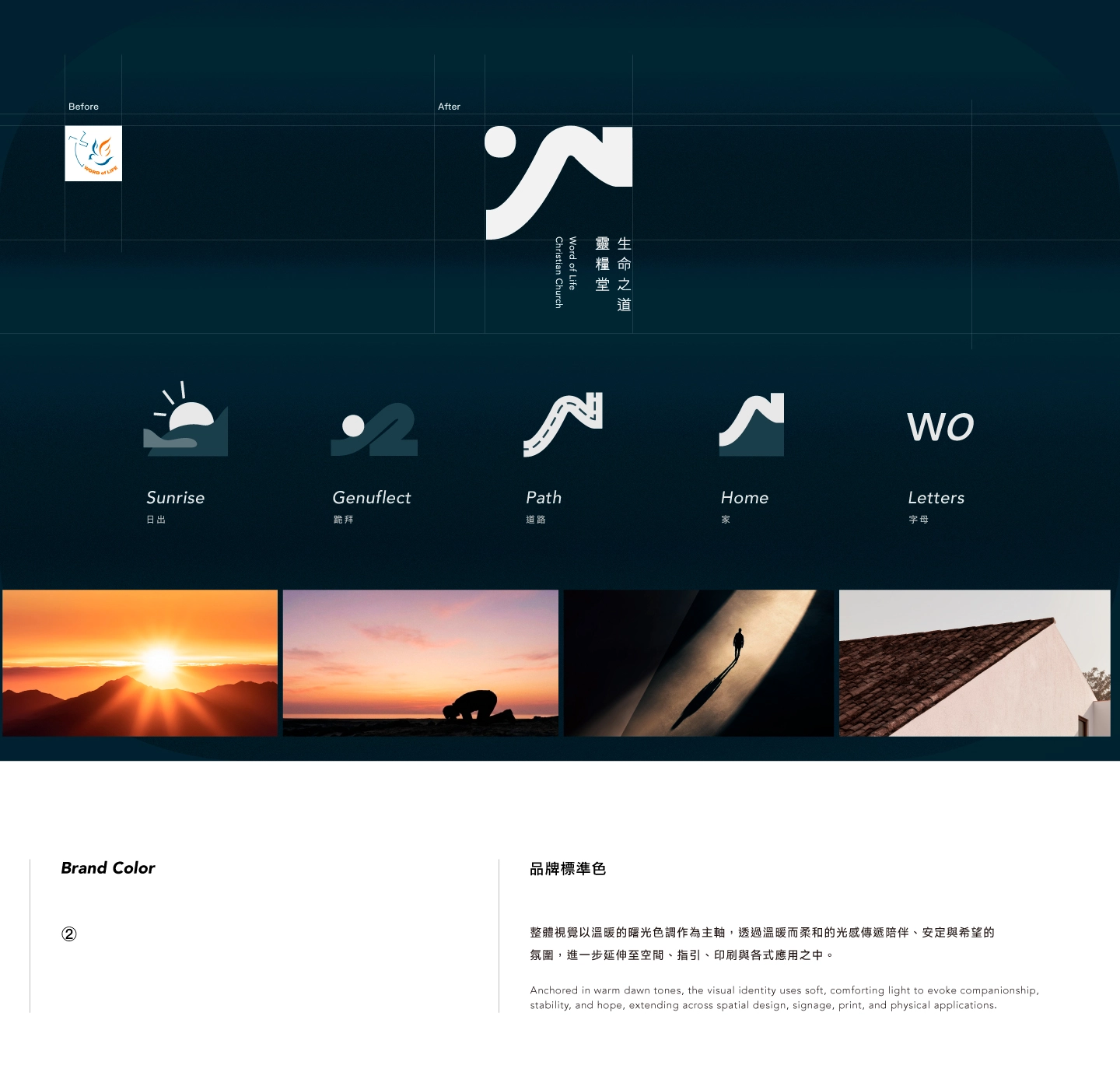
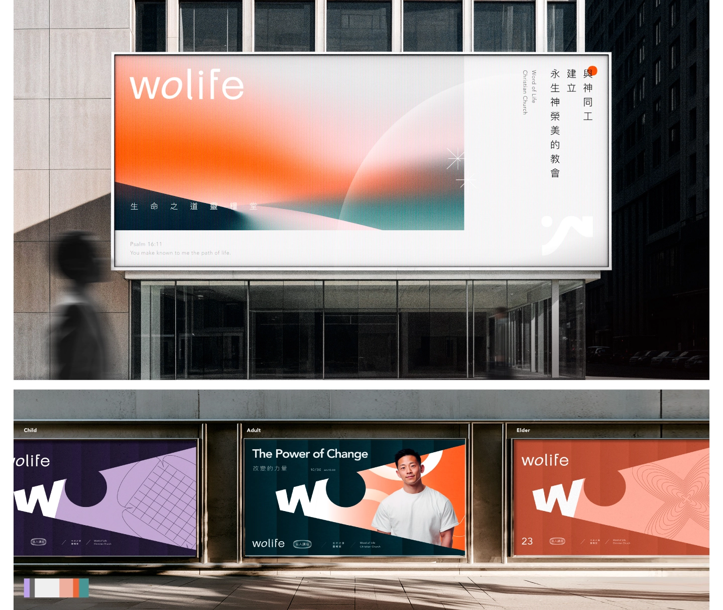
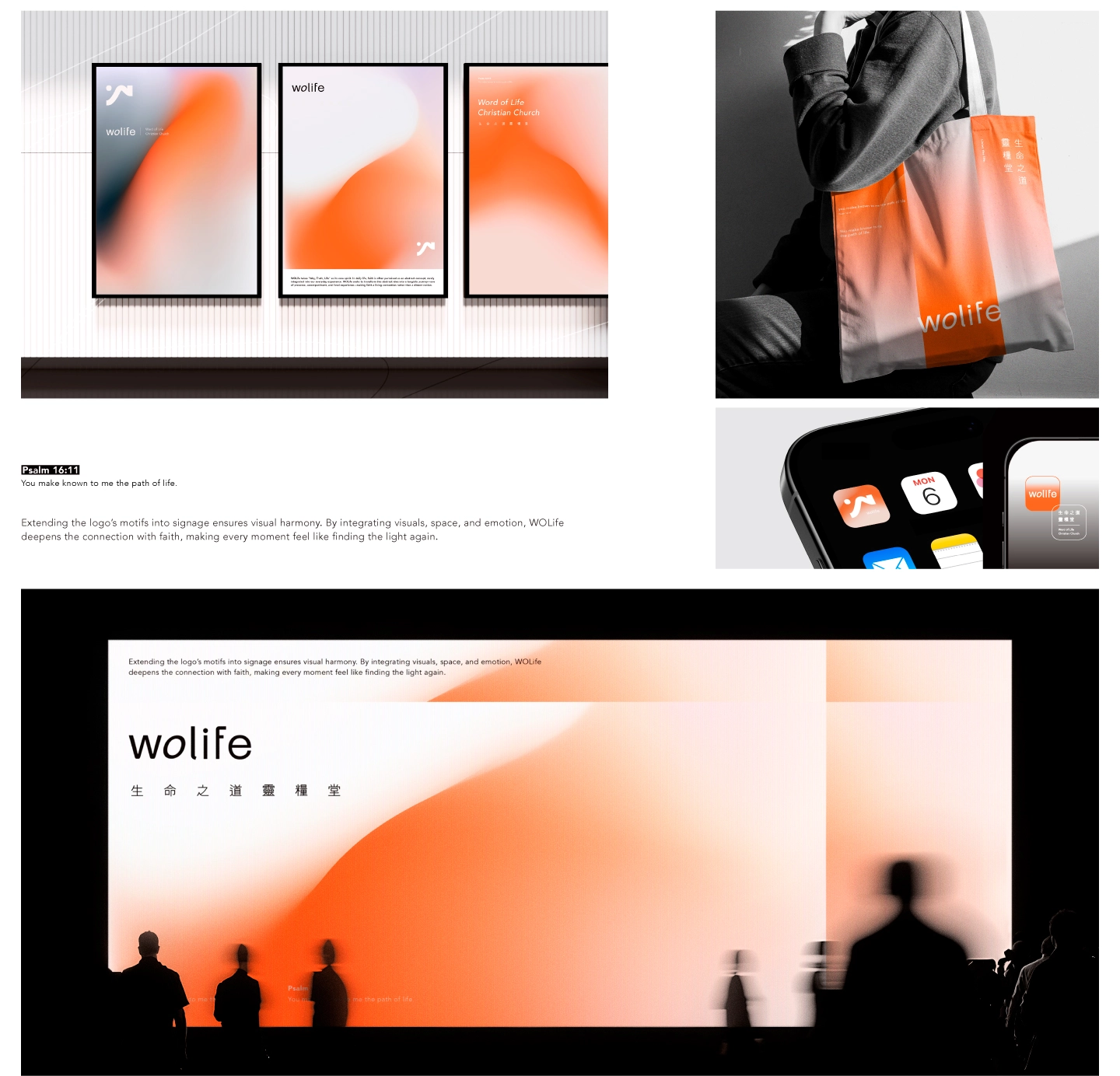
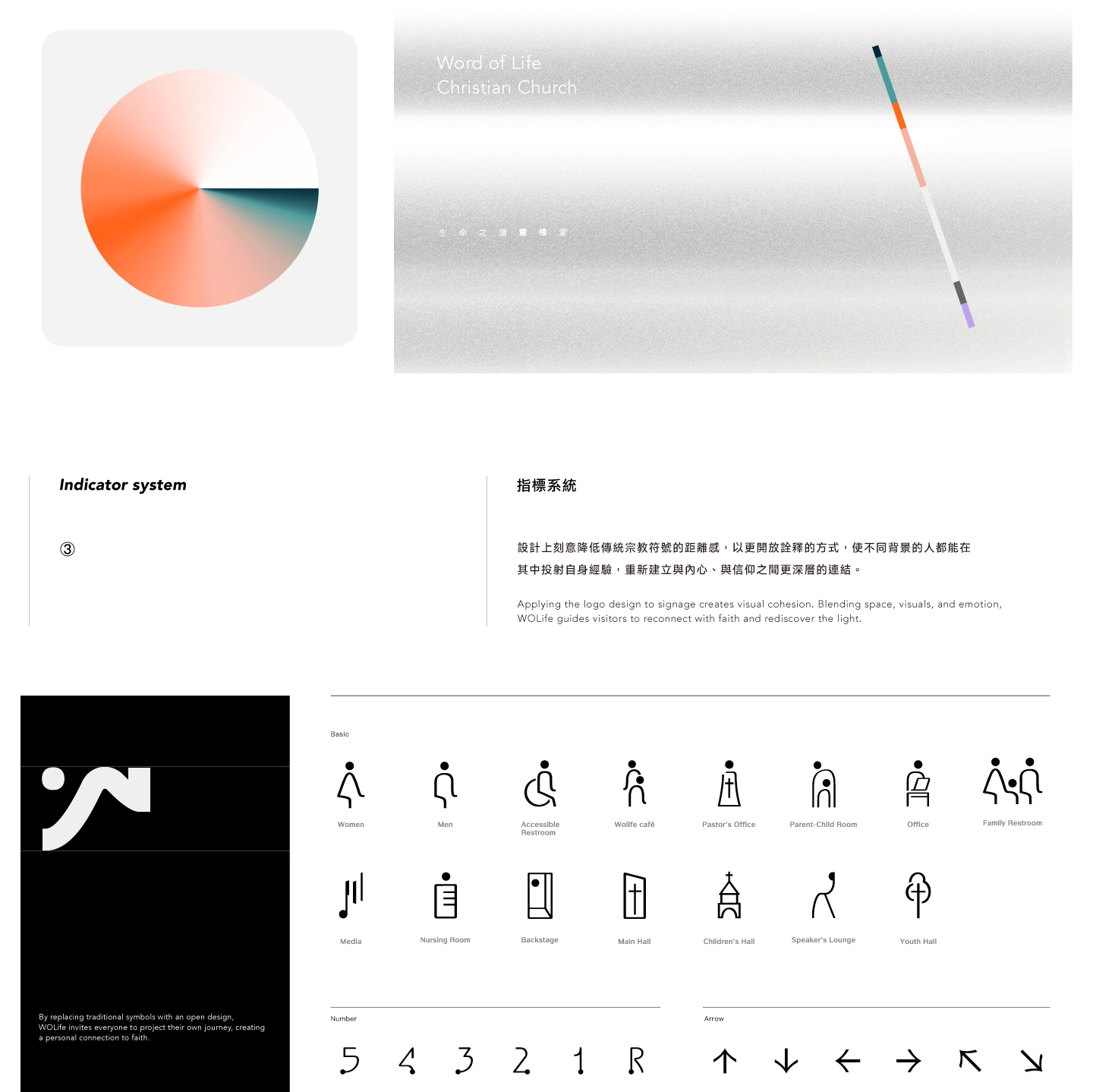
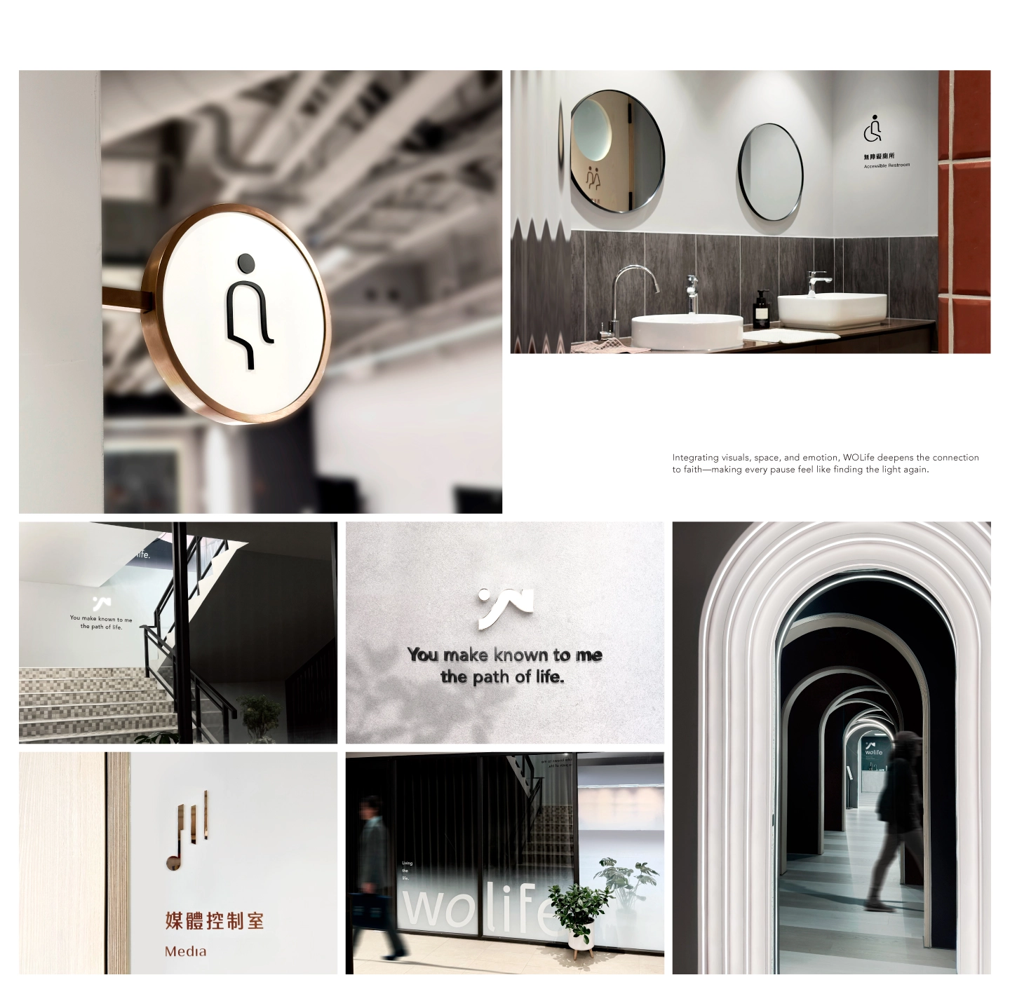
WOLife 以「道路、真理、生命」作為核心精神,在生活中,信仰常被理解為一種抽象的概念,卻較少真正進入人的日常經驗。因此,WOLife 希望將抽象的「道」轉化為一段能被感受、陪伴與實際走進的生命旅程,讓信仰不再只是遙遠的概念,重新連結人與信仰的關係。 標誌由 WO 字母延伸而成。W 化作蜿蜒山路與起伏地景,如同人生歷程中的探索、跌撞與前行,也象徵人在信仰道路上不斷尋找方向的過程;O 則如冉冉升起的曙光,承載盼望。整體同時也有家的歸屬與俯伏敬拜的意象。 整體視覺以溫暖的曙光色調作為主軸,透過溫暖而柔和的光感,傳遞陪伴、安定與希望的氛圍。視覺系統也進一步延伸至空間、指引、印刷與各式品牌應用之中,讓「光」不只是圖像元素,而成為貫穿整體體驗的核心語言,同時也將標誌的原點,延伸到指標識別系統裡面,整體視覺一致性,藉由視覺、空間與情感的整合,WOLife 希望重新建立人與信仰之間更深層的連結,讓每一次進入與停留,都像是在旅途中再次看見光的方向。 設計上也刻意降低傳統宗教符號的距離感,以更開放詮釋的方式,使不同背景的人都能在其中投射自身經驗,重新建立與內心、與信仰之間更深層的連結。
Living the life.
Rooted in "the way, the truth, and the life," WOLife translates abstract faith into a tangible, everyday journey of companionship, bridging the gap between sacred concepts and lived human experience. The logo derives from the letters WO: the "W" transforms into winding mountain paths mirroring life's exploration and perseverance, while the "O" evokes a rising dawn carrying hope, home, and a devotional posture. Centered on warm, dawn-inspired hues, the visual system extends across space, wayfinding, and print. By using light as a core language and minimizing traditional religious distance, the design invites open interpretation, allowing people from all backgrounds to reconnect with their inner selves and faith.