Top One Pot 這一鍋集團|年菜企劃
年菜應用視覺設計
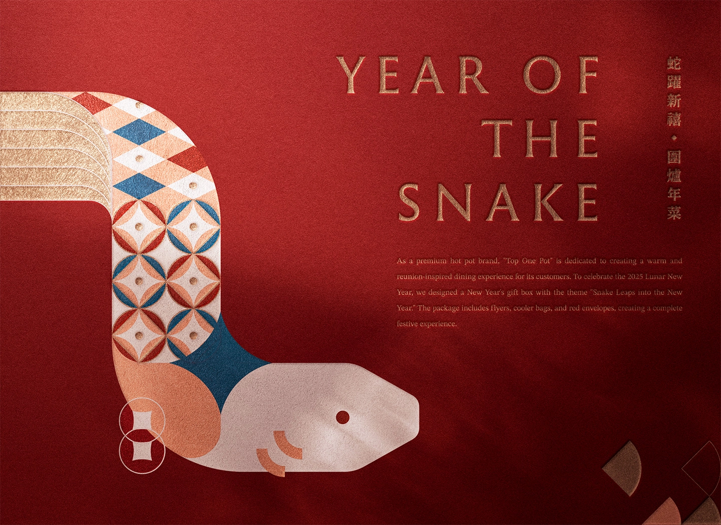
本系列以農曆生肖為核心,發展具延續性與辨識度的年節視覺語言,應用於年菜保冷袋與紅包袋等周邊,將節慶文化轉化為兼具實用性與設計感的品牌體驗。
2025 蛇年以幾何化的蛇形作為主要視覺元素,透過流動的曲線構成現代感輪廓。
蛇身鱗片延伸為裝飾圖騰,融入梅花、錢幣與燈籠等年節圖騰,使傳統符號在現代語境中重新詮釋。
整體構圖以蛇身環繞包體,從正面延伸至背面,強化包裝的整體性與動態視覺。
2026 馬年則以奔馳的馬匹為主視覺,象徵萬馬奔騰的吉祥寓意。
白色馬體搭配燙銀鬃毛作為視覺焦點,鬃毛造型融合書法筆觸,將速度感與東方文化語彙相結合。
背景輔以錢幣元素與漸層弧形,營造流動與前進的視覺節奏。
整體系列在鮮明節慶色彩基礎上,結合幾何造型與動態構圖,使傳統生肖意象轉化為現代且具品牌識別的視覺語言,提升年節產品的質感與收藏價值。
This festive collection reinterprets Chinese zodiac imagery through a contemporary visual system, applied across cooler bags and red envelopes.
For the Year of the Snake, geometric forms and modular scales incorporate traditional motifs such as plum blossoms, coins, and lanterns, creating a fluid composition that wraps seamlessly around the bag.
For the Year of the Horse, a galloping figure symbolizes momentum and prosperity.Silver-stamped mane details, inspired by calligraphic brushstrokes, introduce an elegant contrast against the bold red base, while gradient arcs and coin elements enhance a sense of speed and movement.
The series balances tradition and modernity, transforming festive symbolism into a cohesive and distinctive brand expression.