博亮牙醫 Bright Smiles Dental Clinic
- 榮獲金點設計獎 | Behance精選 | 牙醫診所品牌設計 | 品牌應用設計
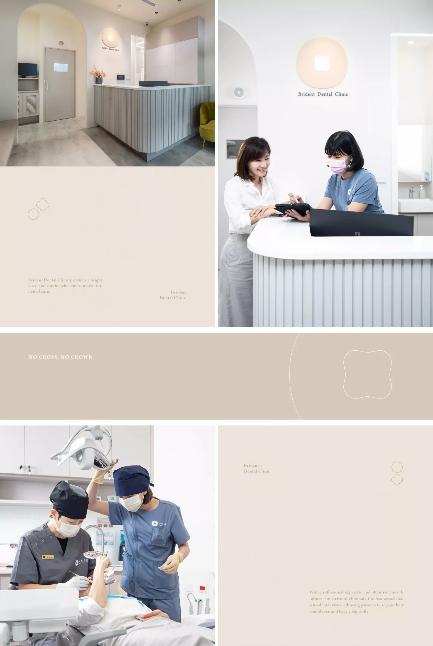
- 博亮牙醫,明亮且溫馨舒適的牙醫診所。看牙醫一直是許多人心中的恐懼,拔牙、抽神經、麻醉並伴隨著機器運作的聲音,許多人寧可忍著疼痛,也不願解決牙齒的問題。但我們重視你的感受,不再只是制式化的看牙流程。專業的技術、細心的問診,多了一份溫暖,擺脫看牙的恐懼。團隊間也會不斷交流與討論,精進技術及知識,讓每一位患者都能確實的解決牙齒問題。
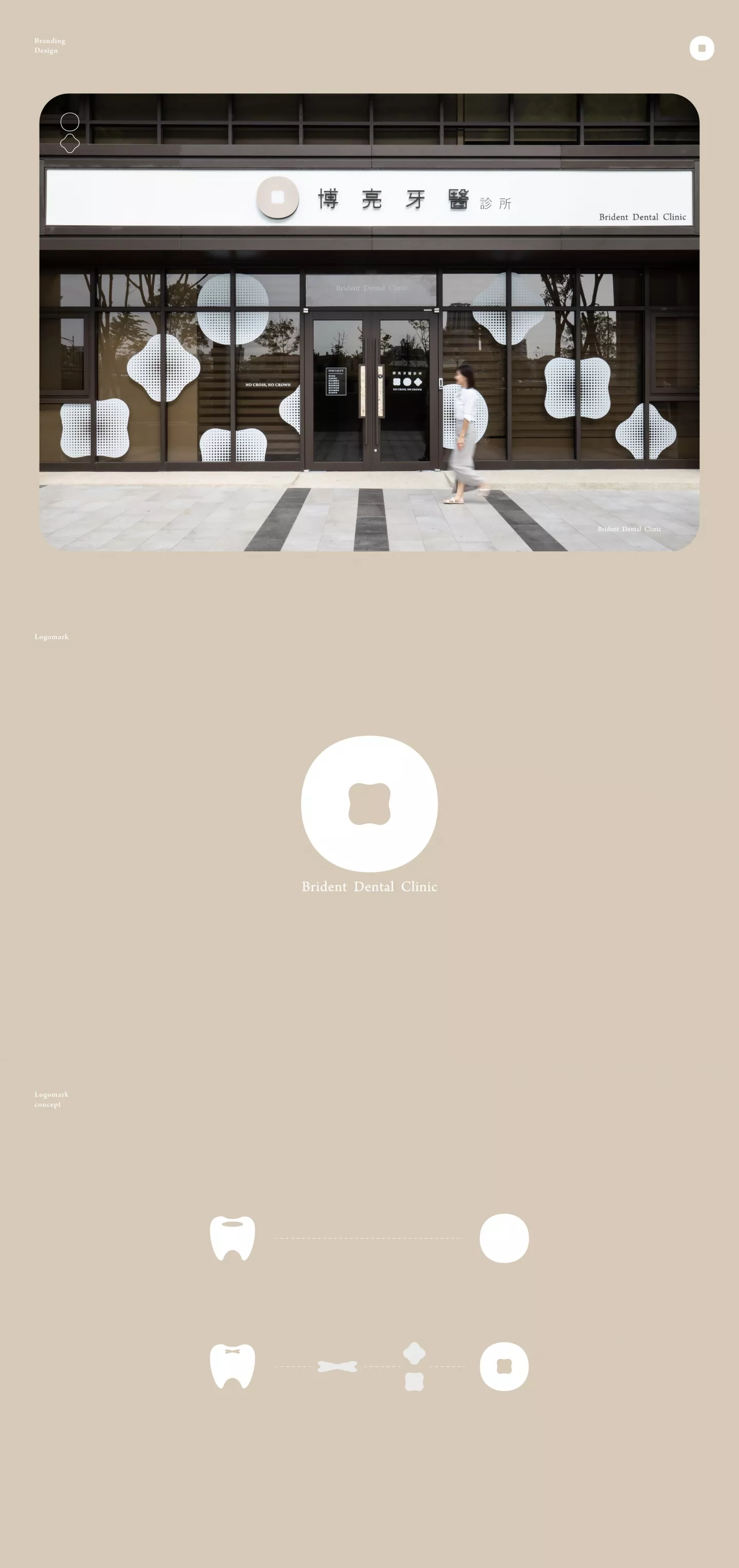
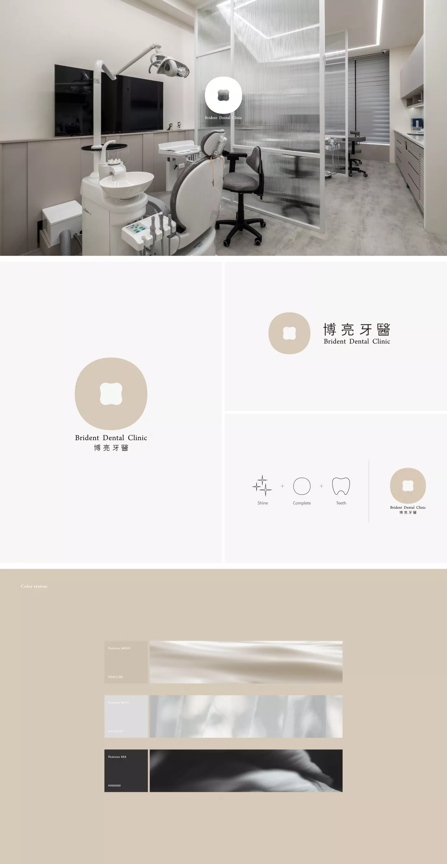
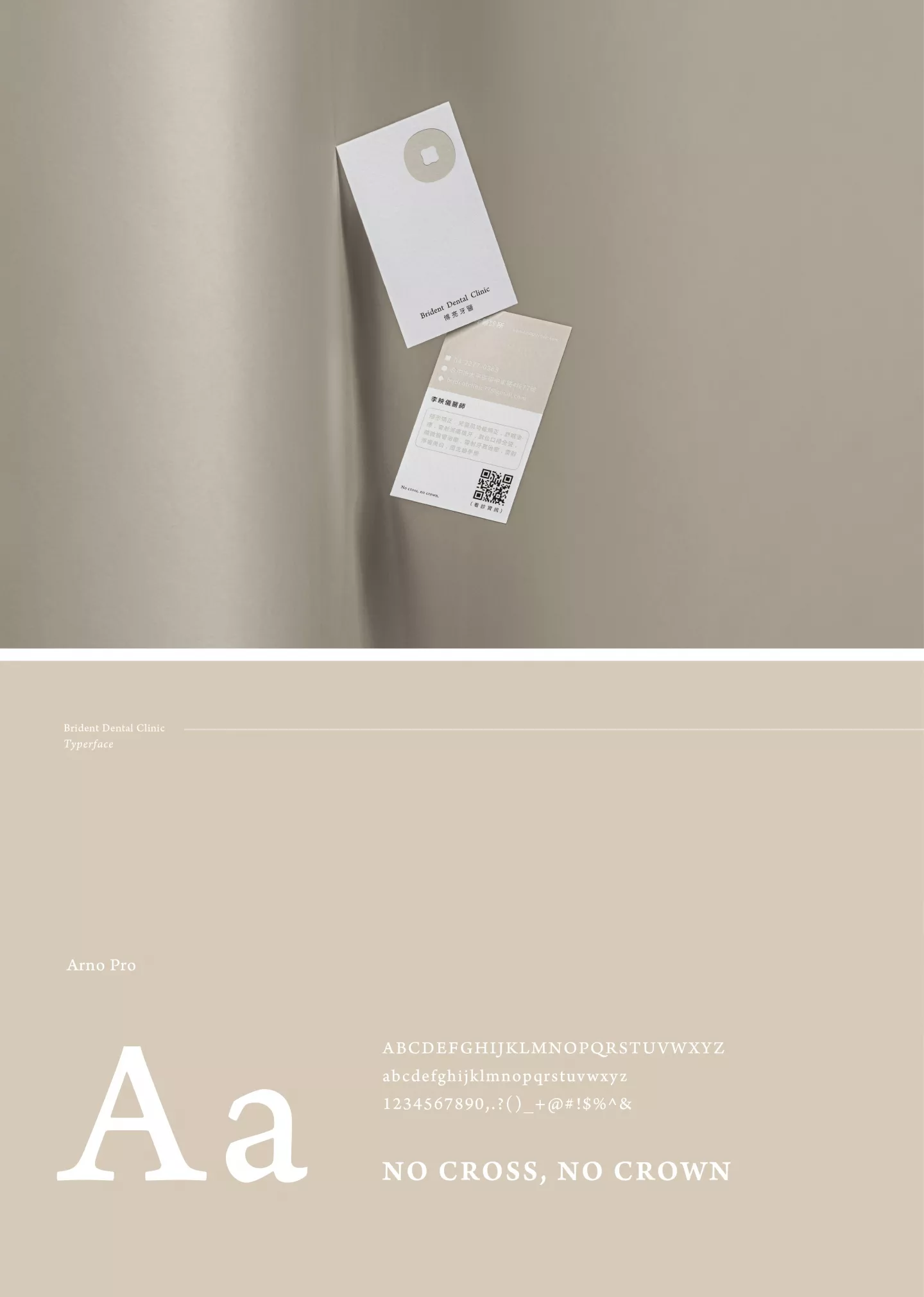
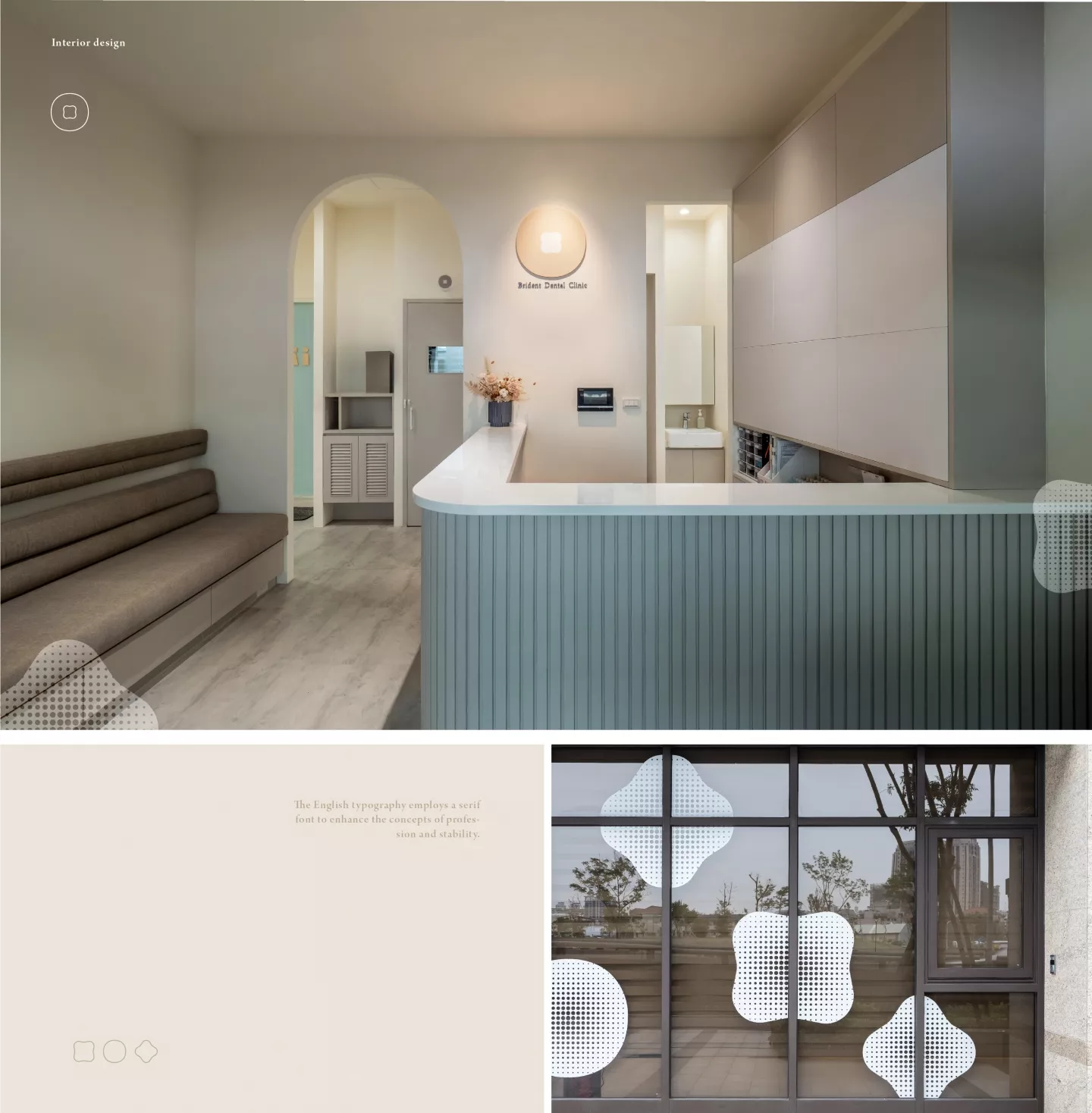
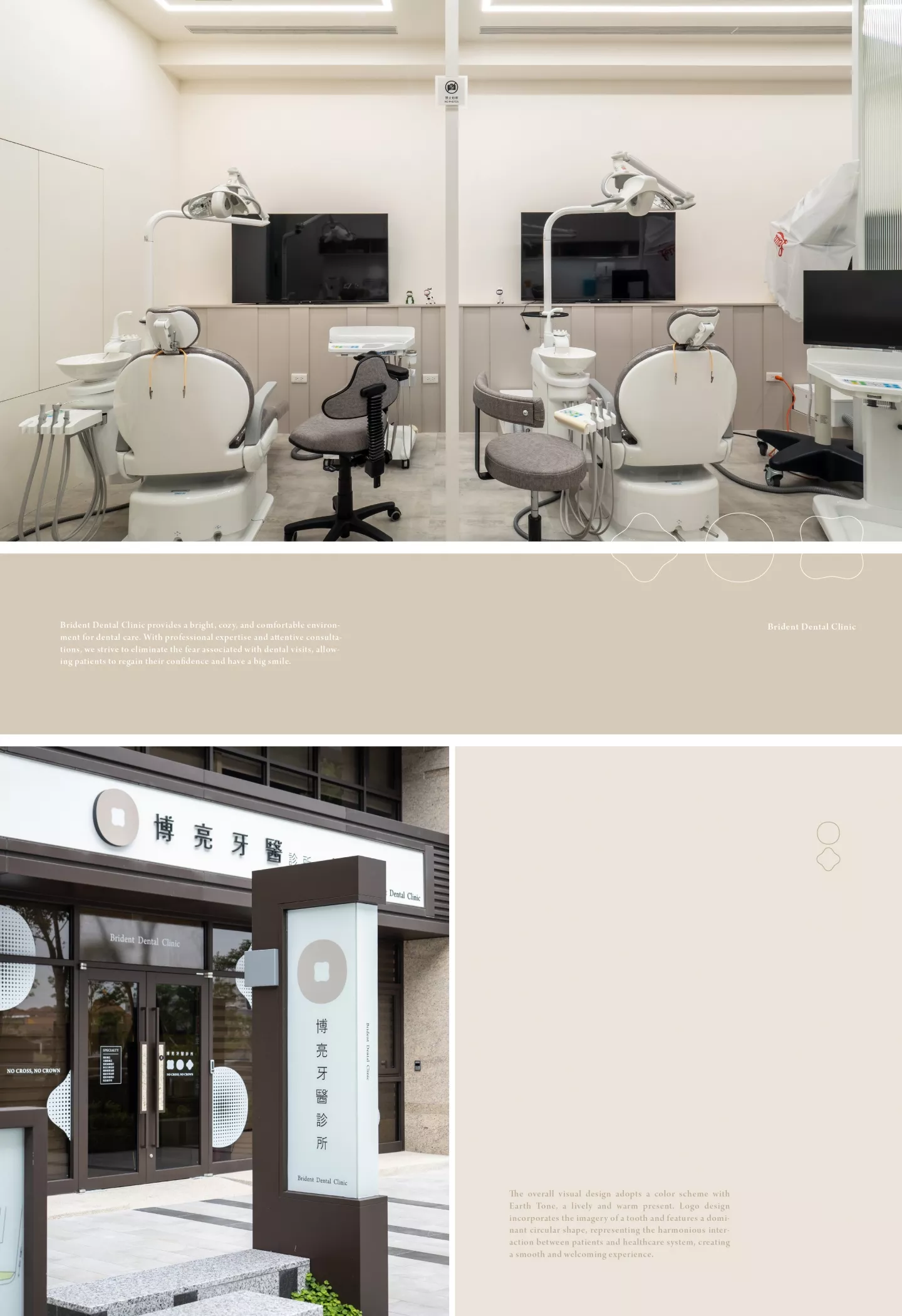
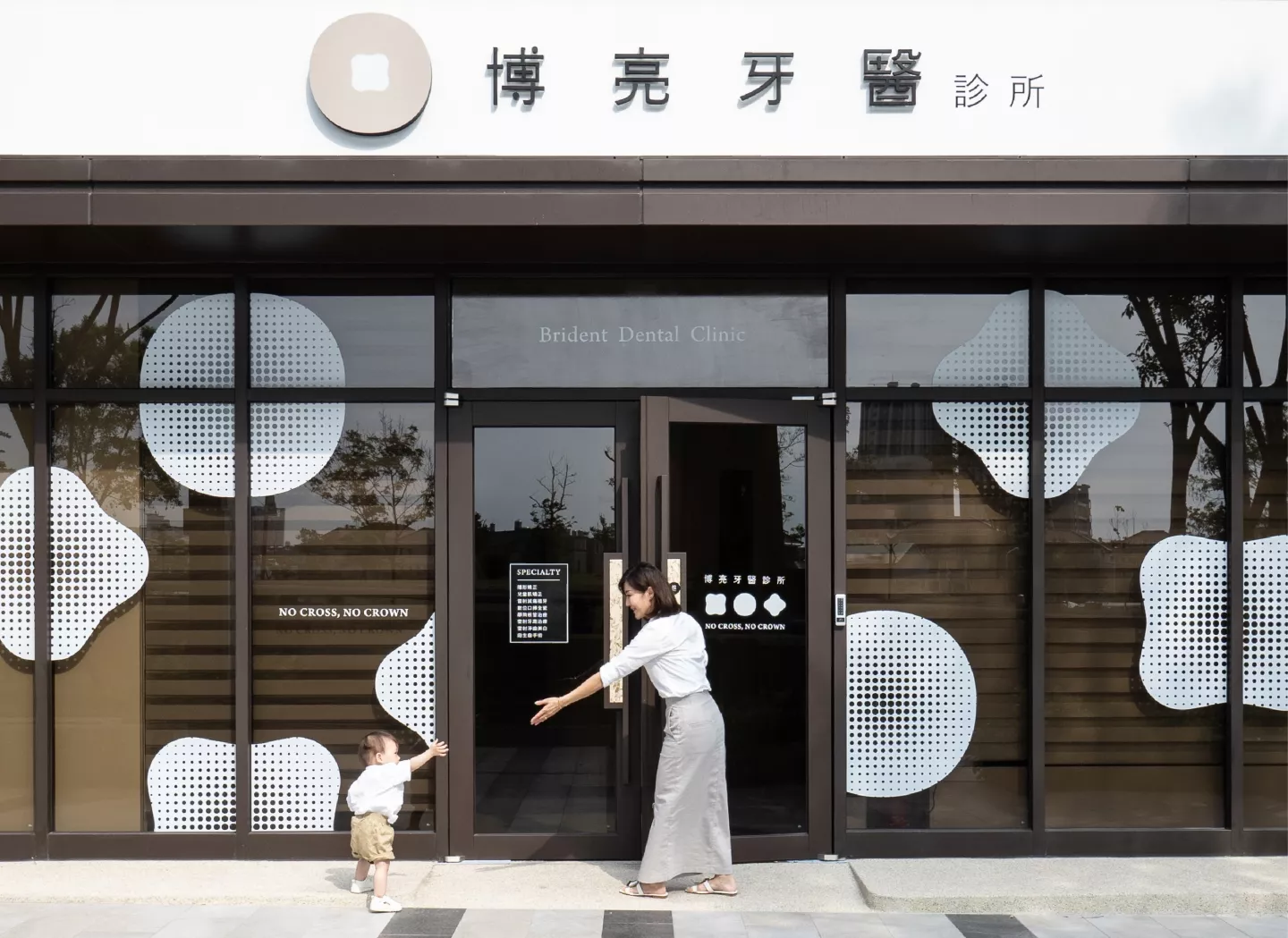
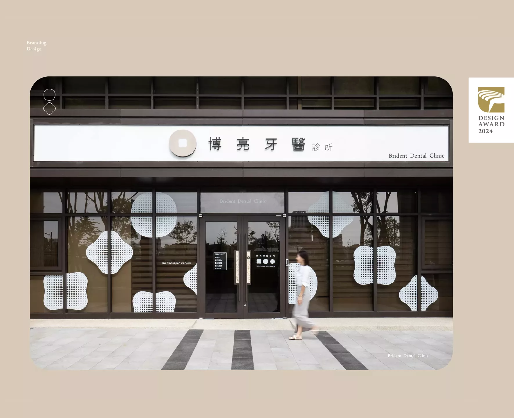
- 在這裡,不會再有使你揮之不去的恐懼,每個角落,都有溫暖,都有親切。我們只想讓你擁有健康亮白的牙齒,重拾一份自信的微笑。整體設計採用自然色系配色,活潑又有溫度的呈現。圖騰採用牙齒的意象,直覺性的反應店家本質,搭配色彩展現出親切的氛圍。英文字體選用襯線字,加強專業及穩重的概念。整體視覺以圓形為主,代表病人與醫療體系間的良好互動,圓滑且親切。
只想讓你擁有健康亮白的牙齒,重拾一份自信的微笑。 - "Bright Smiles Dental Clinic: A Bright and Cozy Dental Practice.Visiting the dentist has always been a fear in the hearts of many, with extractions, nerve treatments, and the sounds of machines causing anxiety. Some people endure the pain rather than addressing their dental issues.However, we value your feelings and have moved beyond the standardized dental procedures. With our professional expertise and attentive consultations, you will feel warm and no longer have the fear of dental visits. Our team constantly communicates and discusses, refining our skills and knowledge to ensure that every patient's dental problems are effectively resolved.
- Here, you will no longer be haunted by lingering fears. Every corner is filled with warmth and kindness. Our only desire is to give you healthy and bright teeth, restoring your confident smile.The overall design adopts a natural color palette, presenting a lively and warm ambiance. The dental imagery used as motifs intuitively reflects the essence of the establishment, and the colors exhibit a welcoming atmosphere.The English font choice employs a serif typeface, enhancing the concepts of professionalism and stability. The overall visual theme revolves around circles, symbolizing the positive interaction between patients and the healthcare system—smooth and friendly."
- 41180台中市太平區環中東路四段77號
- 04 2277 0383