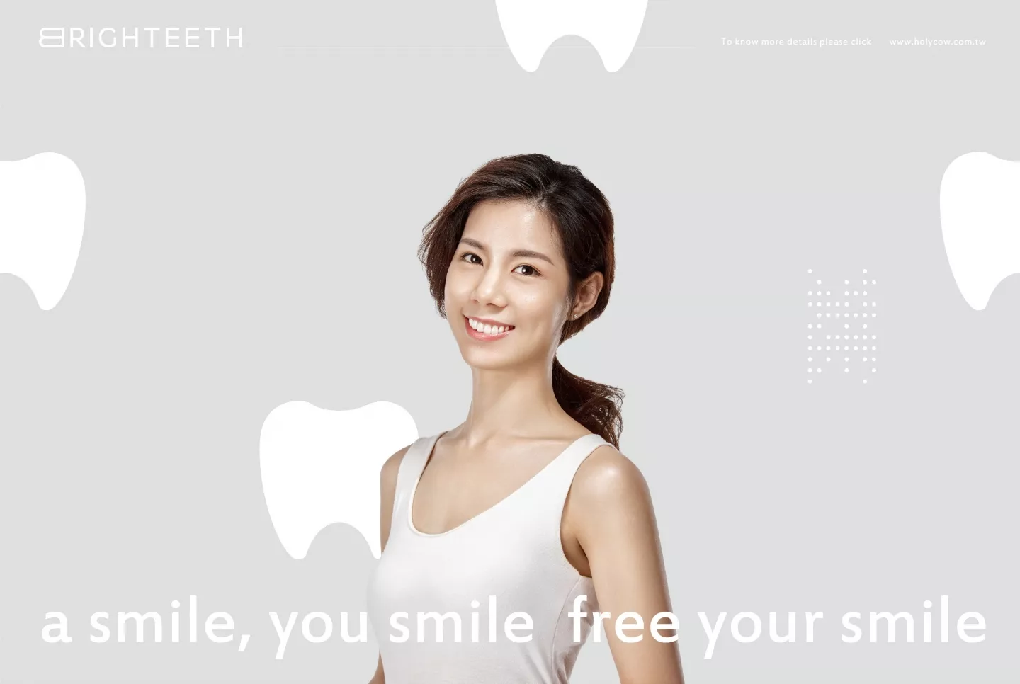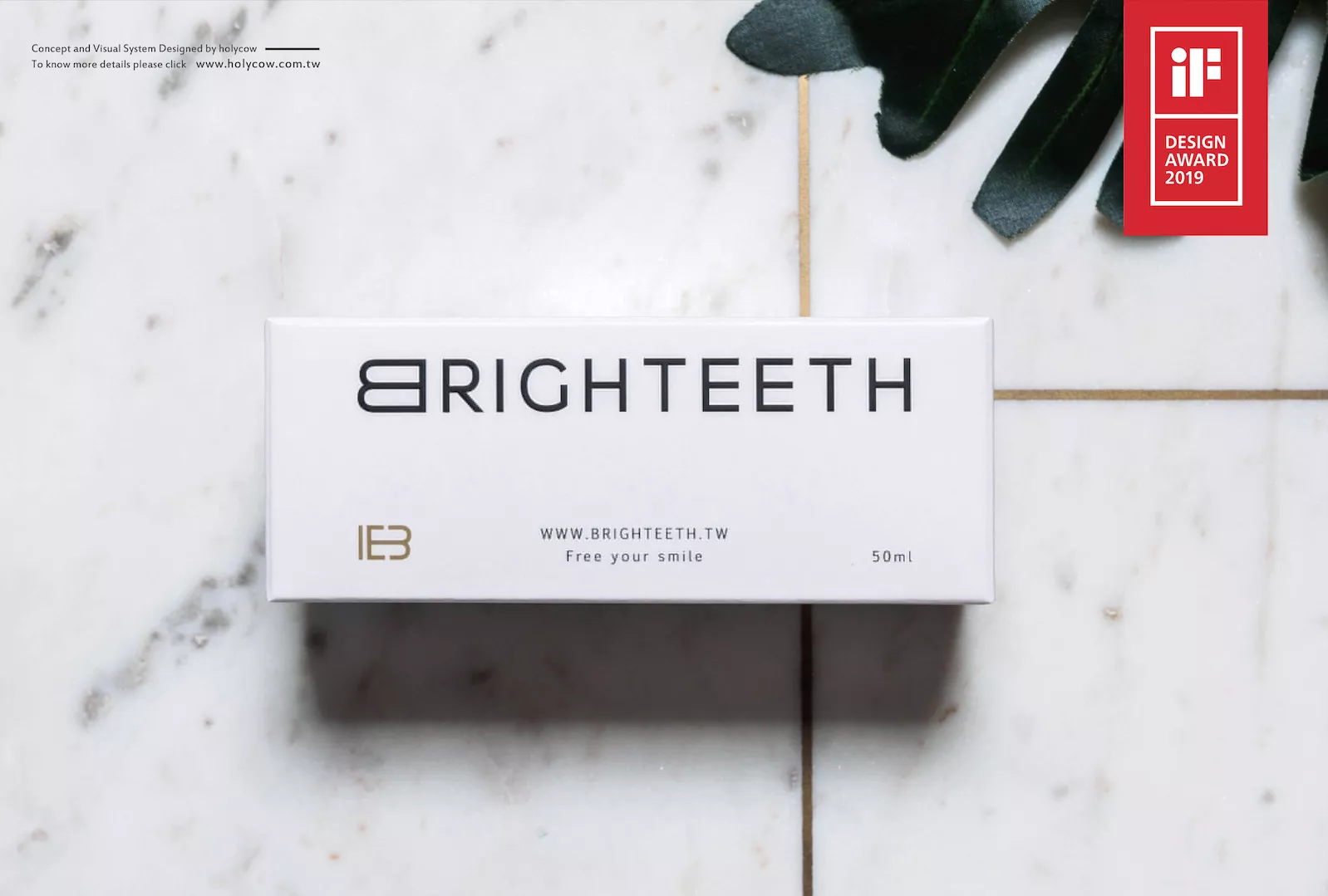
BRIGHTEETH
- 獲得德國IF 設計獎|美白牙齒連鎖品牌識別系統設計|品牌應用設計 | 攝影企劃 | 包裝設計
台北概念店
台北市大安區敦化南路一段236巷38號2樓
(忠孝復興站3號出口步行5分鐘)
電話: 02-27816333
新竹形象店
新竹市東區三民路49號(巨城附近)
電話: 03-5311008
台中旗艦店
台中市西區台灣大道二段492號(SOGO斜對面)
電話: 04-23222888
高雄藝文店
高雄市鼓山區美術北一街103號 (內惟火車站步行5分鐘)
電話: 07-5529359
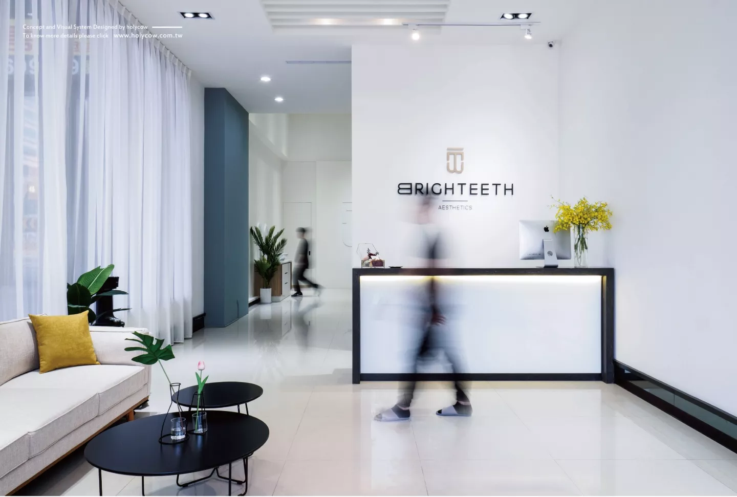
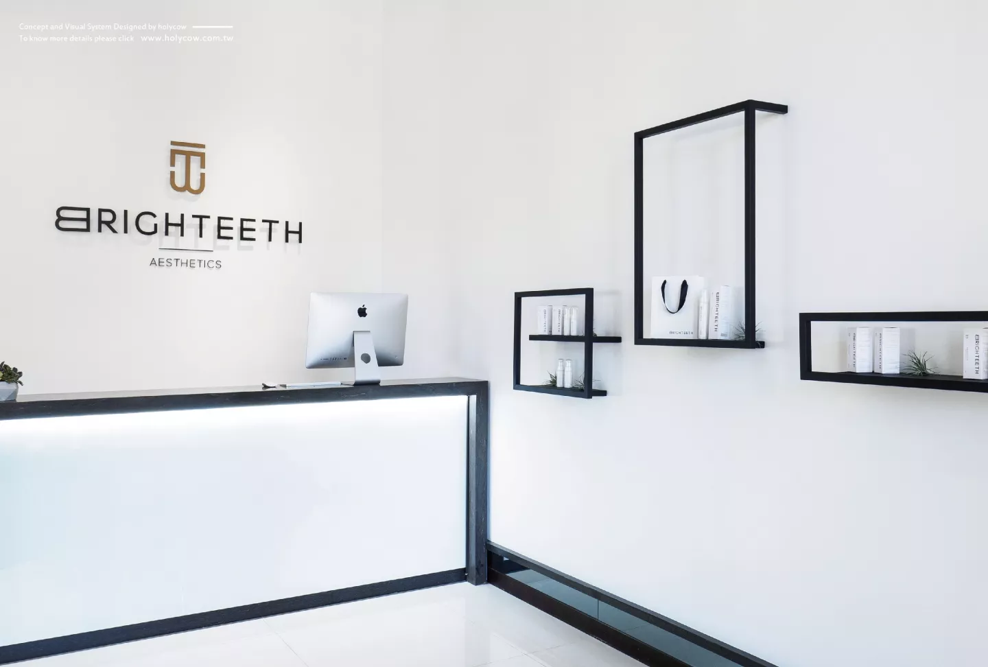
Having bright white clean teeth allows a person’s self-confidence to gleam and brings out the most splendid smile.Brighteeth has created a professional fresh and clean aesthetic center with the uppermost quality and fashion.
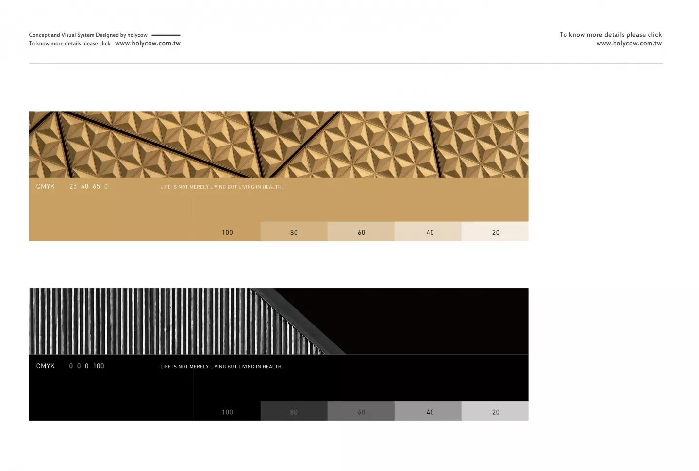
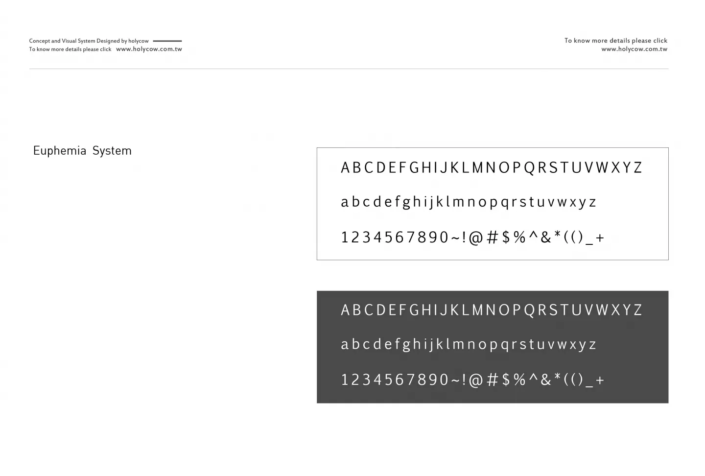
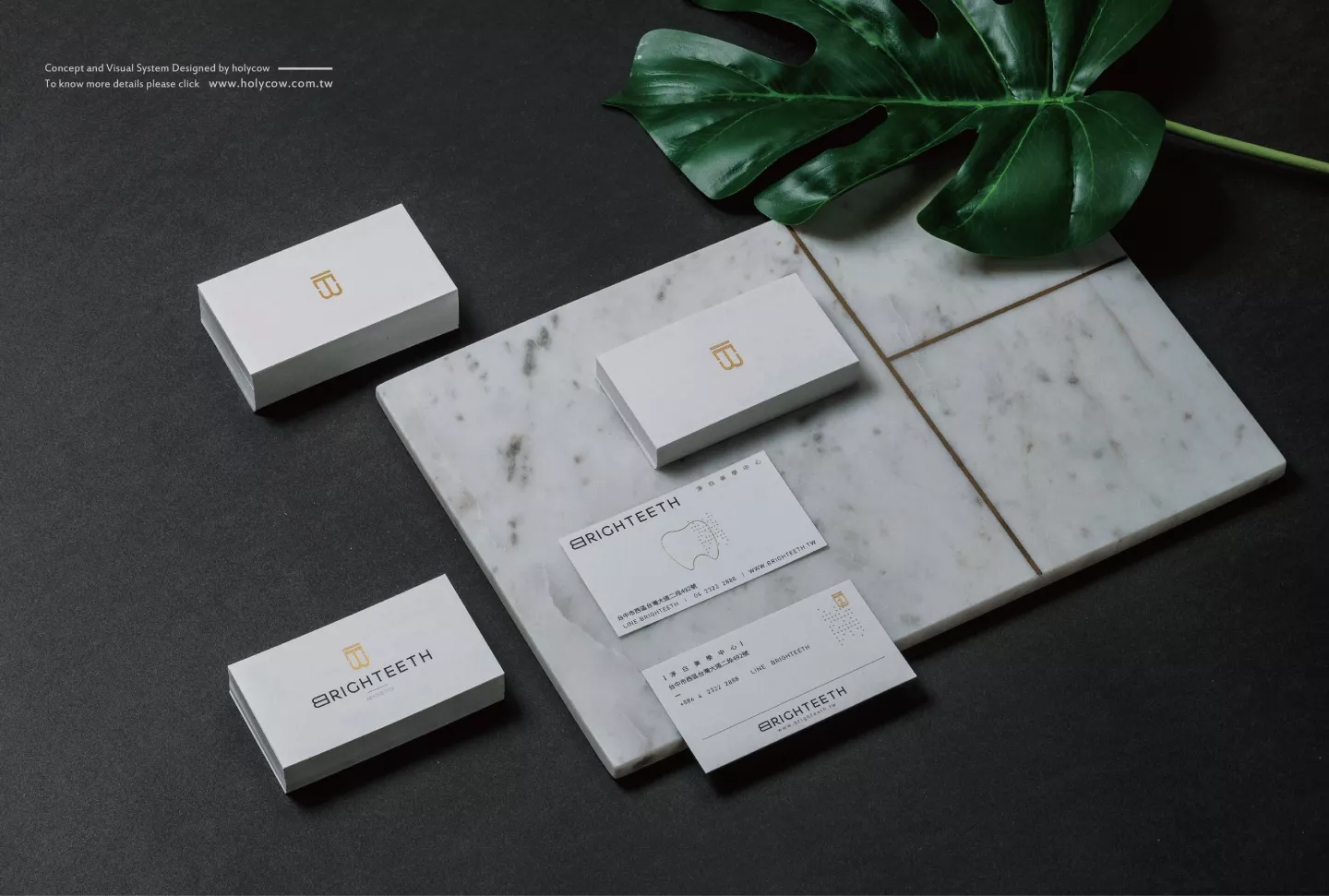
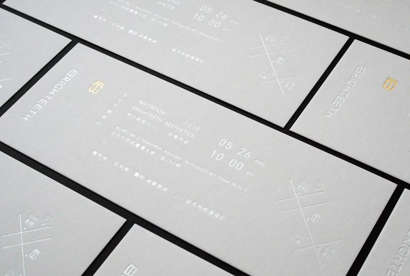
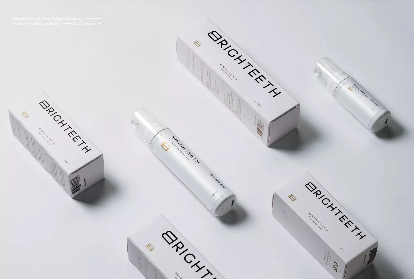
The brand name is a fusion of the words“Bright”and “Teeth”to convey the deep significance of the radiance of white teeth. The logo design utilizes only the letters “B”and “T”as the foundation to carry on the vision of dental renovation. The design is minimalistic, concise, and elegant, combining gold, black and white as the main color scheme with the bold simplistic font design. The letter “B”brings out the fashion, innovation, and proficiency behind the design, taking the viewer into a higher level of visual intensity and positions the brand amongst the luxury brands.
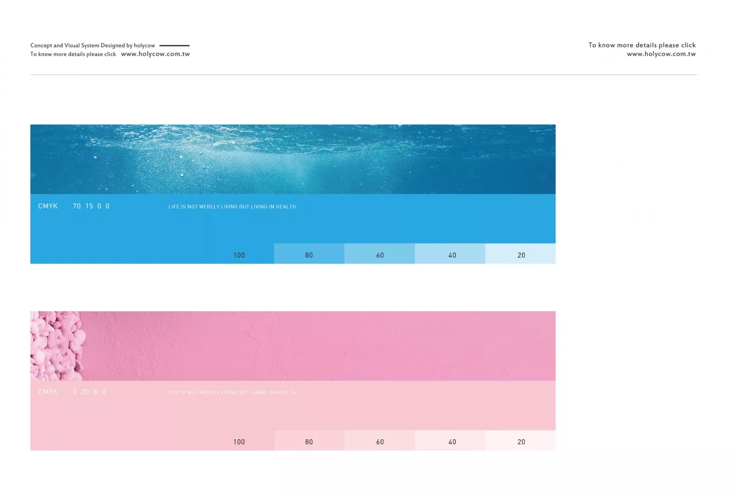
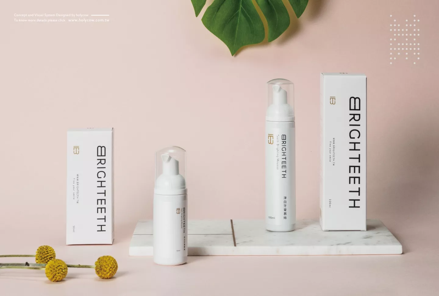
The auxiliary graphics and bright white visuals symbolize purity and the basis of the design. The seemingly scattered design elements can be flexibly placed in various arrangements or layouts, whether it be the symbolic tooth visuals, brand packaging, web design graphics or the various icons.